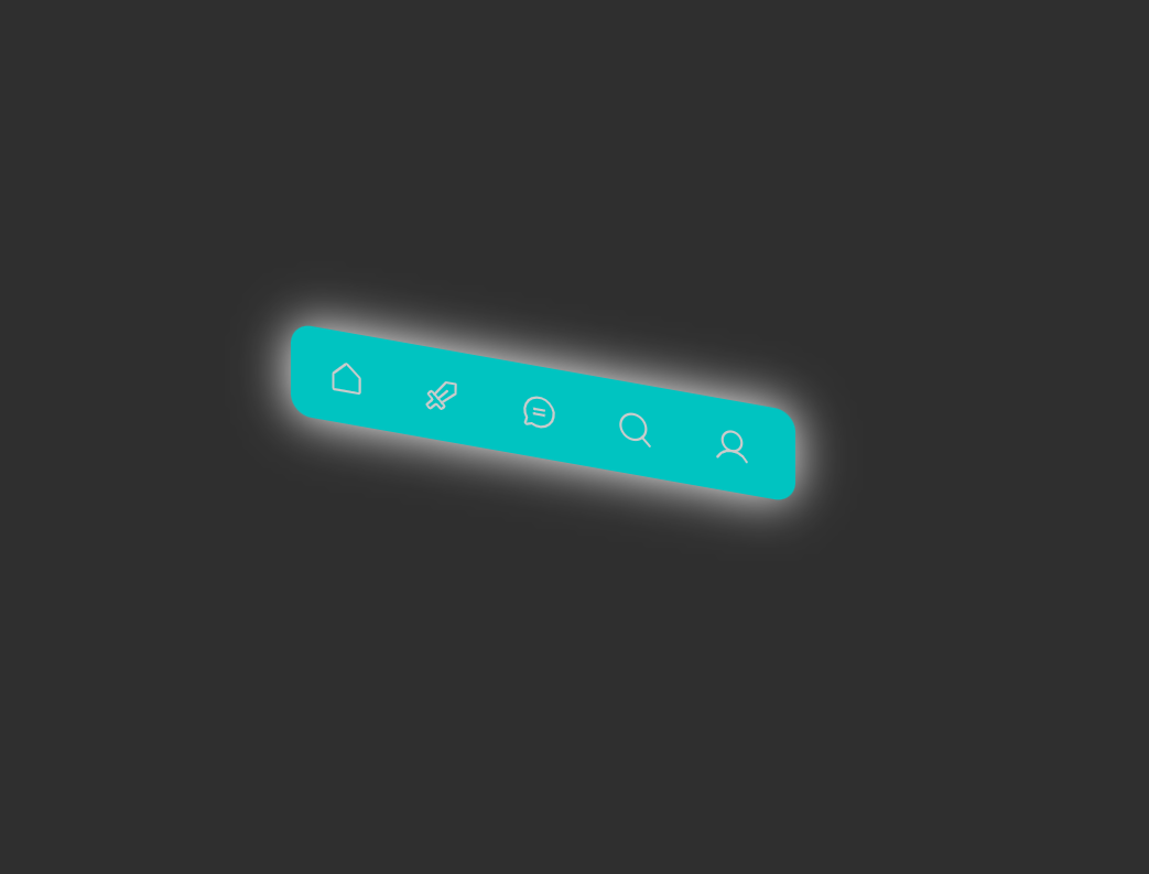
What You'll Build
In this tutorial, you'll create a modern skewed navigation menu using
only HTML and CSS — no JavaScript required. Each menu item has an angled background created
with transform: skew(), and hovering over an item triggers a smooth 3D tilt-back
animation with enhanced box-shadow for a pop effect.
This is a perfect beginner project for mastering CSS transforms,
CSS transitions, inverse skew technique, and the
:hover pseudo-class — skills that apply directly to real-world UI components
like website headers, landing page navigation, and dashboard sidebars.
transform: skewX()
to tilt its background. The text inside receives the inverse skew so it remains upright and readable.
On hover, the skew resets to 0deg with a translateY(-3px) lift for a 3D
interactive feel — all achieved with pure HTML and CSS.
Key Features of This Skewed Menu
transform: skewX() to create a slanted, modern
look.translateY() with enhanced
box-shadow for depth.transform only — the fastest CSS property to animate, composited
on the GPU.Full Source Code (Free)
The entire project lives in a single HTML file — no external CSS or JS files required.
The HTML sets up the card structure and links images from picsum.photos
for demonstration. The CSS drives every animation, transition, and responsive breakpoint.
A four-line script at the bottom removes the shimmer placeholder once each image has
loaded. Use the tabs below to explore the HTML and CSS sections separately.
index.html file.
No build tools, no npm, no libraries — open it in any modern browser and the accordion
gallery works immediately. Swap the picsum.photos URLs with your own images
to customize it instantly.
How It Works — Step by Step
Here's exactly how each layer of this skewed navigation menu is built, from the CSS custom properties down to the hover 3D lift effect.
Set Up the Navigation HTML
Create a <nav> element containing a <ul> list.
Each list item (<li class="menu-item">) wraps an anchor link. This
two-level structure — item container + inner link — is essential because the skew is
applied to the outer container while the inner link receives the inverse skew.
Apply Skew Transform to Containers
Use transform: skewX(var(--skew-angle)) on each .menu-item.
This tilts the entire list item — background, padding, and all — along the X axis.
The angle is stored in a CSS custom property (--skew-angle: -15deg) so
you can change it in one place and retheme the entire menu.
Counter-Skew the Text
The text inside each item receives transform: skewX(calc(var(--skew-angle) * -1)),
which is the exact mathematical inverse of the parent skew. This keeps the text perfectly
upright and readable while the background remains angled — the core trick behind skewed menus.
Style the Base Menu
Apply background colors, padding, font styling, and subtle border-radius
to each menu item for the resting state. The parent <ul> gets a dark
background with box-shadow to ground the menu visually against the page.
Hover: Reset Skew + 3D Lift
On .menu-item:hover, reset the skew to skewX(0deg) and add
translateY(-3px) to lift the item upward. Combine this with an enhanced
box-shadow using the accent color to create a convincing 3D pop effect.
The inner link simultaneously changes its background and text color for a complete
visual state change.
Responsive & Reduced Motion
On screens below 768px, a media query switches the menu to a vertical stack and
removes the skew entirely for better tap target alignment. A
@media (prefers-reduced-motion: reduce) block disables all transitions
for users who have requested reduced motion in their OS accessibility settings.
transform and opacity — never
width, height, margin, or padding directly. The former are
composited on the GPU and skip the layout/paint phases entirely. The latter trigger expensive layout
recalculations on every frame.
Best Practices & Common Mistakes
- Use CSS variables for the skew angle so one change rethemes everything
- Apply the inverse skew to the inner text element, not the outer container
- Keep skew angles moderate (10–20deg) for readability
- Add
@media (prefers-reduced-motion)support - Test on real mobile devices before deploying
- Use
overflow: hiddenon skewed items to clip background edges
- Over-skew items past 25deg — text becomes hard to read even with inverse skew
- Forget to counter-skew the text — it will render at an angle
- Animate
top,left, ormarginfor hover effects - Use incompatible color combinations — skew looks best with strong contrast
- Skip transitions — items will jump abruptly without smooth animation
- Ignore mobile — skewed items can overlap or misalign on small screens
Frequently Asked Questions
Can I create a skewed navigation menu without JavaScript?
transform: skew() combined with transition
and the :hover pseudo-class.
How does CSS skew work on navigation items?
transform: skewX() or skewY() function tilts an element along the
X or Y axis. When applied to a menu item container, it angles the background. The text inside
receives the inverse skew (e.g., skewX(15deg) to counter a parent
skewX(-15deg)) so the text stays upright and readable.
How do I change the skew angle of the menu?
--skew-angle CSS custom property value in the :root block.
For example, --skew-angle: -20deg creates a steeper angle. The inverse skew on the
inner text element uses calc() to automatically match, so the text remains straight.
Will skewed menus affect my page's Core Web Vitals?
Does this skewed navigation work on mobile devices?
How do I add prefers-reduced-motion support?
transition declarations inside a
@media (prefers-reduced-motion: no-preference) block. Add a parallel
@media (prefers-reduced-motion: reduce) block that sets
transition: none on all animated elements. This disables hover animations for
users who have requested reduced motion in their OS accessibility settings.
Conclusion
Skewed navigation menus provide a modern, visually striking approach to website navigation design. Using only HTML and CSS, you can create interactive menus with angled backgrounds and 3D hover tilt effects that dramatically improve the visual appeal of any website.
The key technique — applying skewX() to the container and the inverse skew to
the inner text — is a fundamental CSS pattern that extends far beyond navigation. You can
apply the same approach to cards, buttons, banners, and any UI element that benefits from
a dynamic, angled aesthetic.
Remember to keep skew angles moderate, always provide smooth transitions, support reduced motion preferences, and test thoroughly on mobile devices. With these practices in place, your skewed navigation will look polished and professional on every screen size.