What You'll Build
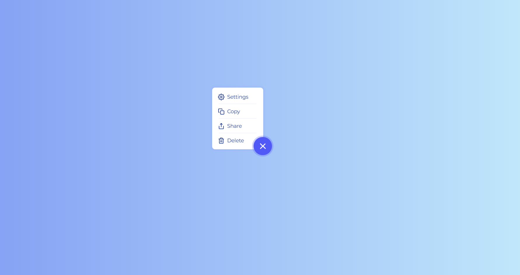
In this tutorial, you'll build an animated floating action button (FAB) menu using nothing but HTML, CSS, and a single line of JavaScript. The button sits in the corner of the screen as a glowing circle with a hamburger-style icon. When clicked, the icon smoothly morphs into a close (X) symbol, a pulsing ring radiates outward, and a card-style list of actions — Settings, Copy, Share, and Delete — scales and fades into view with a staggered cascade effect.
This is a classic CSS expandable circle menu pattern used widely in mobile
apps, admin dashboards, and design systems for quick contextual actions. The entire
interaction state — open or closed — is controlled by toggling a single active
class on the parent container, while CSS transitions, transforms, and keyframes handle
every visual change.
It's an excellent project for practicing transform-origin, animation-delay staggering, icon morphing with rotation, and box-shadow pulse effects — all without reaching for a JavaScript animation library.
Key Features of This Floating Action Button Menu
box-shadow halo
that intensifies on hover and focus for clear interactive feedback.transform to seamlessly turn into a close icon when active.
onePulse keyframe animates the
button's box-shadow outward and back, drawing the eye on activation.0 to 1 with
transform-origin: bottom right, anchoring it visually to the button.
animation-delay values for a cascading effect.active class on the container, leaving all visuals to CSS.
Full Source Code (Free)
The project lives in a single HTML file. The CSS handles the FAB's glow, the icon morph,
the pulse ring, and the staggered list reveal. The JavaScript is a single
click listener that toggles the active class — every visual
change is then driven entirely by CSS selectors targeting .active.
Use the tabs to explore each section.
🔓 Full Source Code unlocks in
Hosted on GitHub Gist — free, no sign-up required
index.html file.
No libraries, no build tools — open the file in any modern browser and the menu works
immediately.
How It Works — Step by Step
Here's a breakdown of the eight core techniques behind this animated floating action button menu, from the base markup to the staggered reveal animation.
Container & Trigger Button Structure
A .list-container with position: relative wraps the
whole component. Inside it sits the circular .more-button, which
contains a .menu-icon-wrapper with three short
.menu-icon-line divs — the classic hamburger icon built from
pure CSS rectangles.
Hidden List Menu Positioning
The ul.more-button-list is positioned absolutely with
right: 24px; bottom: 0;, anchoring it next to the button. By
default it's invisible: opacity: 0 and
transform: scale(0), with
transform-origin: bottom right so it grows outward from the
button's corner rather than from its own center.
The Single JavaScript Toggle
A click listener on .more-button simply calls
classList.toggle('active') on .list-container.
That's the only JavaScript in the entire project — every visual state change
from here on is driven purely by the presence or absence of the
active class.
Revealing the Menu with Scale & Opacity
When .list-container.active is present, the
.more-button-list rule sets opacity: 1 and
transform: scale(1). Combined with the
transition: all 0.3s ease 0.1s defined on the base class, the
menu smoothly grows from a single point into a full card.
Staggering the List Items with fadeInItem
Each .more-button-list-item starts at opacity: 0 and
transform: translateX(-10px). When active, the
fadeInItem keyframe animation runs on every item with a base
delay of 0.2s, while nth-child(2) through
nth-child(4) override the delay to 0.4s,
0.6s, and 0.8s — producing the cascading entrance.
Morphing the Hamburger into an X
On activation, .menu-icon-wrapper rotates
-45deg. At the same time,
.menu-icon-line.first rotates -90deg with
translateX(1px), and
.menu-icon-line.last rotates -90deg with
translateX(-1px). The combined rotations realign the three
short lines into a clean X shape.
The onePulse Glow Animation
The onePulse keyframe animates the button's
box-shadow in three stages: it starts at the resting glow,
expands to a much larger and more transparent ring at 50%, then
settles back to the resting glow at 100%. It runs once,
forwards linear, only when .active is applied —
giving a satisfying "ping" feedback when the menu opens.
Hover States & the Delete Action
Regular menu items change color to the brand blue on hover and
use an ::after pseudo-element as a subtle divider line between
items (hidden on the last item). The #Delete item gets its own
300ms transition, growing to width: 100% with a
translucent red background on hover to clearly mark it as a destructive
action.
.more-button-list (for example, anchoring it to the top-left instead of the
bottom-right of the button), make sure to update transform-origin to match.
Otherwise the scale animation will grow from the wrong corner and look visually broken.
Customization Ideas
This floating action button menu is intentionally simple at its core, which makes it easy to adapt. Here are some practical ways to extend it for your own projects.
- Change the accent color — Replace
#5c67ffin.more-buttonand itsbox-shadowrules with your own brand color to instantly re-theme the component. - Add or remove menu items — Each
.more-button-list-itemis independent. Add new<li>elements with an icon and label, and increase.more-button-list'sheightto fit them. Remember to add a matching:nth-child()delay rule for the new item to keep the stagger smooth. - Anchor the FAB to the viewport — Wrap
.list-containerin a wrapper withposition: fixed; bottom: 24px; right: 24px;to pin the button to the corner of the screen like a true mobile FAB. - Swap the icons — The inline SVGs use the Feather icon style.
Replace the
<path>data with icons from Boxicons or any other SVG icon set while keeping the samewidth,height, andstrokeattributes. - Adjust the pulse intensity — Tweak the spread values inside the
onePulsekeyframe (e.g.0px 0px 0px 12px) to make the ring larger, smaller, or more/less transparent. - Slow down or speed up the stagger — Increase or decrease the
animation-delayvalues on each:nth-child()selector to make the cascade feel snappier or more dramatic. - Style the destructive action differently — Instead of an expanding
red background on
#Delete, try a shake animation or an icon color change to signal danger.
.more-button-list.
Browser Compatibility
Every technique used in this floating action button menu — CSS transforms, transitions,
keyframe animations, pseudo-elements, and classList.toggle() — is
well-established and supported across all modern browsers.
| Browser | CSS Transforms & Transitions | Keyframe Animations | Overall Support |
|---|---|---|---|
| Chrome / Edge | Yes | Yes | Full |
| Firefox | Yes | Yes | Full |
| Safari (macOS & iOS) | Yes | Yes | Full |
| Samsung Internet | Yes | Yes | Full |
| Internet Explorer 11 | Partial | No | Limited |
Performance & Responsiveness
Because every animation in this component is handled by CSS — and specifically by properties the browser can composite on the GPU — it remains smooth even on lower-end devices.
- GPU-friendly properties:
transformandopacitydrive the scale, fade, and rotation animations. These don't trigger layout recalculation or repaint, so the menu opens and closes at a consistent frame rate. - Minimal JavaScript: A single event listener with one line of code means there's virtually no scripting overhead — the browser's CSS engine does all the heavy lifting.
- Small footprint: No external animation libraries or icon fonts are loaded; the icons are inline SVG, keeping the total page weight tiny.
- Responsive by design: Because the component is sized in pixels
relative to its container and anchored with absolute positioning, it scales
predictably across mobile, tablet, and desktop viewports without extra media
queries — though you can add a
position: fixedwrapper for true mobile FAB behavior as described in the customization section. - Touch-friendly target size: The 50×50px button meets common accessibility guidelines for minimum touch target sizes, making it comfortable to tap on mobile screens.
transform,
opacity, and box-shadow for animations — instead of properties
like width, height, or top/left — is
one of the most reliable ways to keep CSS animations smooth across devices.
Frequently Asked Questions
How do I create a floating action button that expands into a menu using CSS?
transform: scale(0) and
opacity: 0 by default. Toggle an active class on the
container with JavaScript when the button is clicked, and target
.active .more-button-list in CSS to set
transform: scale(1) and opacity: 1 with a transition.
Full source code is in the tabs above.
How does the hamburger icon morph into a close (X) icon?
-45deg, the first line rotates
-90deg and shifts slightly via translateX, and the
last line rotates -90deg in the opposite translateX
direction. Combined, the three lines visually rearrange into an X shape — the
classic hamburger-to-close animation, without swapping icons.
What is the staggered fade-in animation for the list items and how does it work?
opacity: 0 and is shifted
-10px horizontally via transform: translateX(-10px).
When the container becomes active, the fadeInItem keyframe animation
runs on every item, animating it to translateX(0) and
opacity: 1. By giving each nth-child item a longer
animation-delay (0.2s, 0.4s,
0.6s, 0.8s), the items appear to cascade in one after
another rather than all at once.
What creates the pulsing ring effect around the button?
onePulse keyframe animation runs once on
.more-button when the container becomes active. It animates the
box-shadow from the button's resting glow, out to a much larger,
more transparent ring at the 50% mark, and back to the resting glow
at 100%. Because box-shadow is animatable, this creates
a quick radar-style pulse that draws attention to the button as the menu opens.
Is this floating action button menu suitable for beginners?
transform-origin, transitions, and
animation-delay in a real, reusable UI component.
Can I use this floating action button menu in a real project?
.more-button-list width/height to fit more or
fewer items, update the color variables (#5c67ff for the primary
color and the red hover for destructive actions), and reposition
.list-container using position: fixed to anchor it to
a corner of the viewport.
Conclusion
This animated floating action button menu proves how far pure CSS can go with just a single line of JavaScript as a trigger. By combining transform-based icon morphing, a box-shadow pulse, scale-and-fade reveals, and staggered keyframe delays, you get a polished, production-ready UI component that feels every bit as smooth as one built with a JavaScript animation library.
The patterns here — toggling a single state class, anchoring transforms with
transform-origin, and layering animation-delay for cascading
effects — are reusable building blocks for dropdowns, tooltips, notification trays, and
countless other small interactive components.
Want to keep exploring CSS animation techniques? Check out the Neon Cursor Animation for advanced pointer effects, or the Animated Button with Star Effects for more GSAP-powered micro-interactions.
Found this useful? Explore more HTML CSS JavaScript projects in the sidebar.