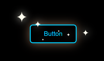
What You'll Build
In this tutorial, you'll create a creative animated button with star effects using only HTML and CSS — no JavaScript required. When a user hovers over the button, multiple SVG star shapes animate outward in an explosion pattern, each glowing with a drop-shadow filter.
This is a perfect beginner project for mastering CSS transitions,
CSS custom properties, SVG inline elements, and the
:hover pseudo-class — skills that apply directly to real-world UI components
like call-to-action buttons, pricing cards, and landing pages.
Key Features of This Animated Button
filter: drop-shadow() for a neon particle look.
--color variable.transform and opacity — the fastest CSS properties
to animate.Full Source Code (Free)
The project uses two files: an HTML file containing the button and inline SVG stars, and a CSS file handling the layout, transitions, and glow animations. Use the tabs to switch between them.
index.html in your
browser. Hover over the button to see the star animation immediately. Or click Preview Result
above to see it live right here.
How It Works — Step by Step
Here's exactly how each layer of this button animation is built, from the CSS variables down to the hover glow effect.
CSS Variables for Theming
A --color custom property defined on the :root or directly
on the button element controls the base color for the gradient, border, glow, and star fill.
Changing one value rethemes the entire component instantly.
Base Button Styling
The button uses position: relative to act as the containing block for
absolutely positioned stars. A gradient background, rounded border-radius,
and layered box-shadow create the base glowing appearance at rest.
Positioning the SVG Stars
Each <svg> star is a direct child of the button with
position: absolute. Specific top, left,
right, and bottom values place each star at a different edge,
corner, or side of the button before the hover state activates.
Hover: transform Explosion
On button:hover svg, each star receives a unique
transform: translate(Xpx, Ypx) scale(1) value that moves it outward
from the button in a different direction. The initial state uses
transform: translate(0,0) scale(0) and low opacity.
Cubic-Bezier Timing
The transition on each star uses a custom cubic-bezier
curve to give the explosion an elastic, springy feel. Different
transition-delay values on each star create a staggered burst rather
than all stars moving simultaneously.
Drop-Shadow Glow on Stars
Each star receives filter: drop-shadow(0 0 6px var(--color)) on hover.
Because drop-shadow follows the actual SVG path shape — not a rectangular
bounding box — the glow hugs each star precisely, making them look like glowing
light particles.
transform and opacity — never
width, height, top, or left directly. The former are
composited on the GPU; the latter trigger expensive layout recalculations on every frame.
Best Practices & Common Mistakes
- Animate only
transformandopacity - Use
will-change: transformfor elements animating on hover - Use CSS variables so one change rethemes everything
- Add
@media (prefers-reduced-motion)support - Test the button on a real mobile device before deploying
- Animate
top,left, orwidth— causes layout thrashing - Place too many animated stars — diminishing returns past 8
- Use animation on every button on the page simultaneously
- Forget that hover doesn't persist on touch devices
- Use heavy JavaScript to replicate what CSS can do natively
Frequently Asked Questions
Can I create an animated button without JavaScript?
:hover pseudo-class combined with
transition and transform. You only need an HTML file and a CSS file.
How do CSS star animations work on buttons?
position: absolute.
At rest they are scaled to 0 and transparent. On :hover, CSS transitions
animate each star's transform: translate() and opacity to move
them outward with a glow via filter: drop-shadow().
How do I change the button and star color?
--color CSS variable on the button or :root and
change its value — for example #ff6b35 for orange, #a855f7
for purple, or #4ade80 for green. The button gradient, border glow,
and star drop-shadow all update automatically.
Will CSS button animations hurt Core Web Vitals?
transform and opacity are
GPU-accelerated and do not trigger layout or paint. They have no measurable impact
on CLS, LCP, or INP when applied to small interactive elements like buttons.
Does the hover animation work on mobile?
How do I add prefers-reduced-motion support?
transition declarations inside:
@media (prefers-reduced-motion: no-preference) { ... }.
This ensures animations only run for users who haven't requested reduced motion
in their OS accessibility settings, keeping the component WCAG 2.1 compliant.
Conclusion
This animated button with star effects shows how much visual impact pure CSS can deliver without a single line of JavaScript. By combining CSS custom properties, SVG inline elements, cubic-bezier transitions, and drop-shadow filters, you get a production-quality interactive component with zero dependencies and minimal performance cost.
Use this technique on call-to-action buttons, sign-up forms, pricing cards, or anywhere you
need to draw the user's eye and encourage a click. Swap the --color variable
to match your brand, adjust the star positions and timing, and make it yours.
Found this useful? Explore the related projects in the sidebar for more modern CSS and JavaScript UI effects.