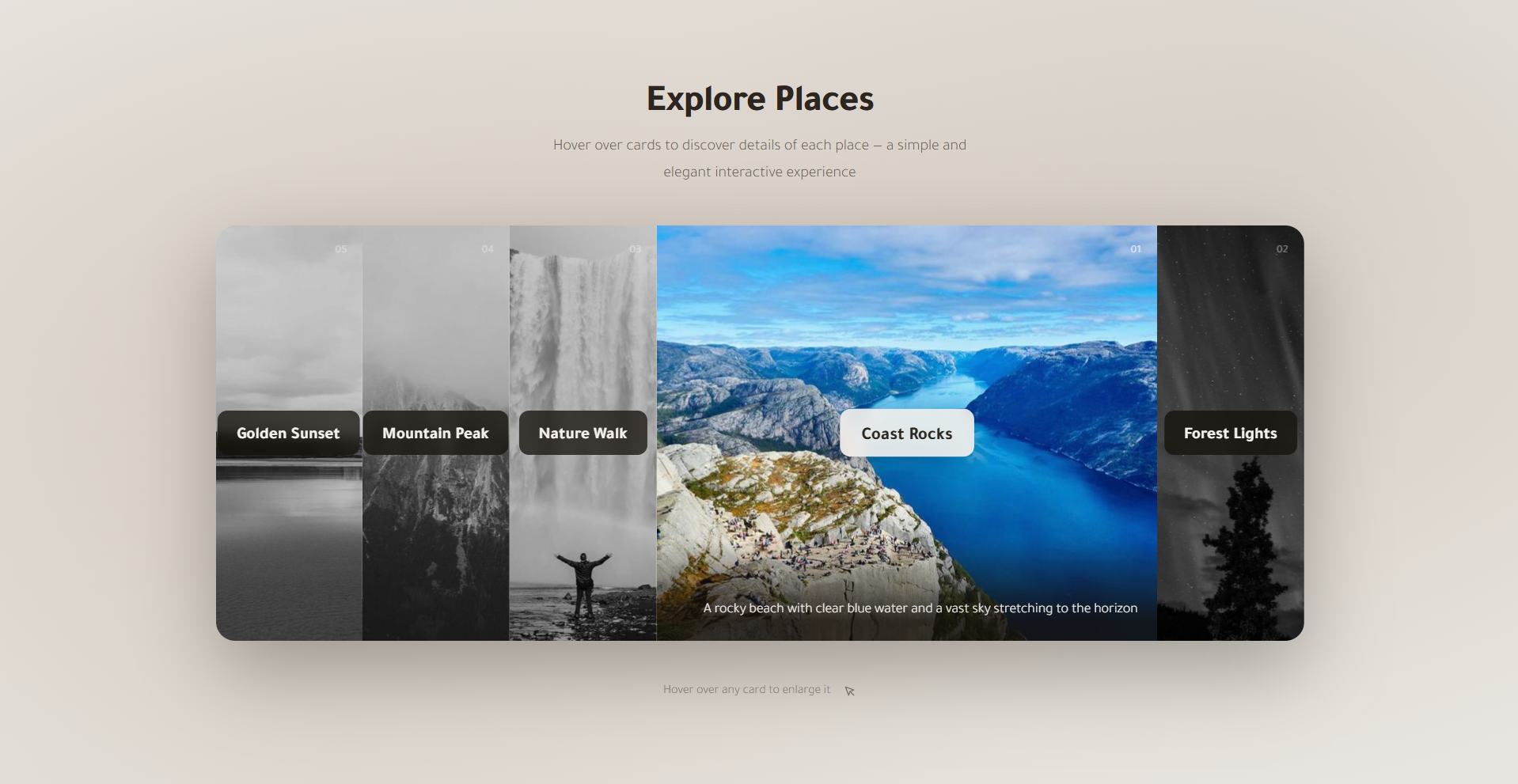
What You'll Build
In this tutorial you'll create a CSS-only flexible accordion image card gallery
— a horizontal strip of five image cards that each expand smoothly when hovered, compressing
the rest to make room. The effect is achieved entirely through CSS Flexbox by manipulating
the flex property on the hovered card, driven by a single transition
rule using a custom cubic-bezier easing for a buttery-smooth feel.
Beyond the core accordion mechanic, each card also transitions its image from muted grayscale to full color as it expands, scales the image with a subtle zoom, and reveals a sliding description overlay that rises up from the card's bottom edge. A decorative numbered badge sits in the corner of each card, and a centered title badge flips between dark and light styling on hover to reinforce the interaction.
This is a popular pattern for image showcase sections, portfolio galleries, destination sliders, and feature comparisons. It requires no JavaScript libraries, no frameworks, and no build tools — just clean, well-structured HTML and CSS that works in every modern browser.
Key Features of This Accordion Card Gallery
flex: 1 1 0. Hovering a
card
sets flex: 3.5 — the flex algorithm redistributes the remaining space
automatically with no manual width calculations.filter: grayscale(100%) brightness(0.8)
and transitions to full color on hover — a clean visual cue that this card is the active
focus.1.15 using CSS
transform, giving a subtle Ken Burns–style zoom that adds depth and energy
without JavaScript.
.card-desc paragraph starts below the card's visible
area at translateY(100%) and slides into view on hover, floating over a soft
gradient backdrop for legibility.load event.:focus-visible styles, so keyboard and assistive-technology users experience
the same visual feedback as mouse users.
Full Source Code (Free)
The entire project lives in a single HTML file — no external CSS or JS files required.
The HTML sets up the card structure and links images from picsum.photos
for demonstration. The CSS drives every animation, transition, and responsive breakpoint.
A four-line script at the bottom removes the shimmer placeholder once each image has
loaded. Use the tabs below to explore the HTML and CSS sections separately.
🔓 Full Source Code unlocks in
Hosted on GitHub Gist — free, no sign-up required
index.html file.
No build tools, no npm, no libraries — open it in any modern browser and the accordion
gallery works immediately. Swap the picsum.photos URLs with your own images
to customize it instantly.
How It Works — Step by Step
Here is a walkthrough of the eight core techniques that make this CSS accordion card gallery tick, from the Flexbox foundation to the mobile fallback strategy.
Flexbox Container Foundation
The .cards wrapper uses display: flex with
flex-wrap: nowrap so all five cards always appear in a single row.
A fixed height: 420px and overflow: hidden keep the
strip constrained. border-radius: 1.2rem clips the corners of the
entire group for a unified, card-like appearance.
Equal-Split Flex and Smooth Expansion
Each .card receives flex: 1 1 0, which tells the flex
algorithm to treat all cards as identical in size, splitting the container's width
five ways equally. The critical rule is
transition: flex 0.6s cubic-bezier(0.4, 0, 0.2, 1)
on the base card. When .card:hover sets flex: 3.5,
the browser smoothly interpolates the flex value over 600ms, expanding the hovered
card and proportionally compressing the others.
Image Grayscale Filter and Zoom
Each card's img starts with
filter: grayscale(100%) brightness(0.8), visually muting the image.
A transition on both filter and transform
means that when .card:hover img applies
filter: grayscale(0%) brightness(1) and
transform: scale(1.15), both changes animate together — the image
blooms into color while gently zooming in.
The Dark Gradient Overlay
A ::after pseudo-element on each card provides the dark overlay that
makes the description text legible against the image. It uses
background: linear-gradient(to top, rgba(20,15,10,0.7) 0%, transparent 55%)
and starts at opacity: 0. On hover its opacity transitions to
1, revealing the gradient only when the card is active and the
description is visible.
The Title Badge Flip
The .card-title badge is positioned with
top: 50%; left: 50%; transform: translate(-50%, -50%) to center
it on the card. By default it has a dark frosted-glass background. On hover,
background transitions to a near-white value and
color to a dark tone — effectively flipping its palette —
while transform adds a subtle scale(1.08) to make
it feel "pop" toward the viewer.
Sliding Description Overlay
The .card-desc paragraph is absolutely positioned at the card's
bottom with left: 0; right: 0; bottom: 0 and
transform: translateY(100%), pushing it just below the visible
clipped area. A gradient background fades from opaque at the
base to transparent higher up so it blends seamlessly. On hover,
transition animates it to translateY(0) so it
slides up into view like a caption rising from below.
Shimmer Skeleton Loading Effect
While each image is fetching over the network, a CSS @keyframes shimmer
animation sweeps a moving gradient highlight across the element's
background, mimicking a skeleton loader. A small JavaScript snippet
checks img.complete on page load and also listens for each image's
load event, adding a .loaded class that the CSS uses
to disable the shimmer animation once the real image has painted.
Responsive Breakpoints and Mobile Fallback
At 768px, the container height is reduced to 360px and
the expand ratio drops slightly for a tighter fit. At 520px, the cards
switch to flex-direction: column and a fixed height: 220px
each, stacking them vertically. Because there is no hover on touch screens,
the grayscale filter is removed, the overlay opacity is set to 1, and
.card-desc is forced to translateY(0) — making all content
permanently visible without any interaction.
overflow: hidden on
.cards is what clips the .card-desc overlay below the
visible area before the hover. If you remove it, the description will be visible at
all times regardless of the CSS translateY state. Similarly, each
individual .card needs its own overflow: hidden to clip
the image zoom without the image escaping its card boundaries.
Customization Ideas
The accordion card gallery is deliberately lean at its core, which makes it easy to adapt to a wide range of real-world use cases. Here are practical starting points.
- Change the number of cards — Add or remove
.cardelements freely. Flexbox recalculates the space split automatically. If you add more than six cards, consider reducing theflex: 3.5hover value to something like2.5so the expanded card doesn't crowd others to invisibility. - Swap the images — Replace the
picsum.photosURLs with your own images. Keepobject-fit: coveron theimgelements so any aspect ratio fills the card without distortion. - Adjust the expand ratio — The
flex: 3.5on.card:hovercontrols how much larger the active card becomes relative to its siblings. A value of2gives a subtler expansion;5gives a more dramatic one. - Try a vertical layout — Change
flex-directiontocolumnon.cardsand give it a fixedwidthinstead ofheight. The accordion will then expand cards vertically — a great fit for sidebar or mobile-first layouts. - Keep cards always in color — Remove the
filter: grayscale(100%) brightness(0.8)rule from the base.card imgselector if you prefer full color at all times and just want the zoom and description reveal effects. - Add a click-to-lock state with minimal JavaScript — Toggle an
activeclass on the clicked card to keep it expanded even after the cursor leaves, useful for touch-screen environments or when each card links to a detail view. - Customize the description content — The
.card-descparagraph can hold any HTML: buttons, tags, ratings, or icon + text combos. Just ensure thepadding-topon the description is large enough to clear the gradient's opaque zone so text remains readable.
:focus-within pseudo-class on the
container to keep the card expanded as long as any child element (like a button
inside the description) is focused — keeping accessibility seamless without any
JavaScript.
Best Practices
Following these guidelines will help you ship the accordion gallery in production with confidence and keep it maintainable as your project grows.
- Always write descriptive
alttext on every card image. Screen readers announce thealtattribute when a user navigates to the card's anchor — a vague or missingaltbreaks the experience for visually impaired visitors. - Use
loading="lazy"on off-screen images — All cards except the first visible one should defer loading so the page's initial paint is not blocked by large image files. The first card's image can usefetchpriority="high"to load it as a priority resource. - Respect
prefers-reduced-motion— Wrap transition and animation declarations in a media query that setstransition: none !importantfor users who have enabled the operating system's reduced-motion preference. This is both an accessibility requirement and a performance optimization on lower-end devices. - Keep image dimensions consistent — Cards look cleanest when all
images share the same aspect ratio. Use an image host or CDN that supports
on-the-fly resizing (like
picsum.photos/id/N/800/600) to enforce a uniform size across all cards. - Avoid animating
widthdirectly — The accordion effect works by transitioning theflexshorthand, not rawwidth. Flex transitions are composited much more efficiently by the browser's layout engine than direct width changes, especially when multiple sibling elements resize simultaneously.
Browser Compatibility
This accordion gallery uses only well-established CSS features — Flexbox, CSS filters,
CSS transitions, @keyframes, and pseudo-elements — all of which have had
broad support across every major browser for years.
| Browser | Flexbox & Transitions | CSS filter | Overall Support |
|---|---|---|---|
| Chrome / Edge | Yes | Yes | Full |
| Firefox | Yes | Yes | Full |
| Safari (macOS & iOS) | Yes | Yes | Full |
| Samsung Internet | Yes | Yes | Full |
| Internet Explorer 11 | Partial | No | Limited |
filter (used for the grayscale effect) is
not supported in Internet Explorer 11, meaning images will always appear in full color
there. All other aspects of the layout still function. IE11 is effectively obsolete
for new projects in 2026 and is not a practical target.
Performance & Responsiveness
Despite being a visually rich component with multiple simultaneous animations, this accordion gallery is exceptionally lightweight because every effect is CSS-driven and uses GPU-compositable properties.
- GPU-accelerated properties:
transform(for the image zoom and description slide) andopacity(for the overlay) are both handled entirely on the GPU compositor thread. They never trigger a layout recalculation or paint step, so the animations remain smooth even on mid-range mobile hardware. - CSS
filtercompositing: Thefilter: grayscale()transition is hardware-accelerated on all modern browsers. Declaringwill-change: transform, filteron theimgelement hints to the browser to promote these elements to their own compositor layer in advance, preventing any frame drops during the transition. - JavaScript animations: Because every visual state — expansion,
zoom, color reveal, overlay fade, description slide — is handled by CSS
transitionrules, there is no JavaScript animation loop, norequestAnimationFrame, and no risk of dropped frames from script execution. - Lazy image loading: The
loading="lazy"attribute on non-primary images defers their network requests until they are near the viewport, improving initial page load time and reducing bandwidth on slower connections. - Responsive without JavaScript: The mobile breakpoint is achieved entirely through CSS media queries. Switching the stack from horizontal to vertical, forcing images into color, and revealing descriptions permanently are all handled in CSS — no resize event listeners or layout recalculation in script.
transform and opacity (plus filter where
supported) instead of width, height, or left
is what keeps multi-element CSS transitions smooth across the full performance
spectrum of devices.
Frequently Asked Questions
How does the accordion expand effect work using only CSS?
.card is given
flex: 1 1 0 so all cards share the container's width equally. On hover,
the targeted card receives flex: 3.5, which tells the flex algorithm to
allocate it 3.5 times as much space as its siblings. Combined with a
transition: flex 0.6s on the base .card rule, this produces
a smooth, animated expand-and-compress accordion effect — no JavaScript needed.
How is the grayscale-to-color hover effect achieved?
filter: grayscale(100%) brightness(0.8),
which drains all color and slightly darkens the image. When the card is hovered,
CSS transitions the filter to grayscale(0%) brightness(1), restoring
full color and normal brightness. Because filter is an animatable CSS
property, the browser smoothly interpolates between the two states over 0.6 seconds
using the cubic-bezier easing defined in the transition.
What is the shimmer loading animation and how does it work?
linear-gradient background with background-size: 200% 100%
and a @keyframes shimmer rule that animates background-position
from its starting point to -200% 0. A small JavaScript snippet listens
for each image's load event and adds a .loaded class, which
the CSS uses to disable the shimmer once the image is ready.
How does the sliding description overlay appear on hover?
.card-desc paragraph is absolutely positioned at the bottom of the
card with transform: translateY(100%), pushing it fully below the card's
clipped visible area. It also sits inside a gradient background that fades from a
semi-opaque dark color at the bottom to transparent at the top. On hover, CSS
transitions it to transform: translateY(0), causing it to slide up
into view from the card's bottom edge.
How does this accordion card gallery behave on mobile devices?
.cards
container to flex-direction: column, turning the horizontal strip into
a vertical stack. Each card is given a fixed height: 220px and the
hover-based flex expansion is disabled. Since mobile users cannot hover, images are
shown in full color, the gradient overlay is visible by default, and
.card-desc is forced to translateY(0) so all content
appears without any interaction.
Is this accordion card gallery accessible for keyboard users?
:focus-visible styles on the anchor
that show a visible outline, apply the full-color image filter, and update the
title badge styling — mirroring the hover state for keyboard and assistive-technology
users. The card images also include descriptive alt attributes for
screen reader support.
Conclusion
This CSS flexible accordion image card gallery is a compelling demonstration of just how much a modern browser can do with nothing but Flexbox, transitions, and CSS filters. By leveraging the flex algorithm's proportional space distribution, a single hover rule drives an entire accordion — no JavaScript toggle, no width math, no animation library.
The techniques here — transitioning flex for layout animation,
combining grayscale filters with transform for image
reveal, and using translateY for slide-in overlays — are reusable
building blocks you'll reach for across countless future projects: hero sections,
team galleries, destination showcases, and feature comparison strips.
Ready to keep exploring pure CSS interactions? Check out the Animated Floating Action Button Menu for CSS keyframe animations with a JS toggle, or the Neon Cursor Animation for advanced pointer-tracking effects.
Found this useful? Explore more HTML & CSS projects in the sidebar or browse the full project library.