What You'll Build
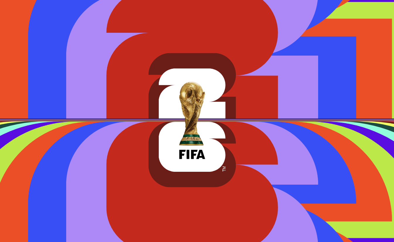
In this tutorial you'll build a CSS-only World Cup 2026 logo animation made of
two stacked digit groups — a "2" built from 21 layered spans and a "6" built from 26 — where
every layer pulses outward and back in a continuous, staggered ripple. There is no JavaScript
counting siblings, no preprocessor generating dozens of nth-child rules, and no SVG
file defining the numeral shapes.
Instead, the entire effect runs on four CSS features that only recently became practical to use
together: @property to register a genuinely animatable custom number, the new
sibling-index() and sibling-count() tree-counting functions to give
every layer awareness of its own position in the stack, the clip-path: shape()
function to draw each numeral's outline with arcs and lines, and container query units to size a
trademark mark relative to its own box instead of the viewport.
The result reads as a deep, almost 3D cascade of color and depth — but it's two HTML elements,
47 empty span tags, and one overlay image. This is a great reference for anyone
who wants to see what "next-generation CSS" looks like in a real, finished component rather than
a spec example.
clip-path, and who want a guided,
practical introduction to the very newest CSS tree-counting functions and the shape()
clip-path syntax — all explained from the ground up, so no prior experience with either is
required to follow along.
Key Features of This Animated Logo
z-index, scale, and
animation-delay are computed from its own position among its siblings — no
manual nth-child chains.
--scale custom property is registered as a typed
<number> with @property, making it smoothly animatable
inside @keyframes for the first time.
clip-path: shape() arc and line commands — no image, font, or SVG path data
required.
:nth-child(10n + x) palette cycles through
ten brand colors across the stacked spans, producing the rainbow depth effect.container-type: size and
cqb units so it scales relative to its own span, not the viewport.
grid-row: 1; grid-column: 1 so every
layer overlaps perfectly, with depth ordering handled purely through computed
z-index.
--char-size: 20vmin custom property drives
every dimension in the logo, so it scales proportionally on any screen with zero media
queries.Full Source Code (Free)
The project is split across two files: index.html for the two stacked digit groups
and the logo overlay image, and style.css for every layer, color, shape, and
animation rule. There is no build step and no dependency — open the HTML file directly in a
Chromium-based browser to see the full effect. Use the tabs below to browse each file.
🔓 Full Source Code unlocks in
Hosted on GitHub Gist — free, no sign-up required
index.html and style.css into the
same folder and open index.html in Chrome or Edge for the full staggered ripple
effect. Other browsers will still render the logo, just with a flatter, less staggered stacking
until sibling-index() support lands.
Project Structure & Assets
Unlike many animated CSS projects, this build doesn't rely on a folder of PNGs to create its visual shapes — both numerals are computed entirely in CSS. Only a single external asset is used, and the rest of the "assets" are really just structural HTML elements doing the work that images would normally do.
Contains the .logo wrapper with two child groups,
.num-two (21 empty spans) and .num-six (26 empty spans), plus a
single overlay <img> tag for the final brand mark. No data attributes,
no inline styles, no scripts.
Every visual result — the numeral outlines, the stacking depth, the
color cascade, the pulsing animation, and the trademark sizing — is generated from this
single stylesheet using @property, sibling-index(),
sibling-count(), and clip-path: shape().
One transparent-background image, centered with
position: absolute; top: 50%; left: 50%; transform: translate(-50%, -50%) and
stacked above everything else with z-index: 99, providing the finished
wordmark on top of the CSS-drawn numerals beneath it.
Suggested Alt: "World Cup 2026 logo overlay centered above animated CSS stacked numerals"
How It Works — Step by Step
Here's a breakdown of the eight core techniques behind this animated logo, from the base markup structure down to the container-query-sized trademark mark.
Two Grid-Stacked Digit Groups in HTML
The markup is just a .logo wrapper containing .num-two and
.num-six, each filled with a run of empty <span>
elements (21 and 26 of them respectively). Each group is its own CSS Grid container,
with .num-two aligned to the bottom row of the logo grid and
.num-six aligned to the top, stacking "2" above "6" without any extra
markup for layout.
Registering --scale with @property
@property --scale declares syntax: '<number>',
inherits: true, and initial-value: .8. Without this
registration, --scale would just be an opaque string token to the
browser, and animating it in @keyframes would jump instantly between
values instead of interpolating smoothly. Registering it as a real
<number> type is what unlocks the smooth pulsing animation later.
Stacking Every Span on the Same Grid Cell
Every span inside .num is placed at
grid-row: 1; grid-column: 1, so all 21 or 26 layers overlap exactly on
top of one another instead of flowing into separate cells. Depth ordering then comes
from z-index: calc(sibling-count() - sibling-index()) — the first span
gets the highest z-index and sits on top, with each subsequent sibling
sliding one layer further back automatically.
Drawing the Numerals with clip-path: shape()
Each span's ::before pseudo-element is a full-size colored block clipped
into the outline of a flat "2" or "6" using clip-path: shape(). The
shape() function reads like an SVG path but is written in native CSS
with from, line to, and arc to commands and
CSS length units — for example, the "2" path starts at 0 var(--r), arcs
up into the rounded top, runs a straight top edge, and arcs back down into the tail.
Scale and Delay from sibling-index()
Every span except the first gets
scale: calc((sibling-index() - 1) * var(--scale)), so the deeper a layer
sits in the stack, the larger its resting scale becomes. The same span also gets
animation: scaleIt var(--speed) calc(sibling-index() * -100ms) ease-in-out
                                infinite
— that negative delay, also computed from
sibling-index(), is what makes each layer enter its pulse loop at a
different point in time instead of all 47 layers moving in lockstep.
Animating --scale Through Keyframes
@keyframes scaleIt changes --scale to 2 at 20%,
.6 at 40%, and 1.4 at 70% of the loop. Because
--scale is registered as an animatable number and every span's
scale formula references it, the same keyframes rule produces a
continuous ripple that cascades visibly through the stack — purely because each layer
started its loop on a different negative delay.
Cycling Colors with nth-child Modulo Selectors
.num span:nth-child(10n + 1) through 10n + 10 assign ten
distinct brand colors that repeat every ten layers, while
.num span:nth-child(1) is forced to white so the topmost, frontmost layer
always reads cleanly. Combined with the depth-based scale from step 5, this produces
the rainbow "depth cascade" visible behind the logo overlay.
Container Query Units for the Trademark Mark
The first span in .num-six gets container-type: size,
turning it into a sizing context for its own content. Its ::after
pseudo-element then adds content: 'TM' sized in 8cqb
(container query block) units, rotated -90deg around its bottom-left
corner, and trimmed tightly with text-box: trim-both cap alphabetic so the
glyph sits flush against its container with no stray leading space above or below it.
sibling-index() and
sibling-count() are part of the CSS Values and Units Module Level 5 draft and are not
yet Baseline. Always test the actual ripple/stagger behavior in your target browsers before
shipping this to production, and wrap the relevant rules in @supports
(z-index: sibling-index()) if you need a defined fallback for browsers that don't
understand the functions yet.
Customization Ideas
Almost every visual decision in this logo is controlled by a small number of custom properties and selectors, which makes it easy to retarget for a different brand, year, or two-character mark.
- Resize the whole logo — Change
--char-sizein the:rootblock. Every dimension in the project, including--rand--gap, is derived from this one value usingcalc(), so the entire composition scales proportionally. - Change the pulse speed — Adjust
--speed(default10s) to make the ripple ride faster for a punchier effect or slower for a calmer, more ambient one. - Swap the color palette — Update the ten
nth-child(10n + x)color rules to any palette you like. Because the colors cycle by stack position rather than fixed index, the cascade pattern stays consistent no matter how many layers you add. - Add or remove stacked layers — Add or delete
<span>elements inside.num-twoor.num-six. Because depth, scale, and timing are all computed fromsibling-index()andsibling-count(), no CSS rule needs to change — the stack simply gets deeper or shallower automatically. - Draw a different numeral — Replace the
clip-path: shape()coordinates in.num-two span:beforeor.num-six span:beforewith a new outline. Any digit, letter, or simple glyph can be described the same way usingline toandarc tocommands. - Adjust the ripple curve — Edit the percentages and
--scalevalues inside@keyframes scaleItto make the pulse sharper, gentler, or multi-peaked. - Replace or remove the overlay image — Swap the
imgsource for any other transparent PNG or SVG, or delete the tag entirely to show only the raw CSS-drawn numeral stack. - Remove the trademark mark — Delete the
.num-six span:first-child::afterrule if you don't need the "TM" glyph, or replace itscontentwith different generated text sized the same way using container query units.
--char-size and every
stacking calculation flows from sibling-index()/sibling-count(), this
logo can be dropped into a hero section, a loading screen, or a footer mark at any size without
rewriting a single selector.
Browser Compatibility
This project deliberately leans on some of the newest functions in the CSS specification, so support is uneven across engines in a way that's worth understanding before you ship it. Here's where each feature stands as of mid-2026.
| Browser | @property & shape() | Container Query Units | sibling-index() / sibling-count() | text-box-trim |
|---|---|---|---|---|
| Chrome / Edge | Yes | Yes | Yes | Yes |
| Safari (macOS & iOS) | Yes | Yes | In development | Yes |
| Firefox | Yes | Yes | In development | No |
| Samsung Internet | Yes | Yes | Yes | Yes |
@property,
shape(), and container query units are Baseline-level stable across all major
engines, so the numeral outlines and trademark sizing render correctly everywhere. Where
sibling-index() or sibling-count() isn't recognized, the browser falls
back to the property's initial value — the stack still appears, just without the per-layer
scale and delay staggering, so the ripple looks flatter and more uniform instead of failing
outright.
Performance & Responsiveness
Despite having 47 separately animated layers, this logo stays light because the browser is doing work it would already be doing anyway — it's simply exposing tree position data and compositing a typed custom property, rather than running any external layout or measurement code.
- No JavaScript measurement cost: Because
sibling-index()andsibling-count()are resolved natively during the CSS cascade, there's noResizeObserver, no DOM query loop, and no inline style injection — the computation happens before layout and paint, not in response to them. - Single composited property: Every layer's motion is driven by one registered
custom property,
--scale, feeding intoscale(). The browser only needs to track one animated value type across the whole stack rather than 47 independent animations. - clip-path is computed once: The
shape()outlines on each::beforeare static — they're never animated — so the cost of drawing the numeral geometry is paid once per layer, not on every animation frame. - Scoped container queries:
container-type: sizeis applied only to the single span that needs it for the trademark mark, keeping the container query's recalculation scope as small as possible instead of containing the whole logo. - vmin-based full responsiveness: The single
--char-size: 20vminvariable means the entire 47-layer composition reflows correctly at any viewport size with zero media queries — from a small phone screen to an ultrawide monitor.
sibling-index() and sibling-count(), not just
the convenience of shorter code.
Frequently Asked Questions
What are sibling-index() and sibling-count() in CSS, and how are they used in this logo?
sibling-index() returns an element's 1-based position among its siblings, and
sibling-count() returns the total number of siblings. In this project they
replace manual nth-child math: z-index is computed as
sibling-count() - sibling-index(), and each span's scale and
animation-delay are derived directly from sibling-index(), so
adding or removing stacked layers never requires rewriting any rules.
How does @property make the --scale animation work?
@keyframes. The
@property rule registers --scale with
syntax: '<number>', inherits: true, and an
initial-value, which tells the browser it's a real animatable number. That
registration is what allows the scaleIt keyframes to produce a smooth
pulsing motion instead of an instant jump.
What does the CSS shape() function do, and why draw the numerals instead of using an image?
clip-path: shape() lets you describe a custom outline directly in CSS using
commands like arc to and line to, similar to an SVG path but
written with native CSS units. Drawing the "2" and "6" outlines with shape()
means no PNG or SVG asset is needed for the digits themselves, the shape stays crisp at
any size, and it can be restyled per layer using only CSS.
Will this animated logo work in all browsers right now?
@property, the
shape() function, and container query units are well supported across
current Chrome, Edge, Firefox, and Safari. sibling-index() and
sibling-count() currently run natively in Chromium browsers, with Firefox and
Safari support still rolling out, so the stacking math falls back to a flatter,
non-staggered layout in browsers that don't yet recognize those functions.
Can I reuse this technique to animate other numbers or text?
sibling-index() and sibling-count() to compute depth, scale,
and timing automatically. Swap the shape() coordinates for a different digit
or letter outline, adjust --char-size and the color list, and the same
staggering logic applies to a completely different glyph.
Why does the logo use container query units (cqb) for the "TM" mark?
container-type: size, which turns
it into its own sizing context. The generated "TM" content is then sized in
cqb (container query block) units, so its font size always scales relative to
that one span's own dimensions rather than the viewport, keeping the trademark mark
proportionally correct no matter how --char-size changes.
Does this project use any JavaScript at all?
Conclusion
This CSS World Cup 2026 logo animation is a showcase of how far pure CSS has come. @property turns a custom property into a real animatable type, sibling-index() and sibling-count() give every layer self-awareness about its position in a stack, clip-path: shape() draws complex outlines without a single image file, and container query units size generated content relative to its own box instead of the viewport. Combined, they replace what used to require JavaScript loops, manually-numbered selectors, and SVG path data — with four CSS rules.
The staggering pattern here generalizes well beyond logos: any deck of stacked cards, a list of
repeating decorative shapes, a loading spinner made of layered rings, or a typographic flourish
can use the same sibling-index()/sibling-count() approach to stagger
itself automatically, with no element count hardcoded anywhere in the stylesheet.
Want to keep exploring modern CSS-only animation? Check out the Magic Animated Motion Button for a hover-driven reveal built from absolute positioning and transforms, or the Animated Button with Star Effects for a different take on layered, particle-style CSS motion.
Found this useful? Explore more HTML CSS projects in the sidebar or browse all projects in the collection.