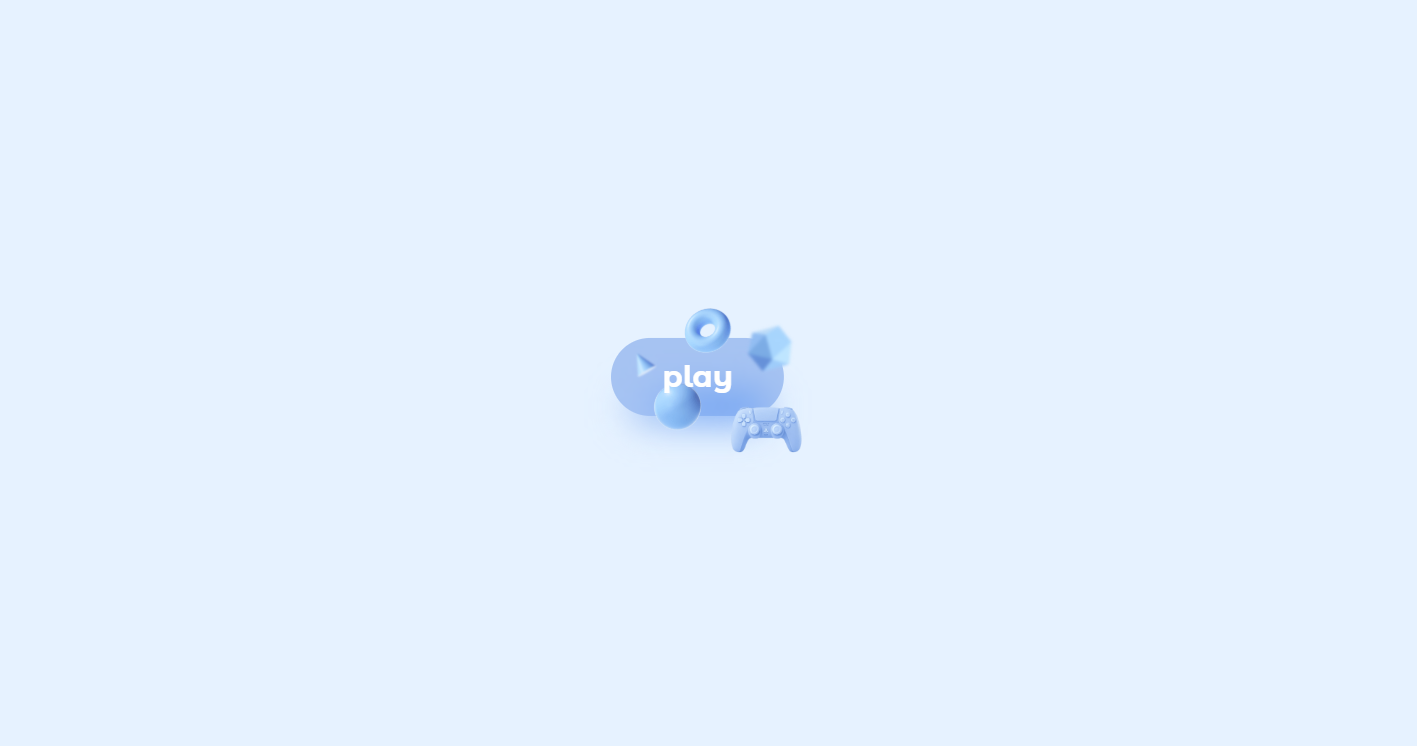
What You'll Build
In this tutorial you'll create a magic animated motion button that uses nothing but HTML and CSS. At rest it looks like a simple, elegant pill-shaped link with a single word label. The moment you hover over it, the button scales up and five floating 3D geometric objects — a cone, a torus, an icosahedron, a sphere, and a control pad icon — materialize around it from hidden positions, each traveling to a unique final orbit with smooth transitions and individual rotation angles.
Beneath the button, a blurred gradient glow shadow fades in at the same moment,
making the entire element appear to lift off the page. Two of the shapes also carry a subtle
filter: blur() value, creating a convincing depth-of-field effect where some objects
look closer and others feel slightly out of focus in the background.
This is a polished example of how CSS transforms, transitions, opacity, and filter effects can be layered together without a single line of JavaScript to produce a visually rich, interactive UI component.
Key Features of This Animated Motion Button
border-radius: 3rem creates the classic pill shape
that scales up to 1.3× on hover for a satisfying pop.transform: translate() rotate().::after pseudo-element with a blurred
linear-gradient and filter: blur(12px) creates a soft halo
beneath the button on hover.
filter: blur()
value, making them appear on a different depth plane from the sharp foreground shapes.pointer-events: none on all images ensures the floating
shapes never intercept mouse events — hover always registers on the button itself.:hover pseudo-class and transitions.transform,
opacity — runs on the GPU compositing layer, delivering silky-smooth
60 fps transitions on any device.
Full Source Code (Free)
The project is split across two files: index.html for the markup and
styles.css for all the animation logic. The HTML is a single anchor tag containing the
text label and five image assets. All motion, hover effects, and glow are handled entirely in CSS.
Use the tabs below to browse each file.
🔓 Full Source Code unlocks in
Hosted on GitHub Gist — free, no sign-up required
index.html and styles.css into the
same folder alongside the img/ folder containing all five shape PNG files. Open in any
modern browser and hover the button to see the magic.
Project Assets & Images
This project relies on five PNG image files stored in an img/ folder. Each one
represents a distinct 3D geometric object rendered against a transparent background, allowing them
to float freely over the button without visible boundaries. Together they form the animated
constellation that orbits the label on hover.
A rendered 3D cone shape. Positioned to the upper-left of the button and
rotated 55° in its resting state. On hover it shifts further left and upward while scaling
up slightly. A filter: blur(0.5px) pushes it visually into the background.
Suggested Alt: "Floating 3D cone shape orbiting an animated CSS button"
A rendered 3D donut/ring (torus) shape. The largest of the floating objects at 38px wide. It sits above the button label and travels upward on hover, acting as a visual crown for the animation. Remains fully sharp — no blur applied.
Suggested Alt: "3D torus ring floating above animated CSS motion button"
A 3D twenty-faced polygon. Positioned to the right side of the button with
a filter: blur(0.9px) — the most out-of-focus shape, implying it sits furthest
in the background. Moves to the upper-right on hover.
Suggested Alt: "Blurred 3D icosahedron shape in CSS button hover animation"
A 3D sphere rendered at 30px. Placed below the button in its resting state and drops further down on hover while remaining crisp and in-focus, providing a strong visual anchor at the bottom of the effect.
Suggested Alt: "3D sphere floating below animated CSS hover button"
The largest asset at 90px — a rendered 3D game controller or control pad icon. It anchors to the lower-right of the button and stays in that zone on hover, scaling up in place. Its large size adds visual weight and balances the lighter geometric shapes.
Suggested Alt: "3D control pad icon in animated magic CSS button effect"
How It Works — Step by Step
Here's a breakdown of the eight core techniques behind this magic animated motion button, from the base markup structure down to the depth-of-field blur layering.
Anchor Tag as the Button Container
The button is an <a> tag with class="button" and
position: relative. This establishes the positioning context for all five
absolutely positioned shape images inside it, so each one's inset: 0 and
margin: auto starts them centered inside the button before the hover
transforms move them outward.
Pill Shape, Color, and Base Transition
The button gets background-color: var(--first-color) — a soft blue-grey
hsl value — with border-radius: 3rem for the pill shape and
padding: .9rem 2.20rem for comfortable proportions. A single
transition: .4s applies to all properties, so the scale and any color
changes animate smoothly on hover.
The Glow Shadow with ::after
A ::after pseudo-element sits behind the button at
z-index: -1. It's sized to 80% of the button's width and 40% of its
height, positioned just below via bottom: -4px, and carries a blurred
linear-gradient using filter: blur(12px). By default its
opacity is 0; on hover it transitions to 1,
making the glow appear to emanate from beneath the lifting button.
Hiding the Shapes with Opacity and Pointer Events
All img elements inside .button share the rules:
position: absolute; inset: 0; margin: auto; pointer-events: none; opacity: 0;
                                transition: .6s
. The pointer-events: none is critical — it ensures
that even when shapes are visible on hover, mouse events pass through them to the parent
anchor, keeping the :hover state active.
Pre-Positioning Each Shape at Rest
Each shape class gets an individual transform: translate() rotate() rule
that defines its hidden starting position. For example, the cone starts at
translate(-25px, -6px) rotate(55deg) and the control starts at
translate(60px, 30px) rotate(10deg). These resting positions are the
same on hover — which means the animation is the reveal traveling from opacity
0 to 1 plus a simultaneous scale change.
Scaling the Button on Hover
.button:hover applies transform: scale(1.3). Because the
images are children positioned relative to the button, they scale with it — so the
entire constellation of shapes expands outward naturally when the button grows, without
needing separate scale rules on each image.
Revealing and Moving Shapes on Hover
.button:hover img sets opacity: 1 to make all shapes visible.
Then each individual class gets an updated transform value on hover — for
example, the torus moves from translate(7px, -14px) to
translate(7px, -32px) scale(1.1), traveling upward and slightly enlarging.
The .6s transition on the base image rule ensures this travel animates
smoothly.
Depth of Field via CSS Filter Blur
The cone receives filter: blur(0.5px) at its base state and the
icosahedron gets filter: blur(0.9px). These values persist on hover.
Because the torus, sphere, and control are unblurred, the eye reads the blurred shapes
as being further away, creating a layered 3D scene from what is actually a flat 2D
element.
.button__text span uses
position: relative; z-index: 10 to stay above the images. If you add more children to
the button, make sure they don't accidentally create a new stacking context that pushes the label
behind the shape images.
Customization Ideas
The motion button is structured so that virtually every visual decision is easy to override. Here are practical ways to make it your own.
- Change the color theme — Update
--first-colorin the:rootblock and adjust the hsl values inside the::aftergradient to match. A warm amber, neon green, or deep purple all work beautifully with the 3D shape aesthetic. - Replace the shape images — Swap any of the five PNGs for your own
transparent PNG or SVG assets. Emojis rendered as images, product icons, or mascots all
work. Adjust each class's
widthandtransformvalues to match your new asset sizes. - Adjust travel distance — Increase the
translate()values on each shape's hover state to make objects fly further from the button for a more explosive effect, or reduce them for a subtler float. - Change the button label — The span contains a single word "play". Replace it with any call-to-action text. Keep it short — one or two words — so the pill proportions remain visually balanced.
- Add more shapes — The pattern is infinitely extensible. Add more
imgtags inside.buttonwith new classes, set their restingtransformpositions, and define where they travel on:hover. - Increase the blur intensity — Raise
filter: blur(12px)on the::afterglow for a softer, dreamier halo, or lower it for a tighter, crisper shadow. - Make it a real button element — Swap the
<a>tag for a<button>element and add aclickevent listener to trigger any action. All the CSS classes remain identical.
Browser Compatibility
Every CSS property used in this project — transform, transition,
opacity, filter, CSS custom properties, and
position: absolute
— has been universally supported across all modern browsers for several years.
| Browser | CSS Transforms & Transitions | CSS Filter (blur) | Overall Support |
|---|---|---|---|
| Chrome / Edge | Yes | Yes | Full |
| Firefox | Yes | Yes | Full |
| Safari (macOS & iOS) | Yes | Yes | Full |
| Samsung Internet | Yes | Yes | Full |
| Internet Explorer 11 | Partial | No | Limited |
filter: blur() is not supported in Internet Explorer 11,
which
means the depth-of-field blur on the cone and icosahedron will simply not render — the shapes will
still appear and animate, just without the blur. IE11 is effectively retired and not a practical
target for projects in 2026.
Performance & Responsiveness
Despite the dramatic visual effect, this button has an extremely small performance footprint because every animation property is handled by the browser's GPU compositing layer.
- GPU-friendly properties:
transformandopacitydrive every shape's motion and reveal. These are composited on the GPU without triggering layout recalculation or repaint cycles, keeping the animation consistently smooth even on mobile hardware. - Zero JavaScript overhead: With no event listeners, no DOM manipulation, and no animation libraries, the scripting cost of this component is literally zero.
- Optimized image loading: The five PNG assets are small, transparent-background files. Once they're downloaded (typically on first page load) they're cached and don't affect subsequent hover performance.
- Touch-screen behavior: On touch devices, the
:hoverstate typically fires on tap-and-hold or on a tap that navigates the link. For a touch-optimized experience consider pairing this with a:focus-visibleor JavaScript-driven class toggle to control the reveal on tap. - Viewport centering: The body uses
display: grid; place-items: center;
                        height: 100vh
to center the button perfectly in any viewport, from mobile to ultrawide desktop. No media queries are required for the core button layout.
transform and opacity instead
of layout-triggering properties like width, top, or left
is the single most impactful habit for building smooth CSS animations. This project is a clean
example of that principle applied across five simultaneous animated elements.
Frequently Asked Questions
How do I make images appear around a button on hover using CSS?
position: absolute; inset: 0;
                            margin: auto
and set opacity: 0 plus a transition on the
base state. On .button:hover img, set opacity: 1 and update each
image's transform value to move it to its final position. The transition
handles the smooth travel between states automatically.
What is the CSS technique used to create the glowing shadow below the button?
::after pseudo-element with z-index: -1 sits behind the button.
It has a linear-gradient background matching the button's color and a
filter: blur(12px) that spreads it into a soft halo. Its opacity
starts at 0 and transitions to 1 on :hover,
making the glow appear to emanate from beneath the button as it scales up.
How does the depth-of-field (blur) effect work on the 3D shapes?
filter: blur() is applied directly on specific shape images — the cone gets
blur(0.5px) and the icosahedron gets blur(0.9px). Because the
torus, sphere, and control remain unblurred, the human eye reads the blurred shapes as
being on a different depth plane, creating a convincing 3D layering effect from a
completely flat 2D element.
Why is pointer-events: none used on the images inside the button?
pointer-events: none, hovering over a shape image would count as leaving the
button, causing the :hover state to toggle on and off rapidly as the cursor
moves across visible shapes. Setting it on every image ensures the parent anchor always
receives all mouse events.
Can I replace the 3D shape images with my own custom images or icons?
.button__cone,
.button__torus, etc.) with its own width and
transform values. Swap the src attribute to any transparent PNG
or SVG, then update that class's width and the translate() values
in both the resting and hover states to match your new asset's dimensions and desired orbit.
How do I change the button's color theme?
--first-color in the
:root block (default: hsl(217, 75%, 80%)). Update this value to
any color. The ::after glow gradient also references similar hsl values inline
— update both gradient color stops to match your new --first-color for a
cohesive result.
Is this animated button accessible for keyboard users?
<a> tag, it receives keyboard focus naturally
when tabbing. The :hover state does not automatically apply to focused
elements in all browsers. For full keyboard accessibility, duplicate the hover rules under a
:focus-visible selector so that tabbing to the button also reveals the
floating shapes for sighted keyboard users.
Does this animated button work without JavaScript?
:hover
pseudo-class selectors combined with transition, transform, and
opacity rules. This makes it extremely lightweight and embeddable in any
project or framework without adding scripting dependencies.
Conclusion
This magic animated motion button is a great demonstration of how much personality pure CSS can inject into a single UI element. By combining absolute positioning, opacity transitions, transform-based movement, filter blur for depth, and a blurred pseudo-element glow, you get a production-ready button that feels genuinely magical — and the JavaScript line count stays at zero.
The techniques here transfer directly to other components: any element can have decorative
children that appear on :hover using this same pattern of absolute positioning plus
opacity and transform toggling. Product cards, navigation links, and call-to-action sections all
benefit from this kind of layered hover choreography.
Want to keep exploring animated buttons and CSS micro-interactions? Check out the Animated Floating Action Button Menu for a FAB that expands into a full action list, or the Animated Button with Star Effects for particle-style CSS button animations.
Found this useful? Explore more HTML CSS projects in the sidebar or browse all projects in the collection.