What Is an Interactive Download Button?
An interactive download button is a UI component that responds visually when clicked, transforming from a "Download" state to an "Open" state with coordinated animations. Unlike a simple hover effect, this button uses a hidden checkbox to detect clicks and trigger multiple CSS animations simultaneously — a pulsing circle, a rotating icon, and fading text transitions.
The technique is built entirely with HTML and CSS using the checkbox hack: a hidden
<input type="checkbox"> paired with a <label>. When the label
is clicked, the checkbox becomes :checked, and CSS sibling selectors apply new styles
and
keyframe animations to child elements.
Why Use This Button Design?
- Clear Visual Feedback: Users see an immediate, multi-layered animation that confirms their click was registered — far more engaging than a simple color change.
- Modern UI Pattern: State-changing buttons (Download → Open, Install → Launch) are used by major platforms like Google Play, App Store, and desktop app stores.
- No JavaScript for Animations: All visual effects are CSS keyframes — no scripts, no libraries, no render-blocking overhead.
- Customizable: Change colors, icon, text labels, timing, and animation types to match any design system.
- Lightweight: The entire effect uses minimal HTML and CSS — tiny file size with maximum visual impact.
Key Features
How It Works — Step by Step
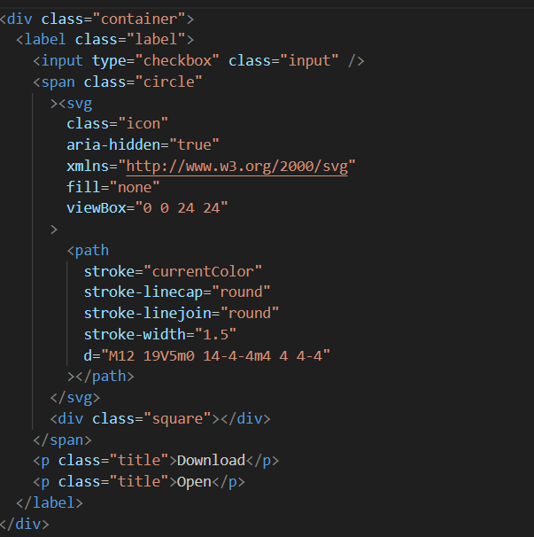
Create the HTML Structure with Checkbox
Use a <label> element wrapping a hidden
<input type="checkbox">, a circle <div> for the
icon area, and two text <span> elements for "Download" and "Open"
labels.
The label makes the entire button clickable.
Style the Button Container and Hide Checkbox
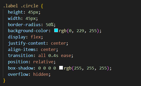
Set fixed dimensions, rounded corners, and borders on the label. Hide the checkbox with
position: absolute; opacity: 0 (not display: none — it must
remain
functional). Style the circle, icon, and text with default-state positioning and colors.
Add Keyframe Animations for All Effects
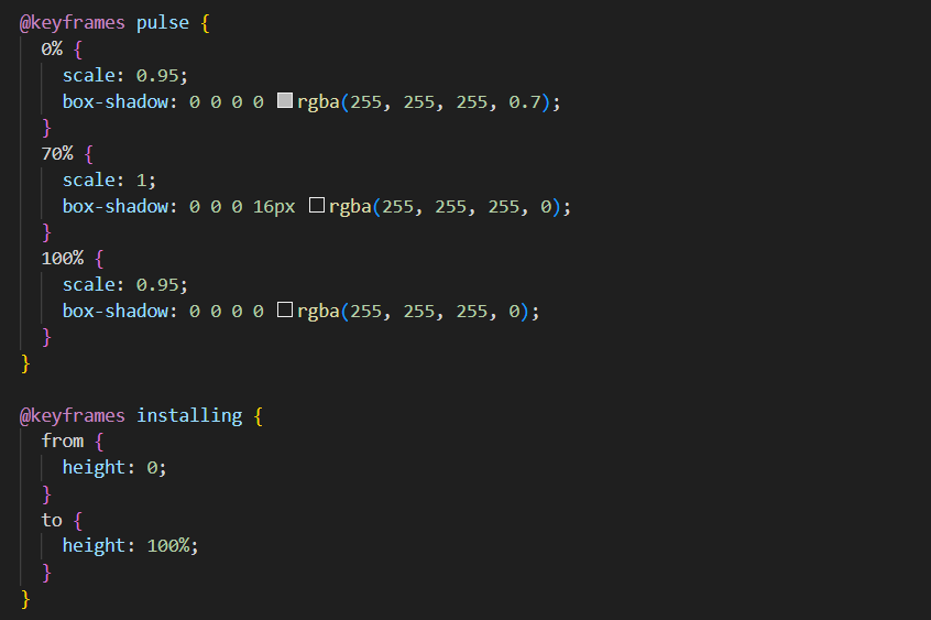
Create @keyframes pulse for scale/opacity, @keyframes rotate
for the
icon spin, and transition rules for text fade. Apply them using the
input:checked ~ label selector so they fire when the checkbox is toggled.
Preview the Final Interactive Button
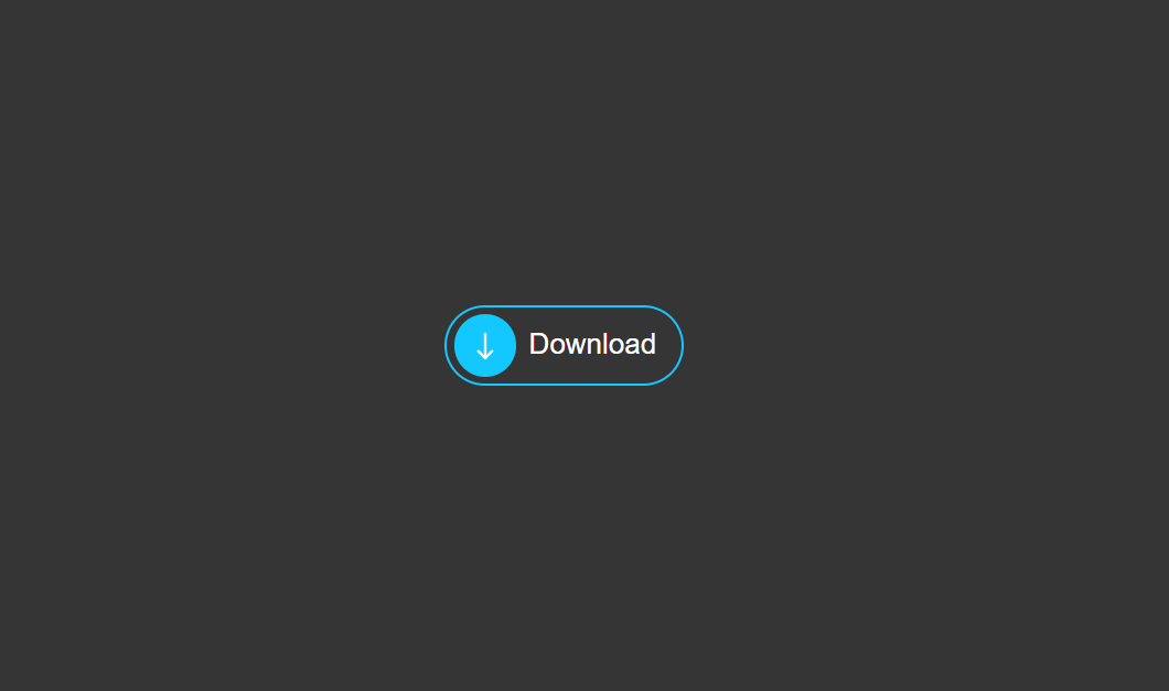
When clicked, the button fires a sequenced animation: the circle pulses, the arrow icon rotates and fades, "Download" fades out, and "Open" fades in. The entire state change is permanent until the page is refreshed — all without any JavaScript.
~ (general sibling combinator) lets you select siblings that come after the
checkbox. This is why the <input> must be placed before the
<label> in the HTML source order.
opacity: 0; position: absolute — never display: none, which removes
it from the accessibility tree. Add aria-label to the label and test with keyboard
navigation (Tab + Space/Enter).
Best Practices & Common Mistakes
- Keep button text short and clear — "Download" / "Open" is instantly understood
- Use
opacity: 0to hide the checkbox — keeps it accessible - Stagger animation delays for a sequenced feel — pulse → rotate → text
- Maintain high contrast between text/icon and background in both states
- Add
:focus-visiblestyles for keyboard users - Test on mobile — touch targets should be at least 44×44px
- Use
display: noneon the checkbox — breaks accessibility and keyboard support - Overcomplicate with too many simultaneous animations — causes visual chaos
- Use confusing text labels like "Click Here" or "Submit" — be specific about the action
- Forget
cursor: pointeron the label — users won't know it's clickable - Set animation durations above 2 seconds — feels unresponsive
- Ignore the
:checkedstate — button won't change visually on click
Frequently Asked Questions
How does the button work without JavaScript?
<input type="checkbox"> is placed
before a <label>. When the label is clicked, the checkbox toggles to
:checked. CSS selectors like input:checked ~ label .element then
trigger style changes and keyframe animations without any JavaScript.
What is the CSS checkbox hack?
:checked
pseudo-class to toggle CSS styles. By pairing the checkbox with a
<label>,
clicking the label checks the checkbox, and CSS sibling selectors (~) apply new
styles to sibling elements — enabling interactive toggles without JavaScript.
How do I change the button text from Download to something else?
Can I make the button reset back to Download after the animation?
animation-delay and a second click. For a permanent
state
change (Download becomes Open), the checkbox hack works perfectly as-is.
How do I change the pulse color and glow effect?
@keyframes pulse rule and the box-shadow or
background-color values within it. Replace the color with your theme's accent
color. Also update any box-shadow values on the button container. Using CSS
custom properties makes this easier to maintain.
Is the checkbox hack accessible for screen readers?
clip: rect(0,0,0,0) or opacity:0 with
position:absolute
instead of display:none, so it remains in the accessibility tree. Add
aria-label to the label element and ensure keyboard users can focus and toggle
the checkbox with Space or Enter.
Conclusion
The interactive download button showcases how creative CSS can replace JavaScript for common UI interactions. By combining the checkbox hack, keyframe animations, and staggered timing, you get a multi-stage button transformation that feels polished and professional — with zero JavaScript.
Use this pattern for download buttons, install buttons, save buttons, or any action where the state changes after the first click. Adjust the colors, icons, and animation timing to match your brand — and ship a delightful micro-interaction in minutes.
Found this useful? Explore the related projects in the sidebar for more modern UI components built with pure HTML and CSS.