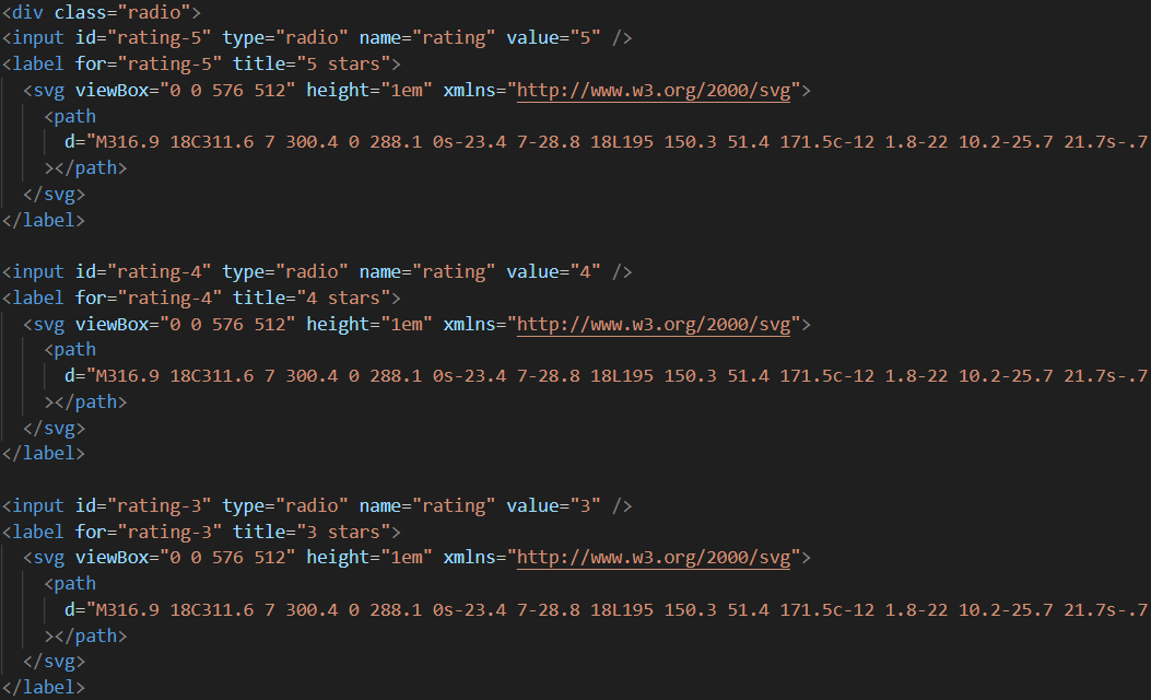
What Is a Star Rating System?
A star rating system allows users to evaluate content, products, or services by selecting a score — usually from 1 to 5 stars. Instead of plain radio buttons, the interface is transformed into an intuitive row of clickable SVG stars that highlight on hover and lock in color on selection.
The technique works by pairing hidden <input type="radio"> elements with visible
<label> elements containing SVG star icons. The CSS :checked pseudo-class and
the general sibling combinator (~) do the rest — no JavaScript needed.
Why Use a Star Rating System?
How It Works — Step by Step
HTML Structure — Radio Inputs & SVG Labels
Create five <input type="radio"> elements with a shared name attribute.
Each is followed by a <label> containing an inline SVG star. The label's
for attribute links it to its input, making the entire star area clickable.
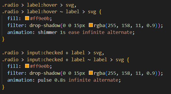
CSS — Hover & Checked State Styling
Hide the inputs with opacity: 0; position: absolute. Style the SVG labels with a default
grey fill. Use input:checked ~ label (general sibling combinator) to fill all stars before
and including the selected one with the accent color. Add transition for smooth hover
effects.
Final Result — Interactive Star Rating
The finished system shows five stars that highlight on hover and lock to a filled state on click. The radio input stores the selected value, ready for form submission. The design works on all modern browsers and touch devices.

flex-direction: row-reverse. This makes the input:checked ~ label
sibling selector fill all stars to the left of the selected one correctly.display: none to hide radio
inputs — it removes them from the accessibility tree and breaks keyboard navigation. Always use
opacity: 0; position: absolute; instead.
Best Practices & Common Mistakes
- Use real
<input type="radio">elements for accessibility - Use SVG icons so stars scale perfectly on all displays
- Hide inputs with
opacity: 0; position: absolute - Add a
transitionon fill color for smooth hover feedback - Require selection before form submission with
required
- Use
display: none— breaks keyboard and screen reader access - Use PNG/JPG star images — they blur on high-DPI screens
- Forget hover states — makes the system feel static and unresponsive
- Use the wrong sibling selector order — stars will highlight in reverse
- Skip testing on mobile touch devices
Frequently Asked Questions
Can I build a star rating without JavaScript?
:checked pseudo-class and
the general sibling combinator (~) handle both hover highlighting and permanent selection
entirely in CSS.Why use SVG instead of emoji stars or PNG images?
fill and stroke, making color changes instant
with a single variable edit. Emoji and PNG stars are blurry at large sizes.How do I read the selected rating value in a form?
<input type="radio"> elements, the
selected value is submitted automatically with the form. Give each input a value attribute
(e.g., value="3") and a shared name attribute, and the rating is included in the
form data on submission.How do I change the star color?
fill property in the CSS for the
:checked ~ label svg rule and update it to any color value. Store it in a CSS variable for
easy site-wide theming.
Which browsers support this technique?
:checked pseudo-class and general sibling combinator. The technique works without any
polyfills.
Conclusion
A star rating system built with HTML and CSS demonstrates how powerful native browser
features have become. By combining radio inputs, SVG icons, the
:checked pseudo-class, and the sibling combinator, you get a fully interactive, accessible rating
widget with zero JavaScript and zero dependencies.
Use it in review forms, product pages, feedback widgets, or any interface where user scoring adds value. Adjust the star count, color, and size — and ship it in minutes.
Found this useful? Explore the related projects in the sidebar for more modern UI components.