What Is a Neon Card Animation?
A neon card animation is a UI component featuring glowing animated edges, electric light trails, and soft luminescent borders. Popularized by cyberpunk UI design, these effects are now widely used across tech portfolios, SaaS landing pages, gaming sites, and futuristic web interfaces.
Unlike heavy canvas-based animations, this tutorial creates the electric glow entirely through SVG filter primitives and CSS animations — keeping the effect lightweight, accessible, and easy to customize.
Why Use Neon Glow Effects in Web Design?
How the Electric Neon Effect Works — Step by Step
The magic behind this animation is the combination of two SVG filter primitives:
feTurbulence and feDisplacementMap. Here's how each
step builds the final result.
HTML Card Structure
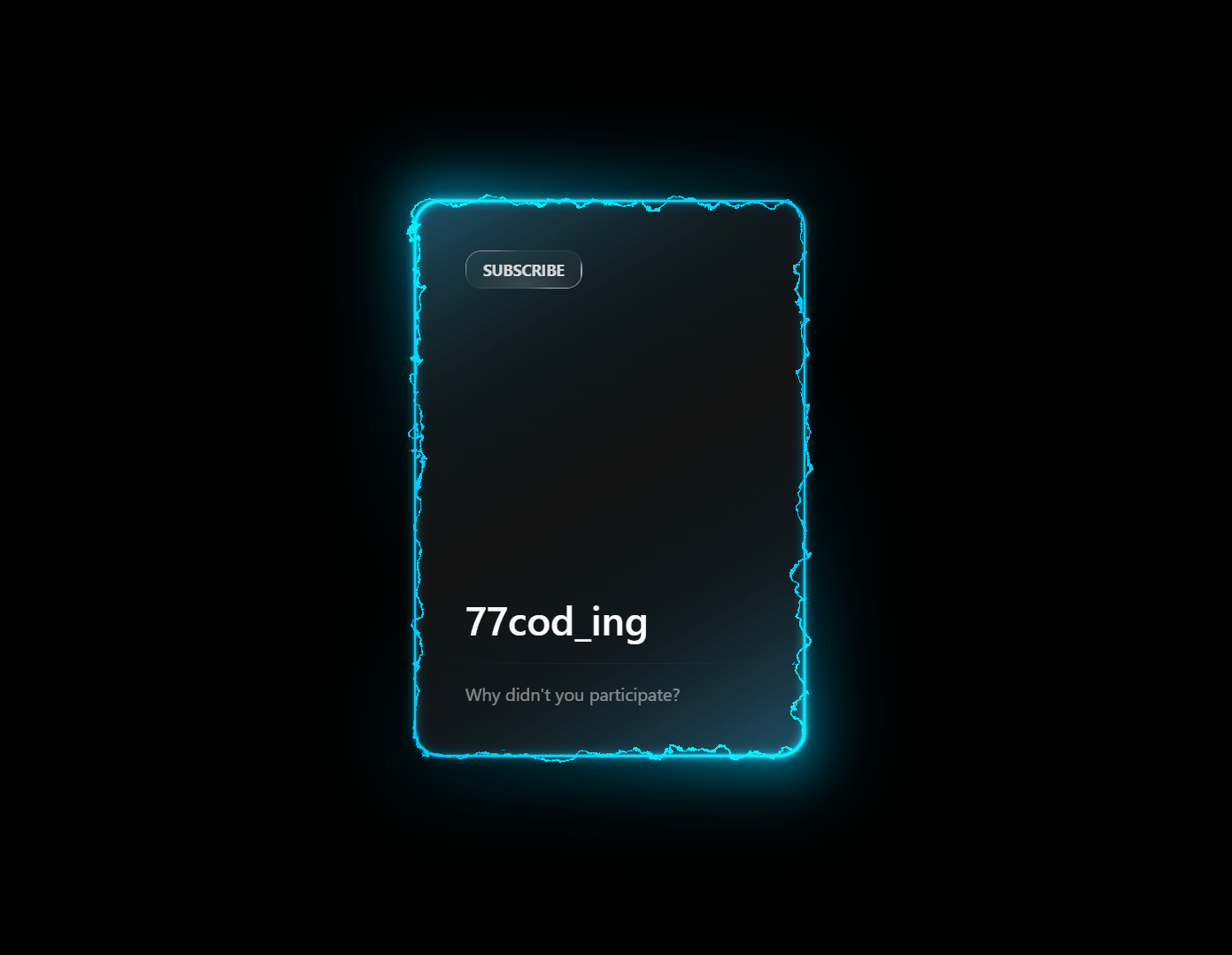
The card is built with layered <div> elements: an outer wrapper,
a border element that receives the SVG filter, a glow overlay, and the content area.
The SVG filter is defined inline with visibility: hidden so it's
available but doesn't occupy space.
SVG feTurbulence — Generating Noise
feTurbulence generates a Perlin noise pattern using
baseFrequency and numOctaves. An
<animate> tag shifts the baseFrequency value
over time, producing the continuous undulating electric motion.
feDisplacementMap — Distorting the Border
feDisplacementMap takes the noise output and uses it to displace
pixels in the border element. The scale attribute controls distortion
intensity — higher values produce wilder electric arcing, lower values give a
subtle shimmer.
CSS Neon Glow with box-shadow
Multiple layered box-shadow values — at different blur radii and
opacities — simulate the light-diffusion of real neon tubes. The glow color is
driven by a --neon-color CSS custom property for easy theming.
Connecting the Filter to CSS
The SVG filter is applied to the border <div> with
filter: url(#neon-filter). Because SVG filters work on the
painted output of the element, the neon gradient border is distorted in real time,
creating the electric effect.
feTurbulence is GPU-accelerated in most modern browsers
but can be expensive when applied to large elements. Keep it scoped to card-sized components for best
performance, and test on mid-range mobile devices.
Best Practices & Common Mistakes
Follow these guidelines to get the best visual result and maintain good page performance.
- Use dark backgrounds — neon glows need contrast to read well
- Scope SVG filters to small elements like cards or buttons
- Use
will-change: filterto hint GPU acceleration - Combine with
:hoverto add interactivity - Use CSS variables so color changes are instant everywhere
- Apply
feTurbulenceto full-page backgrounds - Stack multiple SVG filters on the same element
- Set glow spread too high — it hurts text readability
- Animate many instances simultaneously on one page
- Forget to test on mobile before deploying
Frequently Asked Questions
Can I create this neon animation without JavaScript?
<animate> elements and CSS @keyframes.
You only need an HTML file and a CSS file.
Is SVG feTurbulence heavy on performance?
feTurbulence to large
layout elements or multiple instances simultaneously on the same page.
How do I change the neon glow color?
--neon-color variable in the :root block of the
CSS file and update it to any color value — for example, #ff00ff for
magenta, #00ff88 for green, or #ff6600 for orange.
Which browsers support SVG feTurbulence animation?
feTurbulence and feDisplacementMap,
including Chrome, Firefox, Edge, and Safari (desktop and mobile). Internet Explorer
is not supported.
Can I use this on mobile devices?
Do I need Tailwind, Bootstrap, or any CSS framework?
Conclusion
This electric neon card animation shows how powerful native browser
technologies have become. By combining SVG filter primitives
(feTurbulence + feDisplacementMap) with layered
CSS glow effects, you get a dramatic, animated UI component with
zero JavaScript and zero dependencies.
The technique scales well — use it on hero cards, pricing tables, CTA buttons, or any element where you want to command attention. Change the color variable, adjust the turbulence scale, and make it yours.
Found this useful? Explore the related projects in the sidebar for more modern UI effects built with HTML, CSS, and JavaScript.