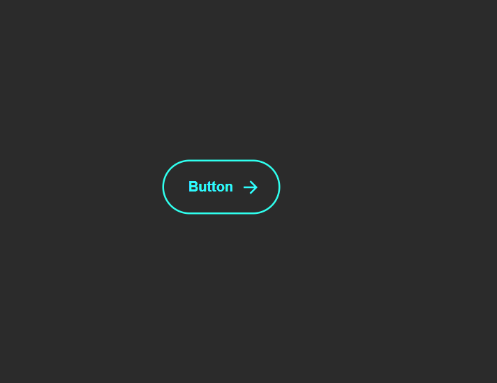
What Is an Expanding Animated Button?
An expanding animated button is a UI component that reacts visually when hovered. Two SVG arrows slide across from left to right, a glowing circle expands beneath the text, and the button text smoothly shifts forward — giving the illusion of motion and depth. The result feels energetic, modern, and tactile.
Unlike a simple color-change hover effect, this button uses multiple coordinated
CSS transitions — width expansion, position shifting, opacity fading, and scale
morphing — all triggered by a single :hover pseudo-class. The technique
demonstrates how powerful pure CSS has become for creating rich interactive UI.
Why Use This Button Design?
- High Visual Impact: The expanding circle and sliding arrows draw immediate attention, making it perfect for primary call-to-action buttons.
- Motion Direction: The arrows visually suggest "go," "next," or "proceed" — reinforcing the button's purpose through animation.
- Pure CSS: No scripts or libraries needed — just clean HTML and CSS code that loads instantly with zero render-blocking overhead.
- Reusable Component: Works for "Download," "Start," "Next Step," "Submit," or any action where you want to convey forward momentum.
- Lightweight: SVG arrows are embedded inline, and CSS transitions are hardware-accelerated — resulting in smooth 60fps animations.
Key Features
How It Works — Step by Step
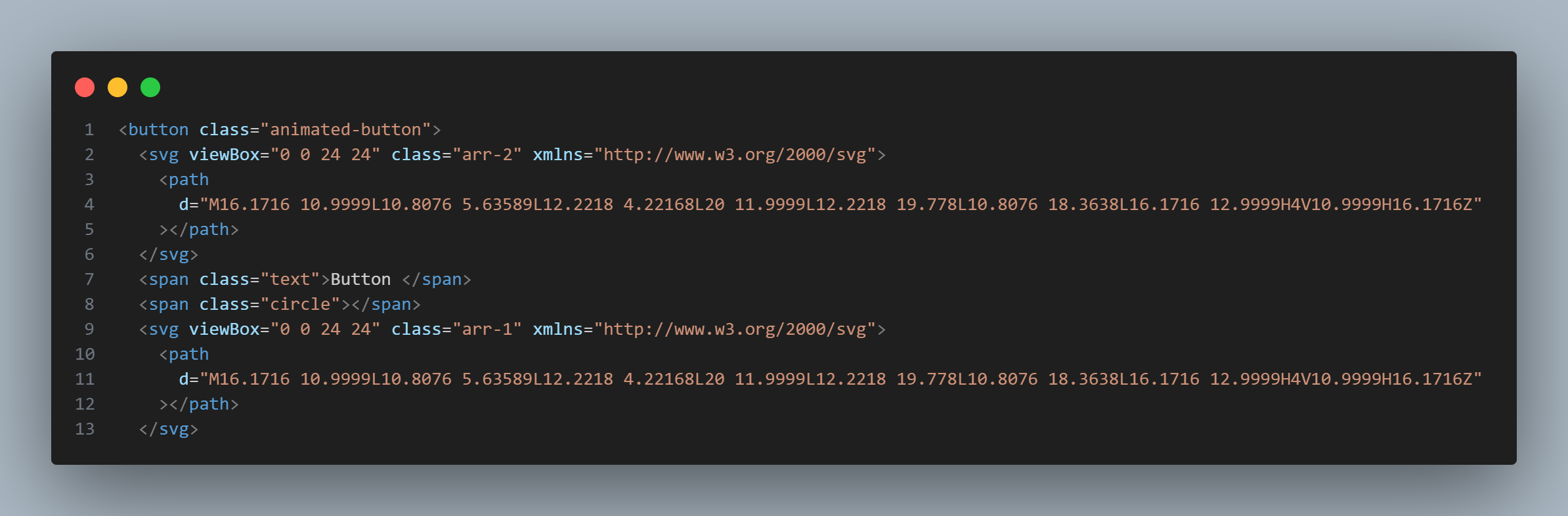
HTML Structure — Button with Arrows & Circle
Create a <button> element containing two inline SVG arrows, a
<span> for the button text, and another <span>
for the expanding circle. This structure gives you independent elements to animate
each part on hover.
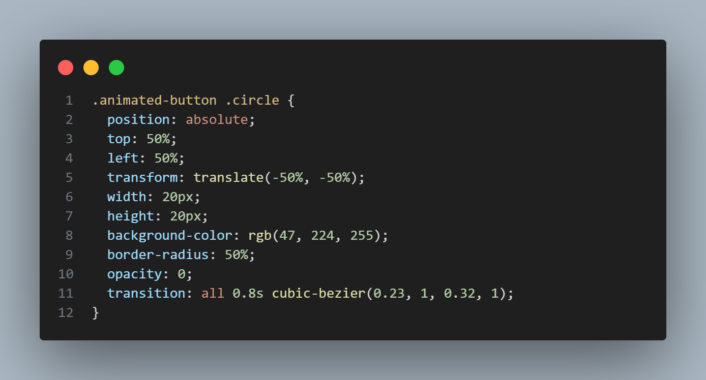
CSS — Hover Transitions & Easing
The circle starts at width: 0; height: 0; opacity: 0 and transitions to
full size on :hover. Arrows swap sides using left and
right position transitions. The key is
transition: all 0.8s cubic-bezier(0.23, 1, 0.32, 1) — this custom
easing creates the fluid, natural motion.
Final Result — Interactive Animated Button
When hovered, the circle expands from center while arrows glide smoothly across. The
text color inverts for contrast, and the button morphs into a more compact, rounded
shape. On click, a brief scale: 0.95 press effect fires. The entire
animation runs at 60fps with zero JavaScript.

cubic-bezier(0.23, 1, 0.32, 1) timing function
creates what Apple calls a "spring" curve — the animation starts fast and decelerates gently.
This single line is what separates a professional-feeling button from a basic linear transition.
background and
border simultaneously — this causes visual jitter on some browsers. Instead,
animate only the expanding circle's width, height, and
opacity while keeping the button border static.
Best Practices & Common Mistakes
- Keep hover duration under 1 second — 0.6-0.8s is the sweet spot
- Use
cubic-beziereasing instead oflinearfor natural motion - Maintain high contrast when colors invert on hover
- Add
:focus-visiblestyles that mirror:hoverfor keyboard users - Use a real
<button>element for accessibility — not a<div> - Test scaling behavior on small screens and touch devices
- Use too many bright glow colors — they overpower the design and cause eye strain
- Animate
backgroundandborderat the same time — causes jitter - Forget to add
cursor: pointerfor the clickable feel - Use extreme transition durations (2s+) — feels sluggish and unresponsive
- Remove default focus outlines without providing a custom
:focus-visiblestyle - Use
display: noneon the circle — breaks the transition; use opacity instead
Frequently Asked Questions
How does the expanding circle animation work without JavaScript?
<span> element inside the button, positioned absolutely.
By default it has width: 0, height: 0, and
opacity: 0.
On the button's :hover state, CSS transitions smoothly animate these properties
to full size and full opacity — creating the expanding glow effect entirely through CSS.
What is cubic-bezier(0.23, 1, 0.32, 1) and why use it?
cubic-bezier is a CSS timing function that controls the acceleration curve of a
transition. The values (0.23, 1, 0.32, 1) create a smooth, natural easing that
starts quickly and decelerates gently — similar to Apple's iOS animation curve. It makes the
button feel fluid and organic rather than mechanical.
Can I change the arrow icons to something else?
How do I change the glow color to match my theme?
background-color and box-shadow values on the expanding
circle span and the button's hover state. Replace the color values with your theme's accent
color. For best results, use CSS custom properties (variables) so you can change the color
site-wide from one place.
Is this button accessible for keyboard and screen reader users?
<button> element, it's naturally keyboard-focusable
and activatable with Enter or Space. Add :focus-visible styles that mirror the
:hover expansion for keyboard users. Screen readers will announce the button
text
automatically. Avoid removing the default focus outline without providing a custom one.
Can I use this button inside a form?
<button> element, it works as a form submit button
by default. Add type="submit" to submit the form, or type="button"
if you only want the visual effect without form submission. You can also wrap it in an
<a> tag if you need navigation instead.
Conclusion
The expanding animated button demonstrates how far pure CSS has come. By
combining position transitions, opacity animations,
SVG icons, and a carefully chosen cubic-bezier easing curve,
you get a button that feels alive and tactile — with zero JavaScript and zero dependencies.
Use it on landing pages, signup forms, download sections, or any call-to-action where you want to convey forward momentum. Adjust the glow color, arrow icons, and easing curve to match your brand — and ship a polished interactive component in minutes.
Found this useful? Explore the related projects in the sidebar for more modern UI components built with pure HTML and CSS.