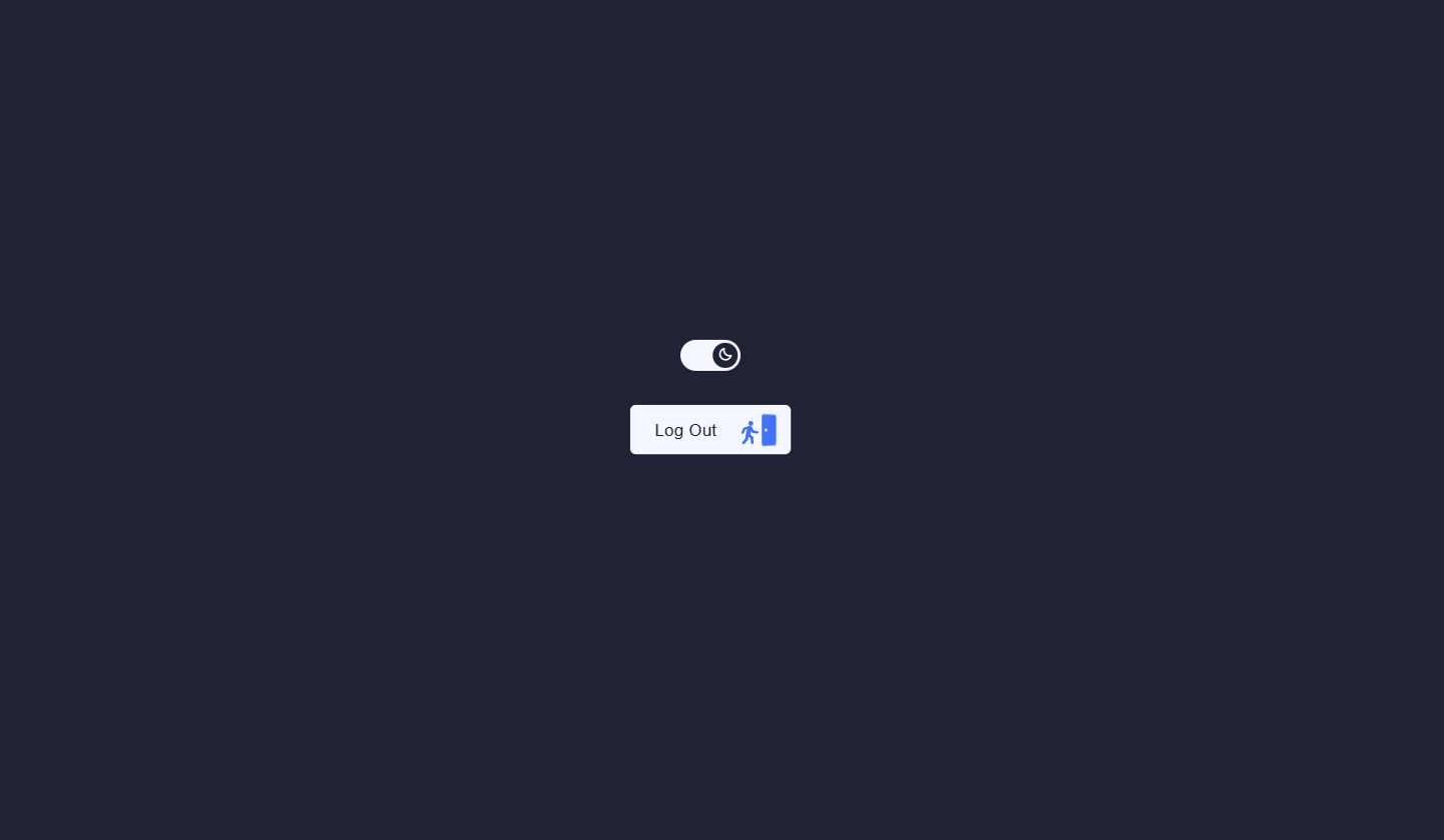
What You'll Build
In this tutorial you'll build two complementary UI components that demonstrate a wide range of CSS and JavaScript animation techniques in one compact, single-file project. The first component is a day/night theme toggle switch — a smooth, pill-shaped button with a sliding circular thumb. As the thumb travels across the track, a sun icon fades and shrinks out while a crescent moon icon scales and rotates in, giving the appearance of one icon morphing into the other. Meanwhile, the entire background of the scene transitions between a soft near-white and a deep navy, producing an immersive day-to-night feel.
The second component takes UI micro-interaction to a playful extreme: an animated logout button. When clicked, a stick figure character walks toward a door rendered in SVG, the door swings open, the figure passes through, the door slams shut, and — in a final comic flourish — the figure falls off screen while spinning. Every limb movement (arms, wrists, legs, calves) is driven by CSS custom properties that JavaScript updates in a carefully timed sequence, turning SVG groups into a surprisingly expressive walking puppet.
Together, these two components cover a foundational web animation skillset: CSS class-based theme switching, opacity and transform crossfades, CSS custom property animation, SVG layering and z-index composition, and sequential animation state machines in vanilla JavaScript.
Key Features of This Toggle & Logout Button UI
cubic-bezier spring easing for a satisfying snap feel.opacity and
transform transitions..scene container smoothly shifts between a light
near-white (#f4f7ff) and a deep navy (#1f2335) over
0.5s with a single CSS transition.rotateY on click, waits for
the figure to walk through, then snaps shut with a timed CSS class addition and
transition-delay.bottom
position off-screen, runs a spin keyframe, and fades out — a three-stage falling
animation that delights users..light-mode and .dark-mode CSS selectors,
so the component always looks correct in both states.states object in JavaScript maps named animation states
to CSS custom property values. Switching states is one function call — clean, readable, and
trivially extensible.Full Source Code (Free)
Both components live together in a single index.html file. The CSS defines all
transitions and animation states. The JavaScript consists of two independent blocks: one
click listener for the theme toggle, and one state-machine-style sequence of
setTimeout calls for the logout button animation. Use the tabs below to
explore the HTML structure, CSS styles, and JavaScript logic separately.
🔓 Full Source Code unlocks in
Hosted on GitHub Gist — free, no sign-up required
index.html file and
add a Boxicons CDN link in the <head>. Open it in any modern browser — no
build tools, no npm, no configuration needed.
How It Works — Step by Step
Here's a deep dive into the eight core techniques powering both the theme toggle and the animated logout button, from the scene setup to the stick figure's dramatic exit.
The Scene Container & Theme Classes
A .scene div wraps both components and starts with the
light-mode class applied. A transition: background 0.5s ease
on .scene ensures that every time the class swaps between
light-mode and dark-mode, the background color blends
smoothly rather than cutting instantly. This single container-level class is the
control point for both the toggle visuals and the button color inversions.
The Toggle Switch — Track & Thumb
The toggle is a <button> with a fixed pill shape
(width: 54px; height: 28px; border-radius: 14px). Inside it, a
.thumb div acts as the sliding indicator. In light mode,
.light-mode .thumb sets transform: translateX(0); in dark
mode, .dark-mode .thumb sets transform: translateX(26px).
The transition: all 0.4s cubic-bezier(.34, 1.56, .64, 1) on the thumb
gives the slide a slight overshoot that feels springy and tactile.
Sun / Moon Icon Crossfade Inside the Thumb
Two <span> elements — .icon-sun and
.icon-moon — are positioned absolutely on top of each other inside the
thumb. Each gets its own transition: opacity 0.3s, transform 0.4s.
In light mode the sun is at opacity: 1; transform: scale(1) rotate(0deg)
and the moon is hidden at opacity: 0; transform: scale(0.5) rotate(-90deg).
In dark mode these values flip. The result is a smooth icon morph that looks like
one animated icon rather than two swapping images.
The JavaScript Theme Toggle — One Line of Logic
A click listener on #themeBtn flips a local
dark boolean and sets scene.className to either
'scene dark-mode' or 'scene light-mode'. That's the
entirety of the JavaScript for the toggle — every visual change cascades from CSS
selectors targeting the theme class. Storing the boolean in JavaScript (rather than
checking the DOM class) makes it easy to read, extend, or connect to
localStorage for persistence.
SVG Layering for the Logout Button
The logout button contains three inline SVG elements, all absolutely positioned and
stacked by z-index. The first (.doorway, z-index 3) is
the static doorframe background. The second (.figure, z-index 4) is
the animated stick figure. The third (.door, z-index 5) sits in front
of the figure by default so it visually "covers" the figure when closed — then the
figure appears to step behind it and through it as the door opens.
CSS Custom Properties as Animation Targets
Each limb group in the SVG figure — .arm1, .wrist1,
.leg2, .calf2, and so on — has
transform: var(--transform-arm1) and a matching
transition: transform calc(var(--walking-duration)*1ms) ease-in-out.
JavaScript defines a states object where each key is a named animation
state and each value is a map of CSS custom property names to target values. The
update(s) function iterates that map and calls
button.style.setProperty(k, v), which triggers all the CSS transitions
simultaneously.
The Click Sequence — Walk, Door, and Slam
Clicking the button while in the default or hover state begins a
setTimeout chain. First, 'clicked' is added and the
figure advances to the walking1 state. After its
--figure-duration elapses, 'door-slammed' is added and
the figure transitions to walking2. The door's
rotateY(35deg) open state then snaps back to
rotateY(0) via a delayed transition, simulating a slam. Finally the
falling sequence begins.
The Falling Exit Animation
When the falling class is added, the figure transitions from
bottom: 5px to bottom: -1080px over the
--figure-duration with a cubic-bezier(0.7, 0.1, 1, 1)
acceleration curve — mimicking gravity. At the same time,
animation: spin 1000ms infinite linear makes the figure tumble.
Opacity fades to 0 at 75% of the duration. After a final 1-second
wait, all classes are removed and the component resets to its default state ready
for the next click.
setTimeout durations in the click
handler are derived from the CSS custom property values defined in the states
object (e.g. states['walking1']['--figure-duration'] * 1). If you adjust the
walking speed, always update the value in the states object — the timer will
follow automatically. Never hard-code the delay separately or the animation will desync.
Customization Ideas
Both components are deliberately minimal at their core, making them easy to drop into existing projects or extend with new behavior. Here are practical ideas for both the toggle and the logout button.
Theming the Toggle Switch
- Persist the preference — After toggling, save the current mode to
localStorage.setItem('theme', dark ? 'dark' : 'light')and read it on page load to restore the user's last choice automatically. - Extend to CSS custom properties — Move the theme change from the
.sceneelement todocument.documentElement(the:root) and define color tokens like--bg,--text, and--borderunder both theme classes. Every styled element on the page will then automatically recolor on toggle. - System preference detection — Initialize the
darkvariable usingwindow.matchMedia('(prefers-color-scheme: dark)').matchesso the component respects the user's OS-level setting on first load. - Change the accent colors — The light scene uses
#f4f7ffand the dark scene uses#1f2335. Swap these for any two contrasting colors to theme the toggle for your own brand palette.
Extending the Logout Button
- Replace the label text — Change "Log Out" to any action label like "Exit", "Leave Room", or "Disconnect". The figure animation is content-agnostic and will work with any verb.
- Add a confirmation step — On first click, show a small tooltip or popover asking "Are you sure?" and only begin the walk animation on a second confirmation click. This keeps the comedic exit for the final action.
- Change the figure fill color — The stick figure uses
fill: #4371f7. Replace this with any brand color, a gradient defined in an SVG<defs>, or even an animated color via a CSS keyframe on thefillproperty. - Add more walking states — Insert additional entries into the
statesobject to make the figure pause, wave, or stumble before reaching the door. The--figure-durationcustom property controls how long the transition takes, so you can make intermediate states as brief or dramatic as you want. - Swap the exit animation — Instead of falling, make the figure shrink
to zero with
transform: scale(0)or teleport away with a flash keyframe on the.bangSVG paths already included in the markup.
Browser Compatibility
Every technique in this project — CSS transitions, keyframe animations, CSS custom properties,
transform on SVG elements, and classList manipulation — is fully
supported across all modern browsers with no vendor prefixes required.
| Browser | CSS Transitions & Custom Props | SVG Transform Animation | Overall Support |
|---|---|---|---|
| Chrome / Edge | Yes | Yes | Full |
| Firefox | Yes | Yes | Full |
| Safari (macOS & iOS) | Yes | Yes | Full |
| Samsung Internet | Yes | Yes | Full |
| Internet Explorer 11 | No (custom props) | Partial | Not supported |
Performance & Responsiveness
Both components are exceptionally lightweight. There are no external animation libraries, no CSS preprocessors, and no runtime dependencies beyond a Boxicons CDN link for the sun and moon icons.
- GPU-composited properties only: The toggle thumb uses
transform: translateX()and the icons useopacityandtransform— the browser promotes these to their own compositor layer and animates them entirely on the GPU, avoiding layout recalculation entirely. - SVG over raster: The logout button figure and door are inline SVG, meaning they scale crisply to any display density (including HiDPI / Retina screens) with zero additional HTTP requests and zero image file weight.
- Minimal scripting footprint: The entire JavaScript for both
components is under 60 lines. There are two event listeners and a handful of
setTimeoutcalls — essentially no CPU overhead during idle states. - Instant first paint: Both components render with CSS only (no JS needed for their initial visual state), so they appear correctly even before the JavaScript event listeners are attached.
- Responsive by default: The toggle and button are sized in fixed
pixels that work well across viewports. For mobile use, wrap them in a flex or grid
container to reflow as needed. The
-webkit-tap-highlight-color: transparentproperty is already set on both interactive elements to remove the default mobile tap flash.
requestAnimationFrame.
Frequently Asked Questions
How does the day/night toggle switch work with CSS?
light-mode and
dark-mode classes on the parent .scene element. CSS selectors
like .dark-mode .thumb then change the thumb's translateX
position from 0 to 26px, the scene background color, and the
opacity and scale of the sun and moon icons — all driven by CSS transitions, with no
extra JavaScript needed for the visuals.
How do the sun and moon icons animate when switching themes?
.thumb element using
position: absolute. In light mode, the sun has opacity: 1 and
scale(1) rotate(0deg) while the moon has opacity: 0 and
scale(0.5) rotate(-90deg). When dark mode activates, the CSS rules reverse:
the sun fades out and rotates away while the moon scales up and rotates into position.
Both transitions run simultaneously via transition: opacity 0.3s, transform
0.4s on each icon, creating a seamless cross-fade swap effect.
How is the animated logout button built without a JavaScript animation library?
--transform-arm1 and --transform-leg1. JavaScript updates
these properties in sequence via a states object and
setTimeout chains, simulating a walking cycle, door interaction, and
falling exit — no animation library required. The CSS transition on each
limb's transform handles all the smooth interpolation automatically.
Can I use this day/night toggle in a real project to switch themes?
light-mode and
dark-mode class swap from .scene to
document.documentElement (the html element) and define your
CSS custom properties — colors, backgrounds, borders — under .dark-mode
and .light-mode selectors. The toggle button logic stays identical. Add a
localStorage read on page load to remember the user's preference between
visits.
What CSS techniques are used to animate the stick figure's limbs?
.arm1, .wrist1, .leg2, etc.)
is an SVG <g> element with
transform: var(--transform-arm1) and a corresponding
transition: transform calc(var(--walking-duration)*1ms) ease-in-out.
JavaScript updates the custom property value via
button.style.setProperty(k, v). Because CSS transitions watch for changes
to the computed transform value, each limb smoothly animates to its new
position without any Web Animations API or GSAP calls. Every pose is defined as a
named entry in the states object, making it easy to add or modify poses.
Is this project beginner-friendly?
states object and the
update() function. Both components are fully self-contained in a single
HTML file with no build tools, so beginners can open the file directly in a browser
and see results instantly.
Conclusion
This project packs two complete, production-quality UI components into a single HTML file and demonstrates just how expressive pure CSS and vanilla JavaScript can be without reaching for a framework. The day/night toggle shows how a single class swap cascades into a full-page visual transformation — a pattern that scales from simple prototypes to complex design systems. The animated logout button pushes further, turning inline SVG and CSS custom properties into a mini animation engine capable of sequenced, character-driven motion.
The underlying patterns here — theme-class cascades, CSS custom property animation, SVG z-index layering, and timed state transitions — are reusable building blocks. You'll find variations of all of them in dark mode toggles for full apps, animated onboarding sequences, interactive data visualizations, and character-driven loading screens.
Want to go deeper into CSS animation? Check out the Animated Floating Action Button Menu for staggered keyframe sequencing, or the Advanced JavaScript Image Slider for GSAP-powered transitions.
Found this useful? Explore more HTML CSS JavaScript projects in the sidebar →