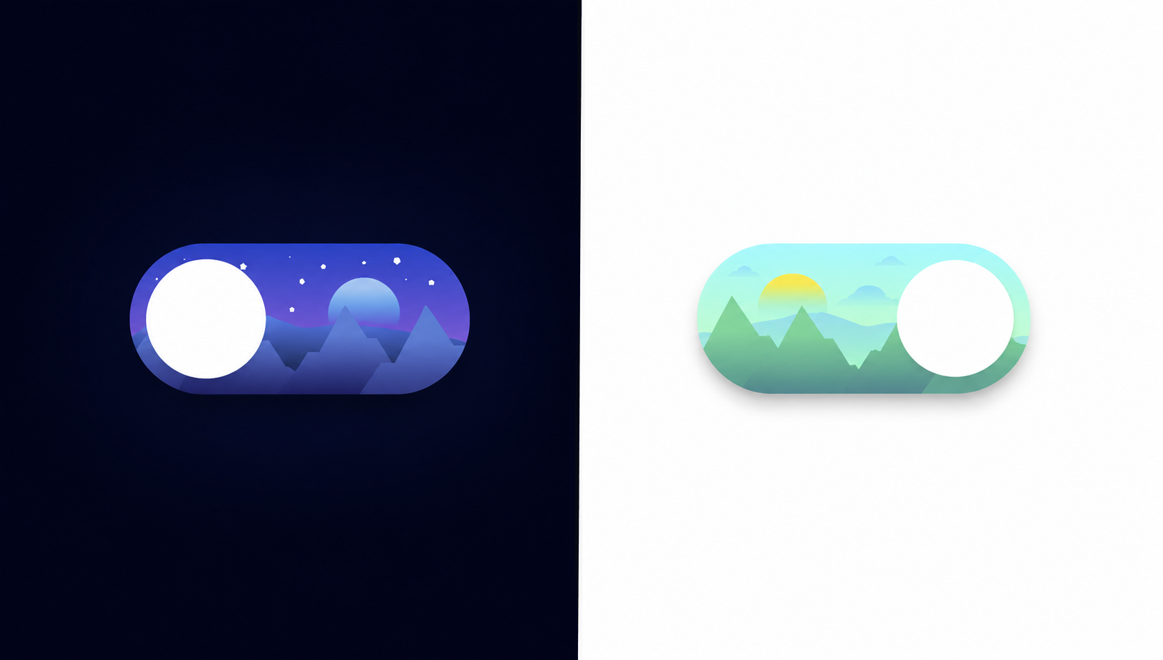
What You'll Build
In this tutorial, you'll build a richly animated day/night toggle switch
using HTML, CSS, inline SVG, and a small amount of JavaScript. From the outside it looks like
a simple pill-shaped checkbox, but inside the switch lives an entire miniature landscape —
layered SVG mountains, a floating orb that acts as both moon and sun, eleven tiny star dots,
and three drifting cloud shapes, all confined within the toggle's rounded boundary by
overflow: hidden.
Clicking the toggle triggers a cascade of simultaneous transitions: the sky gradient shifts
from a deep indigo-to-black night to a soft aqua-to-green day, the orb slides from left to
right while its gradient swaps from a cool moon-blue to a warm sun-yellow, the stars translate
upward and vanish, and the clouds slide down from off-screen into view. A separate JavaScript
listener handles the one thing CSS can't do: updating stop-color attributes
directly on SVG linearGradient elements to recolor the mountain silhouettes and
the ground layer.
It's a fantastic project for learning the CSS checkbox hack, how to layer SVG inside HTML components, how to manage multi-element state transitions with a single checked selector, and how to coordinate CSS and JavaScript to animate what CSS alone cannot reach.
Key Features of This Day Night Toggle Switch
linear-gradient on .slider to paint a realistic dark
night sky inside the pill.
:checked, the gradient flips to a soft
aqua-to-green palette, smoothly transitioning the sky background in
0.4s to represent daytime.
.slider:before pseudo-element is a circle
that slides 110px to the right on toggle, changing its gradient from
cool moon-blue to warm sun-yellow.
.circle divs act as stars, scattered
in varying sizes (1–4px) across the switch. They translateY(-200px)
off-screen when day mode is activated.
translateY(200px) (below the component) and slide up into view when
the day sky is active, creating a natural reveal.
linearGradient fills sit at the bottom of the switch, recolored via
JavaScript from night purple-to-dark to day green-to-teal.
<input type="checkbox"> is the
state holder. All sibling and general-sibling CSS selectors react to
:checked with no class toggling needed for the visuals.
change event listener calls
setAttribute('stop-color', ...) on gradient stops to recolor
the mountain fills and orb — the CSS-unreachable finishing touch.
Full Source Code (Free)
The entire project lives in a single HTML file — no build tools, no external dependencies.
CSS handles all the transitions, transforms, and gradient changes for the background, orb,
stars, and clouds. JavaScript's role is deliberately narrow: it updates SVG
linearGradient stop colors on the mountain shapes and orb that can't be reached
with CSS property changes alone. Use the tabs below to explore each section.
index.html
file. No libraries or build steps required — open it in any modern browser and click the
toggle to watch the full scene animate.
How It Works — Step by Step
Here's a breakdown of the eight core techniques that make this animated day/night toggle work, from the outermost shell down to the SVG gradient JavaScript updates.
The Switch Shell — Label, Checkbox & Slider
Everything is wrapped in a <label class="switch"> element
sized at 200×90px with border-radius: 100px and
overflow: hidden. The hidden <input type="checkbox">
sits first inside the label with opacity: 0; width: 0; height: 0;
so it's accessible but invisible, followed by the .slider span that
fills the entire label area absolutely.
The Sky Background Gradient
.slider uses
background-image: linear-gradient(to bottom, #364BBA, #A979D9)
as its default night sky — a rich indigo top blending to a soft purple-violet at the
base. The input:checked + .slider rule switches this to
linear-gradient(to bottom, #ABFAFF, #D5FFAB) — a sky-blue to meadow-green
palette — with the 0.4s transition already declared on the base
.slider rule handling the fade.
The Moon/Sun Orb — :before Pseudo-element
.slider:before creates a 70×70px white circle positioned
at top: 10px; left: 10px;. When the checkbox is checked,
input:checked + .slider:before applies
transform: translateX(110px), sliding the orb from the moon's position
on the left to the sun's position on the right. The gradient color change from the
cool moon-blue to the warm sun-yellow is handled by JavaScript updating the SVG
gradient stops on the orb's <circle>.
The Horizon Ground Layer SVG
A .slider-bg SVG path draws an irregular ground/horizon silhouette
across the bottom half of the switch using an absolute position at
top: 41px; left: -4px;. Its linearGradient fill
transitions from the night palette (#6A86EB → #010203) to the day
palette (#9FDEF2 → #A8FFAC) via the JavaScript change
listener updating each gradient stop's stop-color attribute.
Layered Mountain Silhouettes
Four .mountain SVGs (two large, two medium) are absolutely positioned
across the bottom of the switch with z-index: 7, sitting above the
horizon layer. Each mountain has its own named linearGradient with
uniquely ID'd stops (e.g. mountain1-stop1). The JavaScript listener
updates all eight stop-color values: dark night purple-blue converts to a natural
day green-to-teal range, making the mountains look like living hills in daylight.
Star Dots — Fade Up and Out
Eleven .circle divs with sizes between 1px and
4px and a cream-white background color are scattered at specific
top/left/right positions across the upper
half of the switch. The 0.4s transition on .circle
means that when input:checked ~ .circle applies
transform: translateY(-200px), all eleven stars smoothly exit
upward through the hidden overflow: hidden boundary.
Cloud SVGs — Slide In From Below
Three .cloud SVGs (one large and two small) start off-screen with
transform: translateY(200px) — pushed below the switch's visible area.
The 0.4s transition on .cloud is the mirror of the star
transition: when input:checked ~ .cloud resets the transform to
translateY(0), the clouds glide upward into the day sky scene.
JavaScript SVG Gradient Updates
A single DOMContentLoaded listener on the
#toggle input listens for the change event.
When fired, it selects each named gradient stop element by ID and calls
setAttribute('stop-color', newHex) with the correct day or night
palette value. This covers the slider-bg ground layer, the SVG
orb circle gradient, and all four mountain gradients — giving every element
its own perfectly themed color for each sky mode.
linearGradient with unique id attributes (e.g.
paint0_linear_217_219 through paint0_linear_217_222). If you
duplicate SVGs without renaming gradient IDs, all mountains will read from the same gradient
definition and only one set of stop-color updates will take effect — the others will share
that same gradient source.
Customization Ideas
The toggle's clean, layered architecture makes it straightforward to extend or re-theme. Here are some practical directions to make it your own.
- Resize the switch — The component uses fixed pixel sizes. To scale it up
or down, increase or decrease
.switch'swidthandheight, then adjust the orb'stranslateXdistance ininput:checked + .slider:beforeto match. - Change sky palettes — Replace the gradient stops in
.slider's base and:checkedrules to pick any two sky moods — a stormy grey-to-purple, a sunset orange-to-red, or a dawn pink-to-gold. - Add a twinkling star animation — Wrap each
.circlestar in a simple CSS@keyframesthat oscillatesopacitybetween0.3and1with staggeredanimation-delayvalues for a realistic twinkle effect in night mode. - Swap mountains for a cityscape — Replace the mountain SVG paths with rectangular building silhouettes to create an urban skyline variant. Keep the same z-index layering for the depth effect.
- Add a sunrise/sunset color stage — If you hook the toggle's
changeevent into your own JavaScript theme system, you could add a brief intermediate orange-sky state that plays before committing to full daytime — a three-phase transition usingsetTimeoutand class swapping. - Wire it to a real dark mode — Add an event listener on the checkbox
that reads
this.checkedand toggles adata-theme="light"attribute on<html>, then define CSS custom property overrides under[data-theme="light"]to theme your entire page. Persist the preference withlocalStorage. - Change the body background color — The JavaScript already updates
document.body.style.backgroundColorbetween#ffffff(day) and#000000(night). Hook this into your full site's color scheme by swapping CSS custom properties instead of a raw hex value.
overflow: hidden on .switch
clips everything to the pill shape, you can add new decorative elements — birds, a shooting
star, raindrops — by positioning them absolutely inside the label and animating them with
transform. They'll be masked automatically by the pill boundary.
Browser Compatibility
Every technique in this toggle — CSS gradients, transitions, transforms,
overflow: hidden, inline SVG with linearGradient, and
setAttribute() via JavaScript — is part of the web platform's stable baseline.
There are no cutting-edge CSS features or experimental APIs in use.
| Browser | CSS Transitions & Transforms | Inline SVG + linearGradient | Overall Support |
|---|---|---|---|
| Chrome / Edge | Yes | Yes | Full |
| Firefox | Yes | Yes | Full |
| Safari (macOS & iOS) | Yes | Yes | Full |
| Samsung Internet | Yes | Yes | Full |
| Internet Explorer 11 | Partial | Limited | Not Recommended |
CSS transitions on SVG
                    background-image gradients
. The slider background itself transitions cleanly in all
modern browsers via the transition: 0.4s on the .slider element.
Internet Explorer 11 lacks full support for CSS gradient transitions and is not a viable
target for new projects in 2026.
Performance & Responsiveness
Despite the visual complexity — multiple SVG layers, eleven animated elements, and coordinated color shifts — this component is remarkably lightweight and performs smoothly on modest hardware.
- GPU-composited transitions: Every animation in the component uses
transform(for the orb slide, star exit, and cloud entrance) or a background-image property change withtransition. Both paths avoid layout recalculation, keeping the browser in its compositor thread for a consistent frame rate. - No raster images: All graphic content — mountains, clouds, ground silhouette, orb — is inline SVG with vector paths. The switch looks crisp at any device pixel ratio, from standard 1x screens to 3x Retina displays, with zero additional HTTP requests.
- Minimal JavaScript footprint: The JS is a single
DOMContentLoadedcallback that caches element references once and callssetAttributeon toggle. There's no animation loop, no library, and no repeated DOM queries. - Self-contained sizing: The component uses fixed pixel dimensions
(
200×90px) which makes it predictable inside any layout system — flex, grid, or static. To make the switch responsive, wrap it in a CSStransform: scale()applied at a breakpoint rather than reflowing internal pixel positions. - Accessibility baseline: Because the toggle is built on a real
<input type="checkbox">inside a<label>, it is keyboard-focusable and operable by default. Addingaria-label="Toggle day and night mode"to the label completes the accessibility baseline.
transform over positional
properties like top/left for the orb, stars, and clouds is
what keeps this visually dense component smooth. Even with eleven simultaneously
animating elements, the browser's compositor handles all of them in a single pass.
Frequently Asked Questions
How does the day/night toggle switch work without a JavaScript animation library?
input:checked + .slider
and input:checked ~ .cloud target every visual element in the component —
changing background gradients, moving the orb with translateX, sliding
clouds in, and hiding stars — all via CSS transition and
transform. JavaScript is only used for the one task CSS can't do: updating
SVG linearGradient stop-color attributes for the mountain and
orb color changes.
What is the CSS checkbox hack and how is it used here?
<input type="checkbox"> element is hidden with
opacity:0 and zero dimensions but remains in the DOM. Because it's a
sibling of .slider and a general sibling (~) of
.circle and .cloud elements, CSS can target
input:checked + .slider, input:checked ~ .circle, and so
on. Clicking the visible label triggers the checkbox, and every CSS rule watching
:checked instantly updates all the visual layers — no class toggling
required.
Why are the SVG gradients updated with JavaScript instead of CSS?
stop-color inside a <linearGradient> definition.
While CSS custom properties can work in some browsers, the most reliable cross-browser
approach is to update the stop-color attribute directly with JavaScript's
setAttribute(). The toggle's change event listener sets new
hex values on each gradient stop for the mountain fill and orb gradient, giving a clean
color shift between night and day palettes that CSS alone cannot achieve.
How are the stars created and how do they disappear in day mode?
<div class="circle"> with a fixed pixel size
(1–4px), a circular border-radius, and a cream-white background color,
absolutely positioned inside the .switch container. In their default state
they're visible against the dark night gradient. When input:checked is
active, the CSS rule input:checked ~ .circle applies
transform: translateY(-200px) with a 0.4s transition, sliding
them upward out of the overflow: hidden switch container and out of
view — a simple but effective disappearing trick.
Is this project suitable for beginners?
translateX/Y transforms. The checkbox hack is a great
concept to learn early because it shows how to manage UI state without JavaScript.
The JavaScript portion is minimal: a single event listener that calls
setAttribute() on a handful of SVG nodes. It's an ideal project for
anyone who knows basic HTML/CSS positioning and wants to practice CSS sibling
selectors and SVG basics in a fun, visual context.
Can I use this day/night toggle as a real dark mode switch for my website?
id to
the checkbox and listen for its change event with JavaScript. On change,
toggle a dark or light class on <body> or
<html>, then use CSS custom properties under those classes to swap
your site's colors. You can also save the user's preference to
localStorage so it persists across page loads. The toggle component
itself is purely visual and self-contained, so it slots into any existing design
system without conflict.
Conclusion
This animated day/night toggle switch shows just how much visual storytelling you can pack into a 200×90px container with nothing but HTML, CSS, and a few lines of JavaScript. By combining the CSS checkbox hack, layered inline SVG, coordinated sibling transitions, and targeted JavaScript SVG attribute updates, the toggle becomes a miniature animated scene — not just a UI control.
The techniques here extend well beyond this specific project. The pattern of using a hidden input as a state flag, letting CSS sibling selectors drive all visual changes, and reserving JavaScript only for what CSS genuinely cannot do is a clean, maintainable approach for any interactive component.
Looking to keep building? Try the Neon Cursor Animation for advanced pointer effects driven by JavaScript, or the Animated Button with Star Effects to explore GSAP-powered micro-interactions.
Found this useful? Explore more HTML CSS JavaScript projects in the sidebar.