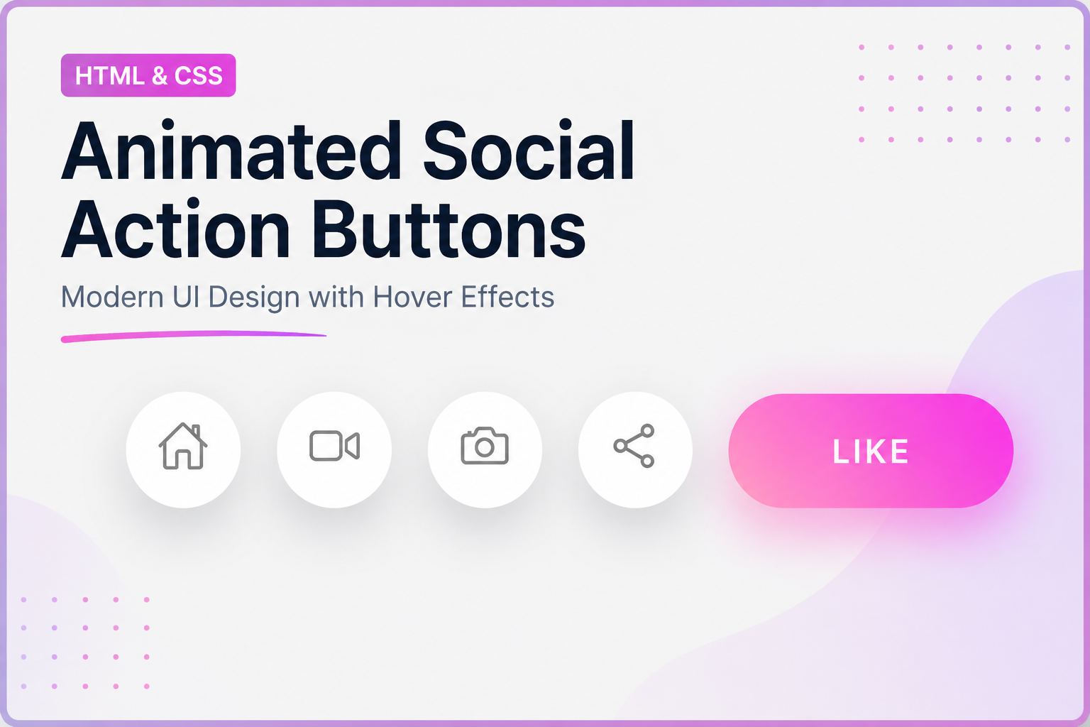
What You'll Build
In this tutorial you'll create a CSS expandable navigation bar with animated gradient icons — a row of circular pill buttons, each containing an Ionicon. When a user hovers, the pill smoothly expands from 60 px to 180 px, the icon scales away and a text label fades in, while a gradient background floods the pill and a matching glow bleeds underneath it. Every item carries its own two-color gradient defined with a pair of inline CSS custom properties.
This project is ideal for anyone learning CSS transitions, CSS custom
properties, pseudo-element layering, and the
:hover pseudo-class. The skills transfer directly to toolbars, docks, sidebars,
social media link lists, and any UI that needs a compact icon state paired with a readable label.
If you enjoy effects that combine icon animations with glow, also check out the Electric Neon Card Animation for another take on CSS-powered glow techniques.
Key Features of This Navigation Bar
--i and --j) give
every item
its own unique two-stop gradient without duplicating any rules.::after pseudo-element with
filter: blur(15px) creates
a soft colored light bleed below the expanded pill.transition-delay
values so
they never overlap mid-animation.:hover
pseudo-class — no
JS event listeners needed.transform, opacity, and
width —
the browser compositor handles the smooth transitions.Full Source Code (Free)
The project is a single HTML file with an embedded <style> block and
Ionicons loaded from a CDN. Use the tabs below to view the HTML structure and the CSS separately.
Copy both and paste them into a single index.html file to run it instantly.
index.html file and
open it in any modern browser. Hover each pill to see the expansion and glow instantly.
Or click Preview Result above to see it live right here on the page.
How It Works — Step by Step
Every visual layer of this navigation bar is intentional. Here is a precise breakdown of how each CSS rule contributes to the final effect.
Per-Item Gradient via Inline CSS Variables
Each <li> has an inline style attribute defining
--i (start color) and --j (end color). The CSS uses these
in background: linear-gradient(45deg, var(--i), var(--j)) on the
::before pseudo-element. This way a single CSS rule drives five completely
different gradients — purple-pink, sky-blue, orange-red, green-cyan, and rose-magenta.
Base Pill Shape and Box Shadow
Each li starts as a 60 × 60 px circle: border-radius: 60px,
white background, and a subtle box-shadow. The element uses
display: flex; justify-content: center; align-items: center to center
the icon. overflow is left at its default so the pseudo-elements can
extend outside during the glow effect.
Pseudo-element Layering: Gradient Fill and Glow
::before sits above the white background with inset: 0,
matching the pill's border-radius, and holds the gradient fill. It starts at
opacity: 0 and transitions to 1 on hover. ::after is
offset downward (top: 10px), blurred with filter: blur(15px),
and set to z-index: -1 so it appears as a glow shadow beneath the pill.
It also starts transparent and fades to opacity: 0.5 on hover.
Width Expansion on Hover
On li:hover, width transitions from 60 px to 180 px with
transition: 0.5s. Because the pill uses flexbox centering, the icon and
label naturally stay centered as the element grows. The box-shadow is also
removed on hover to let the glow pseudo-element be the only shadow source.
Icon Scale-Out and Color Change
The ion-icon is colored #777 at rest. On
li:hover ion-icon, it transitions to transform: scale(0)
with color: #fff — it disappears into a dot. Crucially, its
transition-delay is 0s on hover so it exits immediately,
making room for the label before the expansion is halfway done.
Label Scale-In with Staggered Delay
The .title span starts at transform: scale(0).
On li:hover .title it scales to 1, but with
transition-delay: 0.25s. This 250 ms gap ensures the icon has
already shrunk before the label appears, keeping the animation uncluttered.
On mouse-out, the delays reverse: the label exits first, then the icon returns.
transform, animating
width does trigger layout recalculation. For a navigation bar with a small
number of items this is imperceptible, but avoid using this pattern on dozens of elements
animating simultaneously. For high-performance scenarios, consider using
transform: scaleX() combined with transform-origin: left instead.
Customization Options
This navigation bar is designed to be remixed. Here are the most common adjustments and exactly where to make them.
Changing a gradient
Every list item's two-stop gradient is controlled entirely by the inline
--i and --j variables. To change the purple-pink item to a
teal-lime gradient, update its opening tag from
style="--i:#a955ff;--j:#ea51ff" to
style="--i:#14b8a6;--j:#84cc16". No CSS file changes needed.
Adding a new navigation item
Copy any existing <li> block. Change its --i and
--j color variables, update the name attribute on
<ion-icon> to any icon from the
Ionicons
library, and set the .title text. The layout flex gap handles spacing
automatically.
Adjusting expand width
The expanded width is hardcoded to 180px in ul li:hover.
Increase it for longer labels (e.g. "Settings" needs around 200 px) or decrease it for
short labels like "Go". Match the font-size and letter-spacing
on .title accordingly.
Swap Ionicons for another icon set
Replace the <ion-icon> elements with any icon system that renders via
inline SVG, a <i> tag, or a <span>. The only
CSS change required is updating the selector from ul li ion-icon to
whatever tag your icon library uses.
Vertical layout
Change ul from display: flex to
display: flex; flex-direction: column and remove the fixed
width: 60px from li. Set a min-width: 60px
instead so the pill can expand horizontally in a sidebar context.
Best Practices & Common Mistakes
- Keep
--iand--jas inline variables per item for zero CSS duplication - Use
transition-delayto stagger icon and label swaps cleanly - Set
z-index: -1on the glow::afterso it never obscures content - Add
@media (prefers-reduced-motion: reduce)to disable transitions for accessibility - Test on a real device to confirm the hover state works as expected
- Animate more than 8–10 items simultaneously — layout cost from
widthgrows linearly - Forget to set
overflow: hiddenon a parent if you want glow clipped to a container - Hardcode gradient colors in CSS when inline variables already handle per-item theming
- Rely on hover-only interactions for primary navigation on a touch-first product
- Use the same
--iand--jcolors on two adjacent items — the visual distinction is the whole point
Browser Compatibility
Every CSS feature used in this project has been broadly supported for years. The table below covers the key techniques and their minimum browser support.
| Feature | Chrome | Firefox | Safari | Edge |
|---|---|---|---|---|
CSS Custom Properties (var()) |
✓ 49+ | ✓ 31+ | ✓ 9.1+ | ✓ 15+ |
CSS transition |
✓ All | ✓ All | ✓ All | ✓ All |
::before / ::after pseudo-elements |
✓ All | ✓ All | ✓ All | ✓ All |
filter: blur() |
✓ 18+ | ✓ 35+ | ✓ 6+ | ✓ 12+ |
linear-gradient |
✓ All | ✓ All | ✓ All | ✓ All |
ion-icon).
Web Components are supported in all evergreen browsers. Internet Explorer 11 is not supported,
but IE11's market share is effectively zero in 2026.
Performance & Responsiveness
Animation performance
The most performance-sensitive operation here is the width transition on
<li>. Changing width triggers a layout reflow, which is
more expensive than a transform. However, with five small items this cost is
negligible — browsers batch the reflow for a single frame and the result is visually
indistinguishable from a transform-based approach for this number of elements.
The filter: blur() on ::after is GPU-composited in all major
browsers and does not cause additional layout work. transform: scale() on the
icon and label are also composited, keeping those transitions off the main thread.
Responsiveness
The <ul> uses display: flex with gap: 25px.
On narrow viewports the row will overflow if the items are all expanded simultaneously
(unlikely in normal use, but worth noting). To make the bar responsive, wrap it in a
container with overflow-x: auto and add padding so scrolling is
comfortable on small screens. On touch devices, consider replacing the hover behavior with
a tap-toggle using a small JavaScript click handler, since :hover does not
persist on mobile.
Frequently Asked Questions
Can I build this expandable navigation bar without JavaScript?
:hover pseudo-class and transition property. You need only
an HTML file; no JavaScript is involved at any step.
How do per-item gradient colors work with CSS custom properties?
<li> carries two inline CSS variables — --i (gradient
start)
and --j (gradient end). The ::before and ::after
pseudo-elements reference these with
linear-gradient(45deg, var(--i), var(--j)).
Because CSS custom properties cascade down into pseudo-elements, changing the inline values
on
a parent element automatically updates both pseudo-elements with no extra CSS rules.
How do I add a new navigation item?
<li>, set its --i and --j
inline colors to your chosen gradient stops, replace the ion-icon name
attribute
with any icon from the Ionicons library, and update the span.title text.
The flexbox gap on <ul> handles the spacing automatically.
Why do the icon and label swap instead of appearing at the same time?
transition-delay. On hover, the icon collapses
immediately (delay: 0s) while the label expands after 250 ms
(delay: 0.25s). On mouse-out the reverse happens. This staggering ensures
that only one element is visible at any moment during the transition, producing a clean
single-focus read rather than an overlapping jumble.
Does the blur glow under the pill hurt performance?
filter: blur()
on a ::after pseudo-element, which browsers composite on the GPU separately
from the main document layout. For large numbers of items animating simultaneously,
consider replacing the blur glow with a simpler box-shadow transition instead.
Can I use this navigation bar on mobile devices?
Conclusion
This CSS expandable navigation bar demonstrates how a single CSS mechanic —
the :hover pseudo-class combined with transition — can produce a
layered, polished interaction with zero JavaScript. By stacking gradient pseudo-elements,
staggering transition delays, and routing per-item colors through inline CSS variables, five
visually distinct items share a single CSS rule set.
The pattern scales naturally: swap the icons, change two hex values per item, adjust the expanded width, and you have a completely different navigation bar. Use it as a toolbar at the bottom of a dashboard, a social links row in a portfolio footer, or a quick-access dock for a web app. The underlying CSS technique — pill expand, pseudo-element gradient reveal, blur glow, staggered label swap — is reusable across dozens of UI components.
Found this tutorial useful? Browse the related projects in the sidebar for more modern CSS interaction effects and animation techniques.