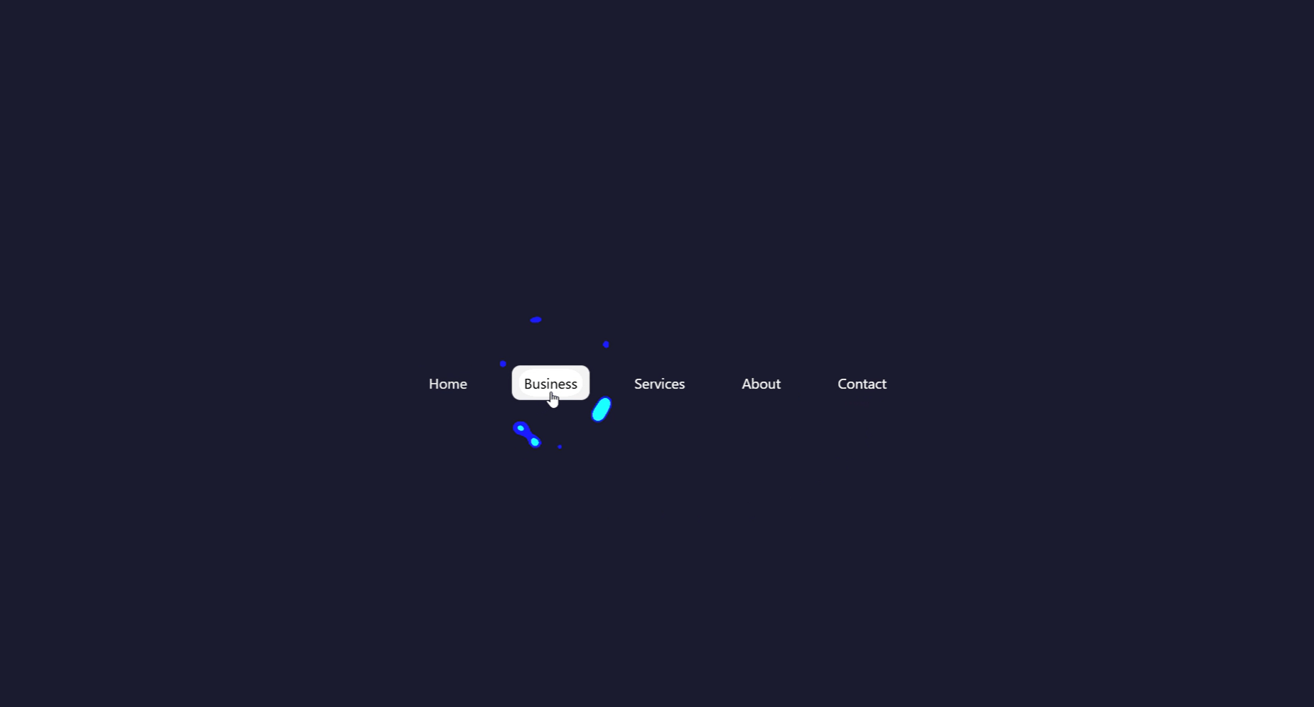
What Is Gooey Navigation?
Gooey navigation is an interactive menu component where elements appear to melt and merge into each other as the active state moves between items — like blobs of liquid morphing together. The effect is achieved by combining CSS blur filters with a contrast filter on a parent wrapper, which causes nearby blurred shapes to visually fuse at their edges, creating organic liquid-looking transitions.
First popularized by creative developer Lucas Bebber, the gooey technique has since become a staple of creative UI design, appearing on portfolios, tech landing pages, gaming interfaces, and any project that wants to stand out from conventional navigation patterns.
Why Use Gooey Navigation on Your Website?
How the Gooey Effect Works — Step by Step
The secret behind gooey navigation is a clever CSS filter trick. Here's how each layer contributes to the final liquid effect.
HTML Menu Structure
Build a <nav> wrapper containing a list of icon-based menu items.
A separate <div> acts as the "blob" — an absolutely-positioned
background element that moves underneath the active item. This blob is what gets
the gooey filter applied to it.
CSS Blur + Contrast — The Gooey Trick
Apply filter: blur(Xpx) to the blob element, then wrap the entire
nav in a parent with filter: contrast(20). When a blurred shape
and a sharp shape overlap, the high-contrast filter causes their edges to
merge visually — producing the organic liquid fusion that defines the gooey effect.
JavaScript — Moving the Blob
A click (or hover) event listener reads the offsetLeft and
offsetWidth of the clicked menu item, then updates the blob's
left and width CSS properties. A CSS
transition on the blob handles the smooth slide between positions.
Responsive Sizing with CSS Variables
All spacing, blob size, and color values are stored in :root CSS
variables. This makes it trivial to adjust the navigation for different breakpoints
or to retheme the whole component by changing one or two values.
filter: contrast().
If your icons appear outside the contrast wrapper, they won't merge — keep everything
inside the same container.
filter: contrast() trick can cause
clipping on Safari for some combinations of blur and contrast values. Test on real iOS/macOS
devices and adjust the blur radius down if elements appear cut off.
Best Practices & Common Mistakes
Follow these guidelines to get the smoothest gooey effect and maintain good performance across all devices.
- Keep the blob and icons inside the same contrast-filter parent
- Use
transitionon the blob'sleftandwidthfor smooth sliding - Set
overflow: hiddenon the nav wrapper to prevent blob overflow - Use CSS variables for colors and sizes — makes theming instant
- Test on real mobile devices to verify touch interaction
- Apply gooey filters to large full-page elements — keep it scoped to the nav
- Use very high
blurvalues — they make the fusion look unclean - Stack multiple filtered elements without testing — compositing layers can get expensive
- Ignore keyboard navigation and focus states — accessibility matters
- Forget to add an active class on page load so users always see a selected state
Frequently Asked Questions
How does the CSS gooey filter actually work?
filter: blur() on child elements with
filter: contrast() on their parent. At low contrast, blurred shapes
simply look soft. But at very high contrast (e.g., contrast(20)), the
blurred edges get crushed back to solid — and where two blurred shapes overlap,
their edges merge together, creating the organic liquid fusion look.
Do I need a library or framework?
Which browsers support the CSS gooey filter technique?
filter property fully.
Safari supports it but may require additional testing for the contrast+blur
combination, especially on older iOS versions. Internet Explorer does not support
CSS filters at all.
Can I change the number of menu items?
<li> items in the HTML. The JavaScript
reads each item's position dynamically using offsetLeft and
offsetWidth, so it automatically adapts to however many items
you have without any hardcoded values.
Is this good for SEO and AdSense?
<nav>, <ul>,
and <li> elements with proper <a> tags, which
search engines can crawl without any issues. The interactive enhancement is purely
visual — the underlying links work with JavaScript disabled too.
How do I change the gooey color?
--blob-color CSS variable in :root. The icon colors
can be controlled separately so active items contrast well against the blob.
Conclusion
Gooey navigation is one of the most visually distinctive UI patterns you can build with web technologies. By combining CSS blur and contrast filters with a small JavaScript blob-tracking script, you get a fluid, organic navigation experience that looks far more complex than it actually is.
The technique is adaptable — use it as a bottom tab bar on mobile, a pill-style top nav on desktop, or even a sidebar with animated blob indicators. Adjust the blur radius, contrast value, and transition duration to match your project's personality.
Found this useful? Explore the related projects in the sidebar for more modern UI effects built with HTML, CSS, and JavaScript.