What You'll Build
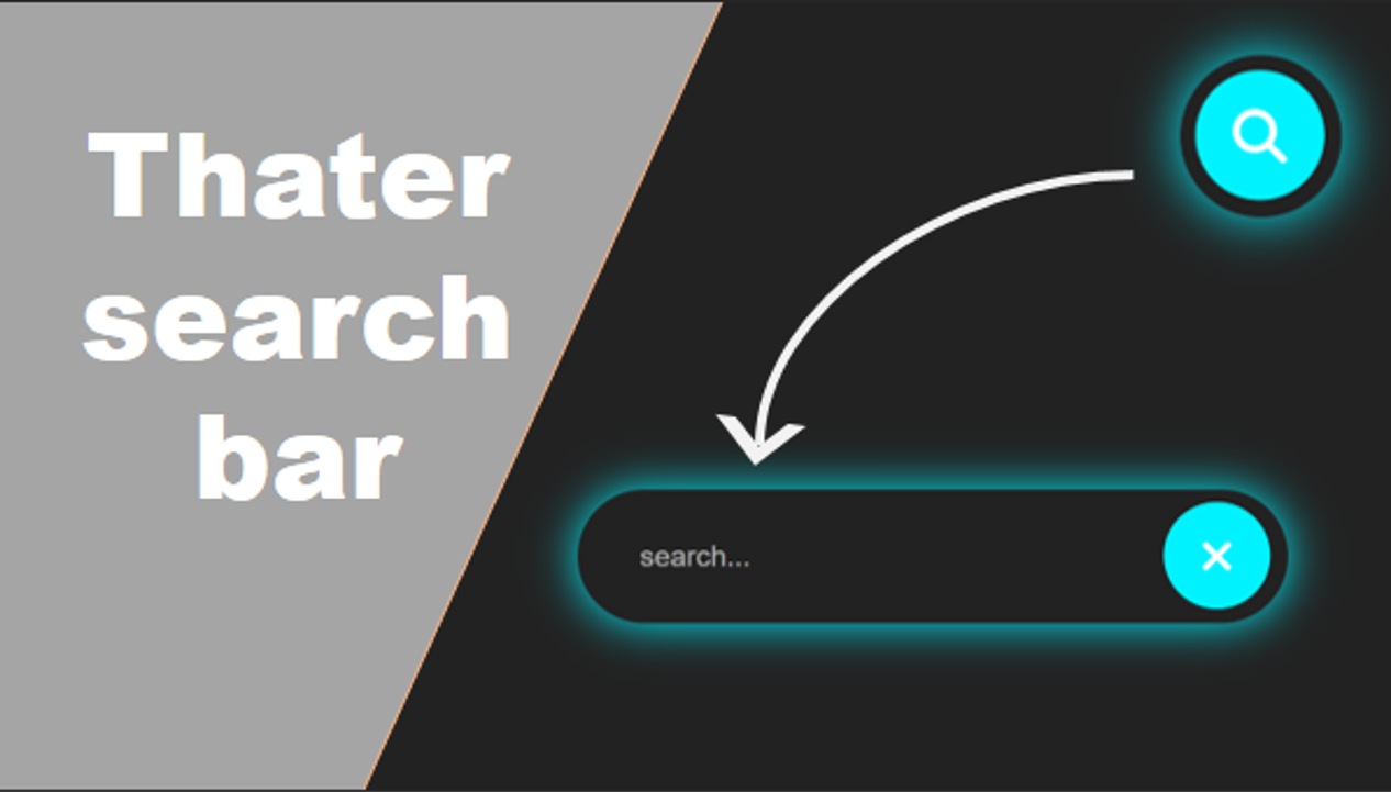
In this tutorial, you'll build a theater-style search bar entirely from scratch — no JavaScript, no libraries, just HTML and CSS. The search bar features a floating placeholder effect where the label smoothly animates above the input when the user focuses or types, all wrapped in a dark cinematic theme with glowing accents.
This project is perfect for beginners who want to practice CSS positioning, pseudo-classes, transitions, and responsive design in one visually impressive, production-ready component.
Key Features of This Search Bar
:focus and :not() pseudo-classes.
box-shadow and text-shadow activate on focus to simulate
neon tube lighting.max-width and relative units so the bar scales cleanly on any
screen size.<label> association, focus-visible outlines, and
sufficient color contrast.transition on font-size, top position, and color creates a fluid
floating animation.Full Source Code (Free)
The project uses two files: HTML for the search bar structure and CSS for the theater theme, floating animation, and glow effects. Use the tabs to switch between them.
index in
your browser. The floating placeholder animation works immediately — no server or build step required.
How It Works — Step by Step
Here's a breakdown of the eight core techniques behind this theater search bar, from HTML structure to the final glow effect.
Create the HTML Input Structure
Build a wrapper <div> containing an <input>
field and a <label> element. The label serves double duty —
it's both the accessible label and the visual floating placeholder. A space character
in the placeholder attribute enables the
:not(:placeholder-shown) trick.
Style the Container with Dark Theme
Apply a deep dark background, subtle border, and border-radius
to the wrapper. This creates the theater-inspired container that frames the
input field. A slight padding gives the floating label room to
animate above.
Position the Label as Floating Placeholder
Use position: absolute to place the label inside the input area
at a vertical center point. Set initial styles — larger font-size, muted color,
and a pointer-events: none so clicks pass through to the input beneath.
Add CSS Transitions for Float Animation
Apply transition properties to the label covering
top, font-size, color, and
background. A duration of 0.2s–0.3s with
ease timing creates a smooth, natural float.
Handle :focus and :not(:placeholder-shown)
Two CSS selectors trigger the float:
input:focus + label activates when the input gains focus, and
input:not(:placeholder-shown) + label activates when the input
has content. Both transform the label to a smaller size, positioned above the field.
Add Glow Effects and Theater Styling
On :focus, apply box-shadow to the container with
cyan/blue tones at multiple blur levels. Add text-shadow to the
floating label. This creates the neon theater glow that makes the component
feel cinematic.
Make It Responsive
Wrap the search bar in a container with max-width: 600px and
width: 90%. Use rem or em for font sizes
so the entire component scales proportionally on mobile, tablet, and desktop.
Add Accessibility Features
Ensure the <label for="..."></label> matches the input's
id. Add :focus-visible outlines for keyboard navigation.
Verify that the label text contrast meets WCAG guidelines in both resting and
floating states.
:not(:placeholder-shown) pseudo-class
is supported in all modern browsers (Chrome 47+, Firefox 51+, Safari 9+, Edge 14+).
If you need to support very old browsers, a tiny JavaScript fallback can toggle a class
on the input event — but for 2025, CSS-only is fully sufficient.
HTML & CSS Concepts Used
This project covers these fundamental-to-intermediate web development techniques:
- CSS Absolute Positioning — Placing the label inside the input area and controlling its
vertical position with
top. - CSS Transitions — Smoothly animating
top,font-size, andcolorproperties when states change. - :focus Pseudo-class — Detecting when the input is active and triggering the float effect.
- :not(:placeholder-shown) — Detecting when the input has typed content to keep the label floated.
- Adjacent Sibling Selector (+) — Targeting the label that immediately follows the input in the DOM.
- CSS box-shadow & text-shadow — Layered shadow values to create the neon theater glow effect.
- CSS Custom Properties — Using
var(--color)for easy theming and color changes. - Responsive Design —
max-width, percentage widths, and relative units for cross-device compatibility.
Frequently Asked Questions
What is a floating placeholder in a search bar?
Can I build a floating placeholder search bar without JavaScript?
:focus and :not(:placeholder-shown) pseudo-classes.
When the input is focused or contains text, CSS transforms move the label above the field.
No JavaScript is required for the core animation. Check out our other
CSS-only projects
for more examples.
What is the theater style in web design?
How do I add a search icon inside the search bar?
Is a floating placeholder search bar responsive?
em or rem for sizing and
max-width for the container, the search bar adapts smoothly to all screen sizes
including mobile devices. The floating animation works identically regardless of container width
because it uses relative positioning values.
Is this project good for beginner developers?
Conclusion
This theater search bar with floating placeholder demonstrates how much you can achieve with pure HTML and CSS. By combining CSS positioning for label placement, :focus and :not(:placeholder-shown) pseudo-classes for state detection, transitions for smooth animation, and box-shadow for the neon glow — you get a production-quality UI component with zero dependencies.
Whether you're building a portfolio, learning CSS animations, or just want a polished search component for your next project — this technique covers the real-world CSS skills that matter. Copy the code, change the glow color, adjust the transition speed, and make it yours.
Found this useful? Explore more HTML & CSS projects in the sidebar or get in touch with questions.