What Is an Animated Input Field?
An animated input field is a form element that responds visually when users interact with it. Features like floating labels that move upward on focus, color changes on the border, and sliding underline animations create a more engaging and intuitive experience for users filling out forms.
Unlike static inputs where the label sits above or inside the field permanently, animated inputs use CSS transitions to transform the label's position, size, and color — providing clear visual feedback about which field is currently active and whether it contains data.
Why Use Animated Input Fields?
- Visual Feedback: Provides clear indication of focus and interaction, so users always know which field they're typing in.
- Better UX: Improves user experience and form completion rates by making the form feel responsive and alive.
- Modern Design: Makes your forms look sleek and professional, matching the quality expectations of modern web applications.
- No JavaScript Needed: Built entirely with HTML and CSS using
:focusand:not(:placeholder-shown)pseudo-classes. - Space Efficient: The floating label pattern saves vertical space since the label occupies the input area when empty.
Key Features
Full Source Code (Free)
The entire project lives in a single HTML file — no external CSS or JS files required.
The HTML sets up the card structure and links images from picsum.photos
for demonstration. The CSS drives every animation, transition, and responsive breakpoint.
A four-line script at the bottom removes the shimmer placeholder once each image has
loaded. Use the tabs below to explore the HTML and CSS sections separately.
index.html file.
No build tools, no npm, no libraries — open it in any modern browser and the accordion
gallery works immediately. Swap the picsum.photos URLs with your own images
to customize it instantly.
How It Works
The structure uses a <div> container with position: relative
holding three children: an <input>, a <label>, and two
decorative <div> elements for the animated underlines.
- The
<label>is positioned absolutely inside the container, centered vertically by default. - On
:focusor when content is present (:not(:placeholder-shown)), the label moves up viatransform: translateY()and scales down. - The two underline divs start at
width: 0and transition towidth: 100%on focus — one from the left, one from the right. - The input border color changes on focus with a
box-shadowglow for added emphasis.
Quick Summary: Build a text input field with HTML, style it with CSS,
and add animations for floating labels and sweeping underlines — all without JavaScript.
The key trick is using placeholder=" " (a space) so
:not(:placeholder-shown) can detect when the user has typed content.
Step 1: Structure the Input Field
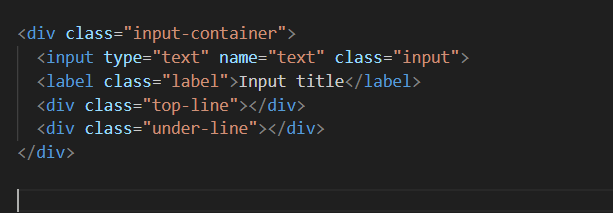
Start with a simple HTML input element wrapped in a container div. Add a label and two decorative divs for top and bottom lines that animate on focus.
Create the HTML Structure
Wrap an <input> with placeholder=" " (a space
character is required for the CSS trick to work), a <label>
linked via for attribute, and two <div> elements
with classes for the top and bottom animated lines.
Step 2: Add CSS Styling
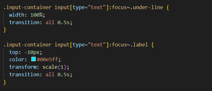
Style the input with padding, border, and transparent background. Position the label absolutely to create a floating effect. Use the decorative divs for underline animations when the input is focused.
Style the Default and Focus States
Set the container to position: relative. Style the input with a
bottom border, transparent background, and padding that accounts for the floating
label. Position the label absolutely, centered vertically. On
input:focus ~ label and input:not(:placeholder-shown) ~ label,
move the label up and scale it down.
Animate the Underlines
Position both line divs at the bottom of the container with width: 0.
On input:focus ~ .line, transition to width: 100%.
Use different left/right positioning and timing for the
staggered sweep effect.
Important: The placeholder attribute must contain a
space character (placeholder=" "), not be empty. An empty placeholder
means :placeholder-shown never matches, breaking the floating label
when users type content without first focusing the field.
Step 3: Preview the Final Effect
When the user focuses on the input, the label scales and moves upward, the top and bottom lines animate smoothly from both sides, and the border highlights — resulting in a visually appealing and interactive input field.
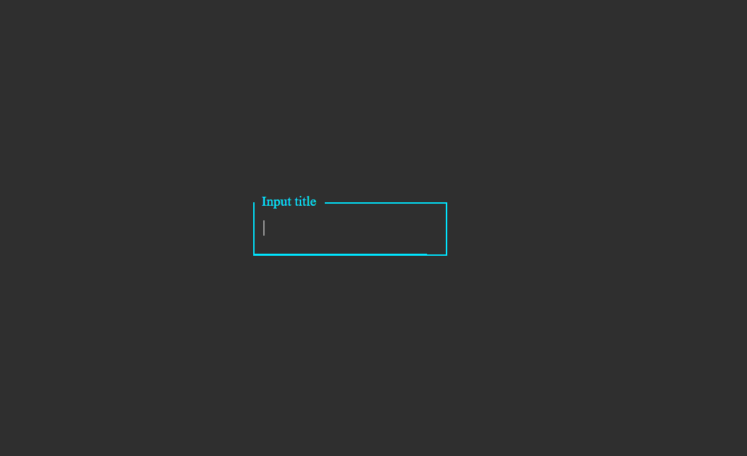
The completed input field in its default and focused states
CSS Properties Used
| Property | Purpose | Applied To |
|---|---|---|
| position: relative | Contains the absolutely positioned label and underline divs | Container |
| position: absolute | Allows the label and lines to be positioned freely inside the container | Label + Lines |
| transform: translateY() | Moves the label upward when input is focused or has content | :focus state |
| transform: scale() | Reduces the label font size proportionally when floated | :focus state |
| width transition | Animates the underline divs from 0 to 100% width | Line divs |
| :not(:placeholder-shown) | Detects when the input has typed content without JavaScript | Pseudo-class |
| box-shadow | Adds a subtle glow around the input border on focus | :focus state |
Best Practices for Input Field Design
- Use Clear Labels: Make sure the label text clearly describes what the user should type (e.g., "Full Name", "Email Address").
- Maintain Accessibility: Always link the label to the input using
the
forattribute matching the input'sid. Add:focus-visiblestyles for keyboard navigation. - Responsive Design: Use
max-widthon the container and relative padding so the input resizes gracefully on mobile screens. - Smooth Animations: Keep transition durations between 0.2s and 0.4s for a feel that's responsive but not jarring.
- Don't Remove the Placeholder Trick: The space in
placeholder=" "is essential — document it in your code so collaborators don't "fix" it by accident. - Test Without JS: Since the entire effect is CSS-based, test in browsers with JavaScript disabled to confirm it still works.
Common Mistakes to Avoid
- Overcomplicating animations — too many moving parts distract users from the actual task of filling in the field.
- Low-contrast labels — if the label becomes hard to read after floating (small size + light color), users lose context about what to type.
- Forgetting :not(:placeholder-shown) — without this, the label drops back down on blur even when the field has content, covering the typed text.
- Using an empty placeholder —
placeholder=""doesn't trigger:placeholder-showncorrectly; it must beplaceholder=" "with a space. - Neglecting focus-visible states — keyboard users need to see which field is active just like mouse users.
- Making the input too narrow — especially on mobile, cramped inputs lead to frustrating typing experiences.
Pro Tip: If you need to support very old browsers that don't
understand :not(:placeholder-shown), add a small JavaScript fallback
that toggles a .has-value class on the input when its value is non-empty.
But for all modern browsers (Chrome, Firefox, Safari, Edge), the pure CSS approach
works perfectly.
Frequently Asked Questions
How does the floating label animation work without JavaScript?
The floating label uses the CSS :not(:placeholder-shown) pseudo-class
combined with :focus. When the input is focused or has typed content
(making the placeholder not shown), the label transitions to a smaller
font-size and moves upward using transform: translateY().
This pure CSS approach eliminates the need for JavaScript event listeners.
Why is position: relative needed on the input container?
The label and the animated underline divs all use position: absolute.
Without position: relative on the parent container, these absolutely
positioned children would escape the container and position themselves relative to
the nearest positioned ancestor or the viewport, breaking the entire layout.
Can I use this input field inside a real form for submission?
Yes. The input is a standard HTML <input type="text"> element
with a name attribute. It works identically to any regular form input
— you can wrap it in a <form> and submit it via GET or POST.
The CSS animations are purely visual and do not affect the input's functionality.
How does the underline sweep animation create a staggered effect?
Two separate div elements are positioned at the bottom of the input. The first
(top line) starts from the left and expands to width: 100% on focus
with one transition-duration. The second (bottom line) starts from the
right (using right: 0 instead of left: 0) and expands
with a slightly longer or shorter duration. This timing difference creates the
staggered sweep illusion.
Does this animated input work on mobile devices?
Yes. The animation triggers on :focus, which activates when a
mobile user taps the input field. The floating label moves up and the underlines
animate in. Make sure to add adequate padding (at least 16px vertical) so the
input meets the 44px minimum touch target guideline for mobile accessibility.
Can I change the animation speed and accent color?
Yes. Adjust the transition-duration value (e.g., 0.2s
for faster, 0.5s for slower) on the label and underline elements.
To change the accent color, update the color value used in the :focus
state for the label, border, box-shadow, and underline background —
using CSS custom properties (variables) makes this a single-line change.
Conclusion
Creating an animated input field with HTML and CSS is a simple yet effective way to improve your website forms. With floating labels, animated underlines, and responsive design, you can make your forms modern, functional, and visually appealing — all without a single line of JavaScript.
The :not(:placeholder-shown) trick is the key to detecting typed content
in pure CSS. Combined with smooth transition values and careful
position: absolute placement, this technique delivers a polished UX that
rivals JavaScript-heavy form libraries.
Try it in your next project — your users will notice the difference, even if they can't quite articulate why your forms feel better to use.