What Is an Animated Navigation Bar?
An animated navigation bar adds motion and visual feedback to the user experience. Instead of static links, this design makes each icon rise and glow when selected, while a circular indicator slides smoothly beneath the active icon — giving a sense of energy and floating lift that instantly modernizes any interface.
This pattern is widely used in mobile app interfaces, developer portfolios, SaaS dashboards,
and any project requiring a clean, modern UI aesthetic. The entire effect is driven
by CSS transition properties and a tiny JavaScript active-class toggle — no heavy
libraries needed.
Why Use This Navigation Design?
How It Works — Step by Step
Four layers combine to produce the final floating nav effect. Here's how each one contributes to the animation.
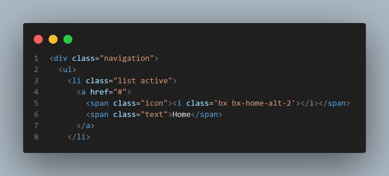
HTML Structure
Create a <div class="navigation"> wrapper containing a
<ul> with five <li> items. Each item holds a
Boxicons icon and a text label. A separate .indicator element (and its
shadow copy .indicator1) sits inside the list — this is the circular
blob that slides behind the active icon.
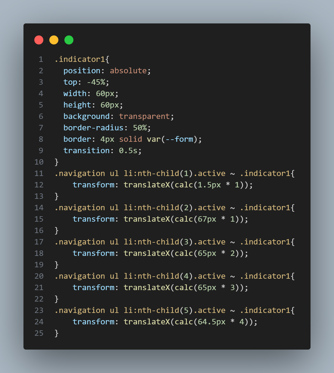
CSS — Layout & Indicator Positioning
Use Flexbox to align items evenly inside the bar. Each icon wrapper
is position: relative so the icon can translateY(-30px)
upward when active. The .indicator is position: absolute
and moves between items via a translateX() driven by CSS classes
set on each list item's nth-child.
Colors are stored in :root variables — --crl for the
bar background and --form for the indicator accent — making the whole
theme changeable in one place.
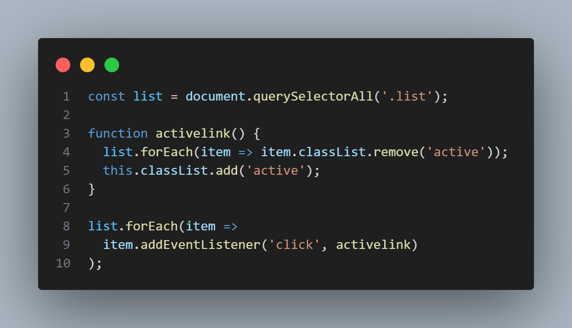
JavaScript — Active State Toggle
A concise click event listener removes the active class from all
<li> elements, then adds it to the clicked one. This single
class toggle triggers all CSS transitions simultaneously — the icon lifts, the
indicator slides, and the glow appears — with no manual animation code required.
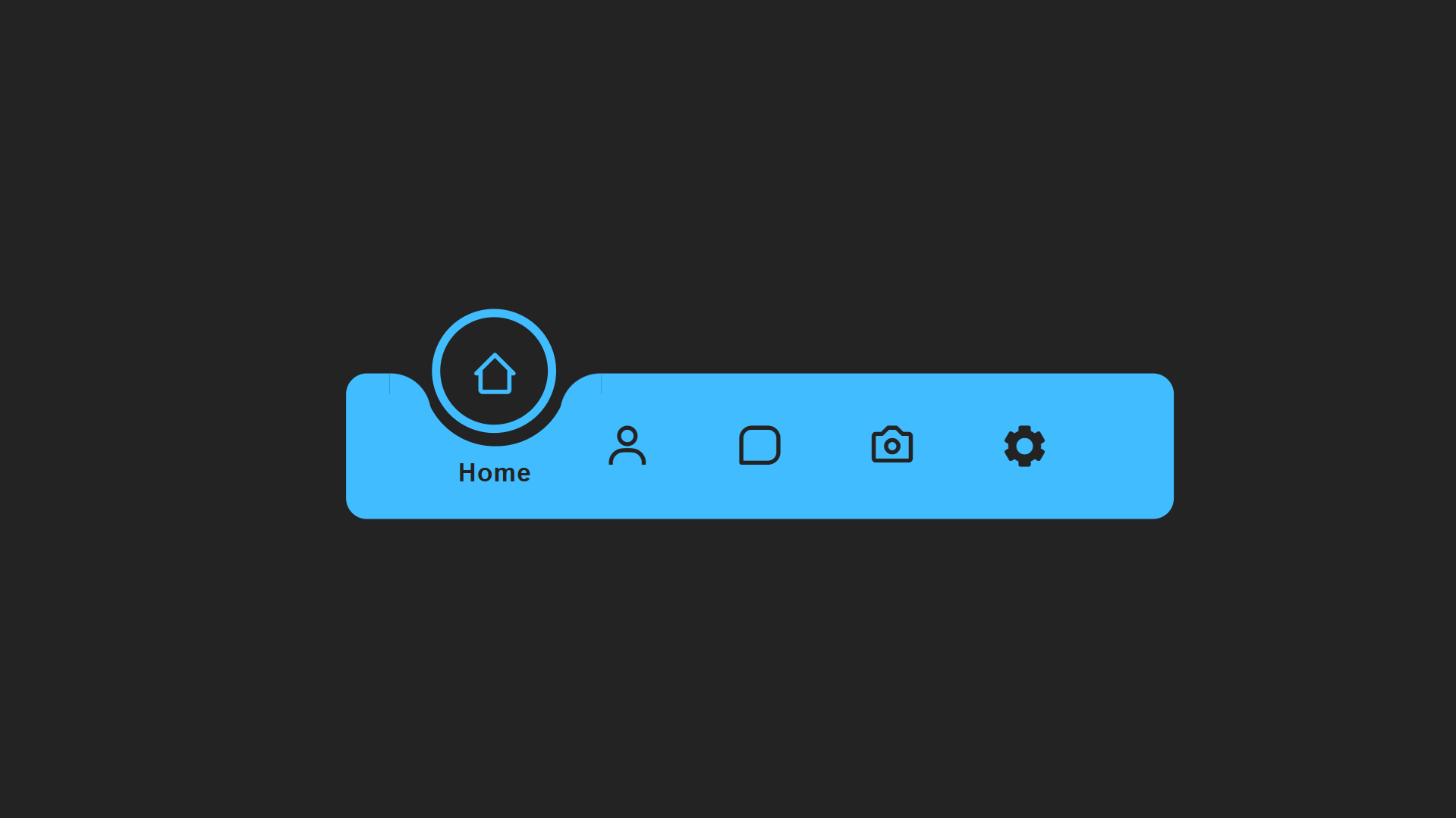
Final Result
The finished navigation bar shows icons that lift gracefully on click and a glowing circular indicator that slides smoothly to the new active position. The effect works on all modern browsers and adapts cleanly to mobile screen sizes.
transform: translateX() value changes with each active class — and
transition: 0.5s on the indicator element interpolates between those values
automatically. No JavaScript animation loop is needed.
<head>, or replace icons with any alternative icon set you prefer.
Best Practices & Common Mistakes
Follow these guidelines to keep your navigation bar polished, accessible, and performant.
- Limit navigation to the 4–6 most essential pages
- Use contrasting colors between icons and the bar background
- Store all colors in
:rootCSS variables for easy theming - Maintain consistent animation speed (
0.4s–0.6s) across all transitions - Add
aria-current="page"to the active item for accessibility
- Overcrowd the bar with more than 6 icons
- Use inconsistent icon sizes or mixed icon sets
- Forget hover and focus states — keyboard users need visible focus indicators
- Set animation duration above
0.8s— it feels sluggish - Use
pxfor widths —%orvwkeeps it responsive
Frequently Asked Questions
Can I add more or fewer navigation items?
<li> elements in the HTML, then update
the corresponding CSS nth-child rules that control the indicator's
translateX() position for each item. The JavaScript requires no changes —
it loops over all list items dynamically.
How do I change the indicator color?
--form variable in the :root block of the CSS
file and update it to any color value. This single variable controls the indicator
background, the icon glow, and any accent highlights throughout the component.
Does this navigation work without JavaScript?
:focus-within or checkbox hack, but JavaScript provides
the cleanest and most reliable solution for this interaction.
Which browsers support CSS transitions used here?
transform, transition, and translateY/X
fully. Internet Explorer 11 supports transitions but not all transform values without
vendor prefixes.
Can I use this as a bottom tab bar on mobile?
.navigation element with
position: fixed; bottom: 0; left: 0; width: 100% to pin it to the
bottom of the viewport on mobile screens. Use a media query to apply these rules
only below your mobile breakpoint if you want it to float only on small screens.
Do I need any framework or build tool?
index.html in any browser.
Conclusion
The animated floating navigation bar is an elegant, interactive design
that instantly modernizes any website. By combining CSS custom properties,
transform transitions, and a minimal JavaScript class toggle, you get a
polished, immersive navigation experience with virtually no performance overhead.
The technique is highly adaptable — use it as a bottom tab bar on mobile apps, a centered pill nav on desktop landing pages, or a sidebar with a sliding vertical indicator. Change the accent color, swap the icons, adjust the transition speed, and make it yours.
Found this useful? Explore the related projects in the sidebar for more modern UI effects built with HTML, CSS, and JavaScript.