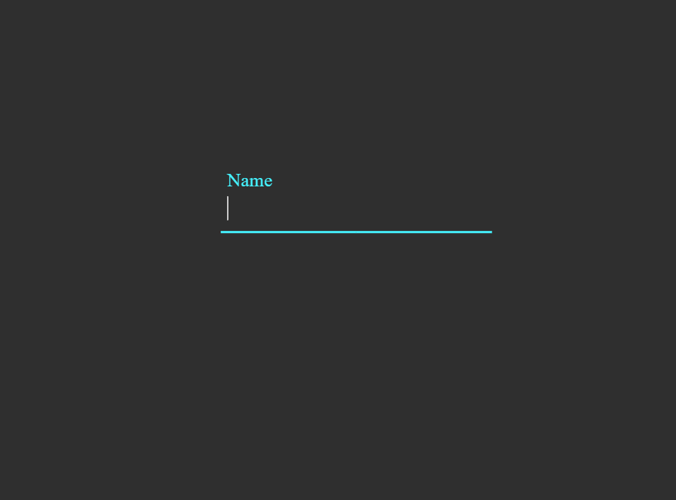
What You'll Build
This tutorial walks you through creating a Floating Label Input Effect using only HTML and CSS. The result is a clean, modern animated form input where the placeholder label sits inside the field at rest, then smoothly floats upward and shrinks when the user focuses the input or begins typing — a staple of contemporary form UI design.
The floating label pattern improves usability and accessibility: users always know what a field is for, even after they start typing, because the label never disappears — it simply repositions itself above the input. When combined with an animated underline and CSS color transitions, the result is a polished, production-ready form component.
:focus and :valid
pseudo-class selectors on the <input> to detect interaction state, and CSS
transition with transform and font-size changes on the
<label> to animate it into the floating position — no JavaScript required.
Key Features of This Floating Label Input
transform: translateY() and font-size — smooth, readable, and elegant.:focus detects when the input is active;
:valid keeps the label floating once content has been entered.transform: scaleX(), adding a satisfying visual feedback cue.transition on color to reinforce the active state clearly.<label> element linked via for
and id ensures screen readers correctly associate labels with inputs.How It Works — Step by Step
Here's a breakdown of the two core layers that power this floating label input effect.
HTML Structure
The markup wraps each input and its label inside a shared container element —
typically a <div class="form-group">. Inside, the
<input> comes before the <label> in the
source order. This ordering is intentional: it allows the CSS adjacent sibling combinator
(input + label or input ~ label) to target the label based on
the input's state, which is the entire mechanism behind the CSS-only floating effect.
The required attribute on the input is also important — it enables the
:valid selector to fire correctly once the field has content.
CSS — Label Float & Underline Animation
All the interaction lives in CSS. By default, the <label> is
absolutely positioned inside the form group, sitting at the baseline of the input field
to mimic a placeholder. When the input receives :focus, or when it becomes
:valid (meaning the user has typed something), the adjacent label is
targeted with a sibling selector: input:focus ~ label, input:valid ~ label.
At this point, CSS applies transform: translateY(-1.4rem) and a smaller
font-size to animate the label upward into the floating position.
Simultaneously, an animated underline — a ::after pseudo-element
with transform: scaleX(0) at rest — expands to scaleX(1)
on focus, growing from the center outward to complete the polished effect.
A transition property on both elements ensures all changes animate
smoothly at a comfortable speed.
<input> element
must appear before the <label> in the HTML. CSS can only select
elements that come after a target in the source — there is no "previous sibling"
selector in CSS. If the label is placed first, the :focus ~ label technique
will not work. Use position: absolute on the label to visually layer it over
the input regardless of DOM order.
Understanding :focus and :valid
The :focus pseudo-class matches an input element exactly while it has keyboard
focus — the moment the user clicks or tabs into the field. The :valid
pseudo-class matches when the input's value satisfies its constraints (for a
required text input, this means the field is not empty). Together they cover
both active typing and the state after the user moves on, ensuring the label stays floating
so it never obscures filled-in content.
The Animated Underline
The underline decoration is built using a CSS ::after pseudo-element on the
form group container. At rest, it has width: 100% but
transform: scaleX(0), making it invisible. On focus, it transitions to
scaleX(1) with transform-origin: center, so it expands outward
from the middle of the field — a widely recognized UX pattern from Material Design that
users immediately associate with an active, interactive input field.
Get the Source Code
The full source code is available for free. Scroll down and wait for the countdown to finish to get the GitHub Gist link. Or explore the code preview below.
/* Loading source code... */index.html in
your browser. No server or build tool required — the floating label effect renders instantly.
Make sure to include the required attribute on your inputs so the
:valid selector fires correctly once the field has content.
Frequently Asked Questions
What is a floating label and why use it?
placeholder, the label never disappears once typing starts,
so users always know what information a field is asking for. This improves both usability and
accessibility, especially on long forms where context is easy to lose.
How does the label animate without JavaScript?
<label> is absolutely
positioned inside a relative container so it overlays the input visually. When the input
receives :focus or becomes :valid, a CSS sibling selector
(input:focus ~ label) targets the label and applies
transform: translateY() and a smaller font-size. A
transition on the label smooths the position and size change over time —
producing the floating animation with zero JavaScript.
Why does the input need to come before the label in HTML?
~ (general sibling) only work forward in the DOM —
they can select elements that appear after the reference element, never before.
Since we need to select the label based on the input's state (:focus,
:valid), the <input> must come first in the HTML source.
Absolute positioning on the label then lets us layer it visually over the input regardless of
source order.
Can I customize the colors and animation speed?
--label-color
for the default label color, --focus-color for the active state accent, and
adjust the transition duration on the label and underline to speed up or slow
down the animation. Swap the underline color to match any brand palette instantly.
Is this accessible for screen reader users?
<label> element connected to the
input via matching for and id attributes, screen readers correctly
announce the label when the input receives focus — the same behavior as any standard form.
Unlike styling a placeholder alone (which disappears on input and has poor
contrast support), this approach fully meets accessibility expectations for labelled form
controls.
Conclusion
The Floating Label Input Effect demonstrates just how expressive modern CSS has become. By combining CSS sibling selectors with the :focus and :valid pseudo-classes, smooth transition animations, and a scaleX underline effect, you get a production-ready, accessible animated form component with absolutely zero JavaScript and zero external dependencies.
This technique is highly versatile: use it for login forms, registration pages, contact forms, checkout flows, or any UI where clean, modern input design matters. Adjust the label color, underline accent, animation timing, and typography to match your design language in minutes — all through CSS custom properties.
Found this useful? Explore more HTML & CSS projects in the sidebar →