What You'll Build
This tutorial walks you through creating a premium 3D flipping card component that's perfect for portfolio projects, profile cards, or product showcases. Here's what makes it special:
Step-by-Step Build Guide
Create the HTML Structure
Start by creating a .card container with a .content wrapper inside.
Within .content, add two child divs: .front and .back.
The front holds your static content, while the back contains the hidden content revealed on flip.
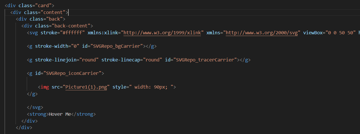
The nested structure enables proper 3D transform inheritance
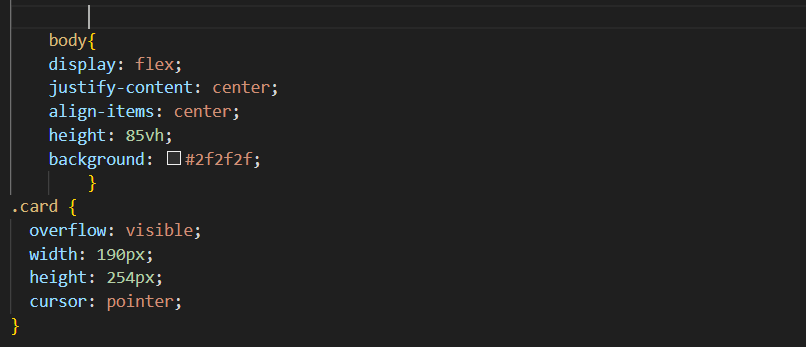
Center the Card with Flexbox
Apply display: flex, justify-content: center, and
align-items: center to the body. Set a dark background to make the
glowing effects visible against the page.
min-height: 100vh on the body ensures
the card stays centered even with minimal content.
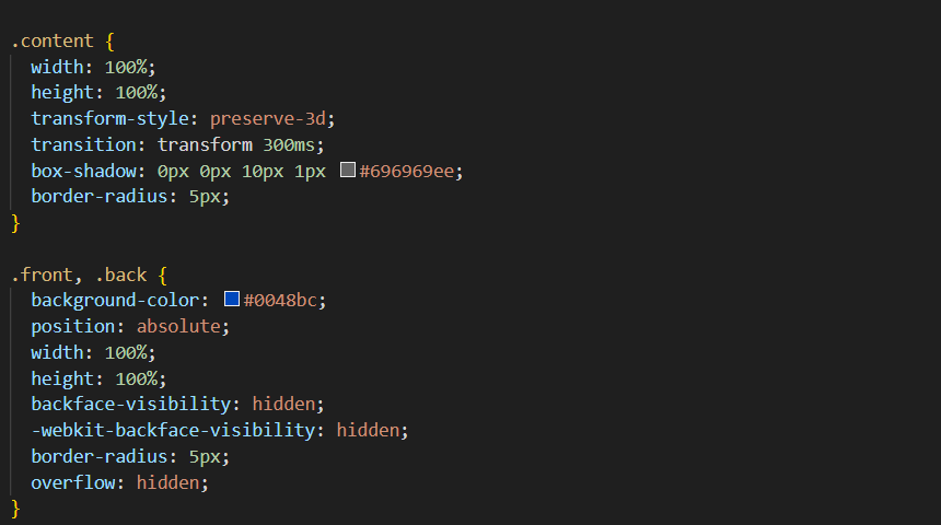
Apply 3D Perspective and Transform Style
Add perspective: 1000px to the .card element and
transform-style: preserve-3d to .content. This enables
true 3D transformation on child elements.
Perspective creates depth; preserve-3d enables child 3D transforms
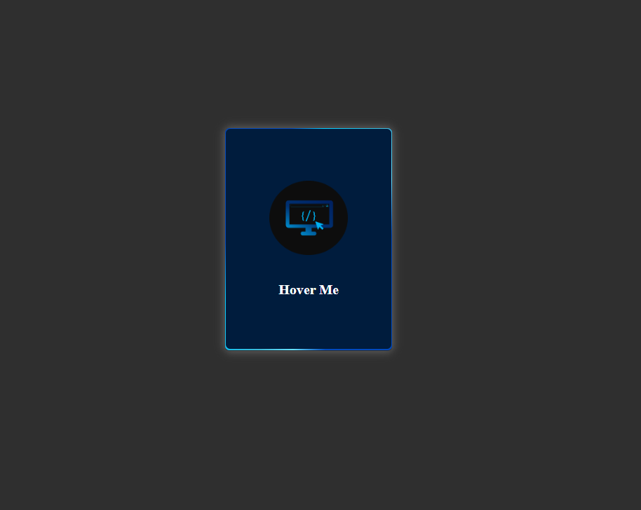
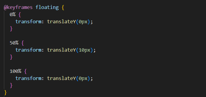
Design the Front Face with Floating Glow
The front side includes animated glowing circles and your main content.
Create circular elements with border-radius: 50%, apply
box-shadow for the glow, and use @keyframes floating
for smooth vertical motion.
Create the Animated Back Face
The .back features a gradient line that rotates infinitely using
@keyframes rotation. The .back-content sits above
this animation, holding your logo and call-to-action text.
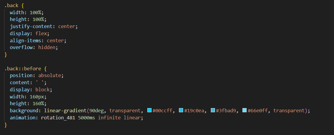
.front and .back must have
backface-visibility: hidden, and the back needs
transform: rotateY(180deg) to be pre-positioned correctly.
Trigger the Flip on Hover
Add this single CSS rule to complete the flip effect:
.card:hover .content {
    transform: rotateY(180deg);
}
Combined with a transition on .content, this creates the smooth
180-degree rotation that reveals the back face.
Final Customization
Adjust these key properties to match your design:
- Colors: Modify
box-shadowandlinear-gradientvalues - Speed: Change
transition-durationandanimation-duration - Depth: Adjust
perspective(lower = more dramatic) - Glow intensity: Modify
filter: blur()amounts
Full Source Code (Free)
The entire project lives in a single HTML file — no external CSS or JS files required.
The HTML sets up the card structure and links images from picsum.photos
for demonstration. The CSS drives every animation, transition, and responsive breakpoint.
A four-line script at the bottom removes the shimmer placeholder once each image has
loaded. Use the tabs below to explore the HTML and CSS sections separately.
🔓 Full Source Code unlocks in
Hosted on GitHub Gist — free, no sign-up required
index.html file.
No build tools, no npm, no libraries — open it in any modern browser and the accordion
gallery works immediately. Swap the picsum.photos URLs with your own images
to customize it instantly.
CSS Properties Reference
Quick reference for the key CSS properties used in this project:
| Property | Purpose | Value Used |
|---|---|---|
perspective |
Sets 3D viewing distance | 1000px |
transform-style |
Enables 3D for children | preserve-3d |
backface-visibility |
Hides element when rotated away | hidden |
transform: rotateY() |
Rotates element on Y-axis | 180deg |
filter: blur() |
Creates glow/blur effect | 15px |
conic-gradient() |
Creates rotating color gradient | custom |
backface-visibility property
may need -webkit- prefix for older Safari versions.
Frequently Asked Questions
How does the 3D flip work without JavaScript?
transform-style: preserve-3d to enable 3D space for children.
The front face has no rotation while the back is pre-rotated 180 degrees. Both have
backface-visibility: hidden. On hover, the parent rotates 180 degrees,
hiding the front and revealing the back — all in pure CSS.
What is the purpose of perspective?
perspective property defines how far the viewer is from the z-plane.
A lower value (like 500px) creates a more dramatic, distorted 3D effect, while a higher
value (like 1500px) makes it more subtle. Without perspective, 3D transforms appear flat.
How is the glowing effect created?
box-shadow values with rgba colors and
filter: blur(). For animated glow, @keyframes cycle through
different shadow values. The rotating gradient line uses conic-gradient()
animated with transform: rotate().
Can this work on mobile/touch devices?
:active
instead of :hover, adding a JS touch listener to toggle a class, or
showing both sides stacked vertically on mobile via media queries.
What is backface-visibility and why is it important?
backface-visibility: hidden makes an element invisible when rotated away
from the viewer. Without it, both faces would show simultaneously during the flip,
creating a mirrored effect. This property is essential for flip card effects.
How do I change the glow colors and animation speed?
box-shadow rgba values and linear-gradient color stops
for colors. Adjust transition-duration for flip speed and
animation-duration in @keyframes for glow/particle speed.
Change cubic-bezier timing to alter animation easing.
Conclusion
You've successfully built a premium 3D flipping card with these features:
- Smooth 180-degree Y-axis flip animation on hover
- Animated glowing edges with rotating gradient lines
- Floating particle effects with keyframe animations
- Zero JavaScript — pure HTML and CSS solution
- Fully responsive design for all screen sizes
- Easy to customize colors, speed, and effects
This component is perfect for portfolio cards, team member profiles, product showcases, or any interactive UI element that needs a modern, futuristic touch.