What Is an Animated Button?
An animated button is a UI element that responds visually when users interact with it. Animations such as color changes, shadow glows, scaling transforms, and background expansions add life to buttons — making them more engaging and improving the overall user interaction experience.
Unlike static buttons that only change color on hover, animated buttons use CSS transitions and pseudo-elements to create multi-layered effects that feel polished and professional, signaling quality and attention to detail in your design.
Why Use an Animated Subscribe Button?
- Visual Appeal: The glowing effect and smooth expansion immediately catch the user's attention, drawing focus to your call-to-action.
- Better Engagement: Animated buttons encourage users to click and interact, which can directly improve subscription conversion rates.
- Modern Design: Adds elegance and professionalism to your site, making it feel current and well-crafted.
- Lightweight: Built only with HTML and CSS — no JavaScript libraries or frameworks required, resulting in faster page loads.
- Easy to Customize: Change colors, sizes, and animation timing with just a few CSS variable tweaks.
Key Features
How It Works
The button uses a single HTML element with a ::before pseudo-element for the
background fill effect. Here's the breakdown:
overflow: hiddenon the button keeps the expanding pseudo-element contained within the rounded corners.::beforestarts withheight: 0and transitions toheight: 100%on hover, creating the upward fill.transform: scale(1.05)on hover gives the button a subtle "lift" effect.- Multiple
box-shadowlayers on hover produce the neon glow. transitionwithcubic-beziereasing ensures the animation feels natural and responsive.
Quick Summary: Create a button with HTML, style it with CSS, and add hover animations for scaling, glowing shadows, and background expansion effects — all without a single line of JavaScript.
Step 1: Structure the Button
Start with a simple HTML button element. This will act as the base for applying all
the CSS effects. You can also use an <a> tag if the button links
to a subscription page.
Create the HTML Element
Add a <button> or <a> element with the
text "Subscribe" inside your page body. Wrap it in a container if you need
centered positioning.
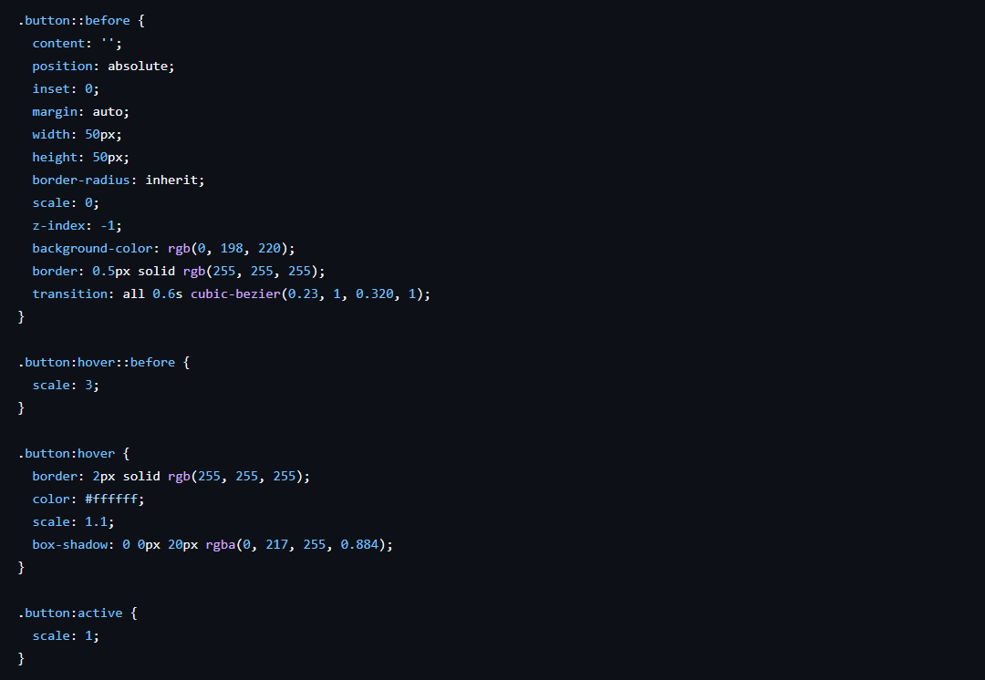
Step 2: Add CSS Styling
Style the button with padding, rounded corners, and a border color. Then use
::before for the background expansion effect. Add hover animations
for scale and glowing shadows.
Apply Base Styles and ::before
Set padding, border-radius, position: relative, overflow: hidden, and the initial colors. Create the ::before pseudo-element with absolute positioning, starting at height: 0 from the bottom.
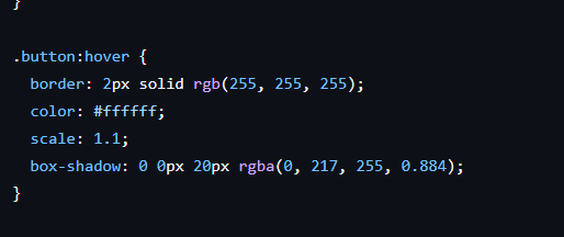
Add Hover Effects
On :hover, set ::before { height: 100% },
transform: scale(1.05), update text color, and apply multiple
box-shadow layers for the glow. Add transition
with cubic-bezier easing to the button and pseudo-element.
Important: Don't forget position: relative on the
button and position: absolute on ::before. Without these,
the pseudo-element will not be contained within the button.
Step 3: Preview the Final Effect
When users hover over the button, it expands smoothly from bottom to top, changes text color for contrast, scales up slightly, and adds a glowing shadow — resulting in a polished, modern subscribe button that feels alive.

The completed button in its default and hover states
CSS Properties Used
| Property | Purpose | Applied To |
|---|---|---|
| transform: scale() | Subtly enlarges the button on hover for a lift effect | :hover |
| box-shadow | Creates the multi-layered neon glow effect | :hover |
| ::before + height | Animates the background fill from bottom to top | Pseudo-element |
| overflow: hidden | Contains the ::before expansion within border-radius | Base state |
| transition | Controls animation speed and easing curve | Base state |
| border-radius | Rounds the button corners for a modern look | Base state |
| cubic-bezier() | Custom easing for natural, non-linear animation feel | transition |
Best Practices for Button Design
- Keep It Clear: Use short, action-oriented text (e.g., "Subscribe", "Sign Up"). Avoid vague labels.
- Maintain Contrast: Ensure text is always readable against the background — both in default and hover states.
- Responsive Design: Use relative units (rem, em) for padding and font-size. Make sure the button scales well on mobile devices with a minimum touch target of 44x44px.
- Smooth Animations: Use easing functions like
cubic-bezier(0.4, 0, 0.2, 1)for natural transitions. Avoid overly fast or jarring movements. - Accessibility: Add
:focus-visiblestyles that mirror the:hovereffect so keyboard users get the same experience. - Performance: Only animate
transformandopacitywhen possible for GPU-accelerated, jank-free animations.
Common Mistakes to Avoid
- Overusing animations — too many effects make the button distracting rather than attractive.
- Low-contrast colors — if the text becomes hard to read during or after the animation, users won't know what the button does.
- Wrong sizing — buttons that are too large look awkward, and buttons that are too small are hard to click, especially on mobile.
- Forgetting hover/focus states — without visual feedback, users can't tell if the button is interactive, hurting accessibility.
- Missing overflow: hidden — without this, the ::before expansion will break outside the rounded corners, looking broken.
- No position: relative — the absolutely positioned ::before will escape the button and position itself relative to the page instead.
Pro Tip: Always test your animated buttons on both desktop and mobile.
CSS :hover behaves differently on touch devices — the state may persist
after tapping. Consider adding :active styles as a fallback for mobile
users.
Frequently Asked Questions
How does the background expansion animation work?
The expansion uses a ::before pseudo-element positioned at the bottom of
the button with height: 0 by default. On hover, the height transitions
to 100%, creating a smooth upward fill effect. The parent button has
overflow: hidden so the pseudo-element doesn't spill outside the rounded
corners.
Can I change the glow color without breaking the animation?
Yes. The glow is created entirely with box-shadow on the :hover
state. Simply change the rgba color values in the box-shadow declaration
to match your brand color. Make sure to also update the ::before background
color and the text color on hover for a cohesive look.
Does this animated button work on mobile devices?
Yes. Since the animation uses CSS :hover, it activates on tap for mobile
users. However, the hover state may persist after tapping on some browsers. To ensure
a clean experience, keep the hover and active states visually similar, and use media
queries to adjust button size for touch targets (minimum 44x44px).
Why is overflow: hidden important for this button design?
The ::before pseudo-element that creates the background fill expands
from bottom to top. Without overflow: hidden on the parent button, the
pseudo-element would be visible outside the button's border-radius,
creating sharp square corners that break the rounded design.
Can I use this button inside a form or does it need to be a link?
You can use either a <button> element inside a
<form>
for actual form submission, or an <a> element styled as a button for
link-based subscription flows (like Mailchimp links). The CSS works identically for both
elements — just apply the same class.
How can I make the animation faster or slower?
Adjust the transition-duration value on the button and its
::before pseudo-element. For example,
transition: all 0.2s ease
makes it faster, while transition: all 0.6s ease makes it slower. You can
also use cubic-bezier() timing functions for custom easing curves —
cubic-bezier(0.4, 0, 0.2, 1) gives a Material Design-like feel.
Conclusion
Building an animated subscribe button with HTML and CSS is a simple yet powerful way to enhance your website's interactivity. With just a few lines of CSS, you can create a glowing, modern design that encourages clicks and boosts engagement.
The combination of ::before background expansion, transform: scale(),
and multi-layered box-shadow creates a polished effect that would normally
require JavaScript — but here it's pure CSS, meaning faster load times and better performance.
Try it in your next project and make your buttons stand out. Small details like animated buttons signal quality and attention to craft, which builds trust with your audience.