What Is a Terminal Typing Animation?
A terminal typing animation is a visual effect that mimics how text appears in a command-line interface. The characters are revealed one by one — just like someone typing in real time — often paired with a blinking cursor and a delete-then-retype loop for a continuous, engaging effect.
Popularized by hacker-style and retro UI design, this effect is widely used on developer
portfolios, cybersecurity websites, tech landing pages, and creative loading screens. Unlike heavy
JavaScript-based type libraries, this tutorial achieves the entire effect through
CSS @keyframes and the steps() timing function — keeping it
lightweight, dependency-free, and easy to customize.
Why Use a Terminal Loader in Web Design?
How the Terminal Typing Effect Works — Step by Step
The core technique combines two CSS mechanisms: the steps() timing function for
character-by-character reveal, and @keyframes for the cursor blink and optional
delete-and-retype loop. Here's how each layer builds the final effect.
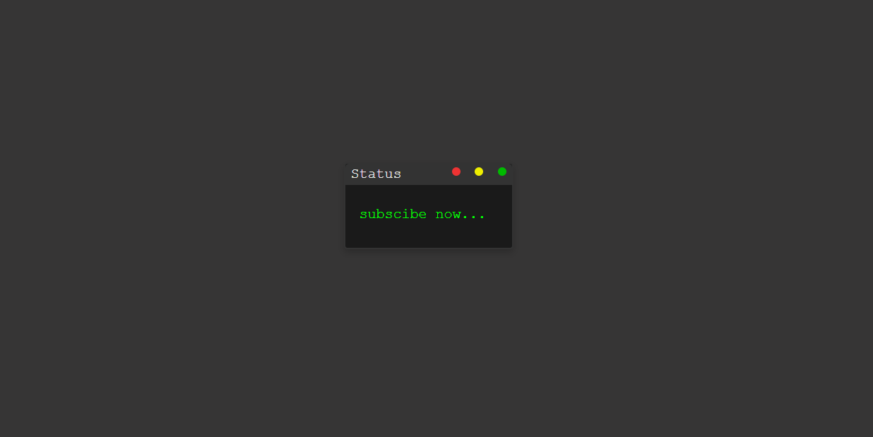
HTML Terminal Structure
Build a terminal window wrapper with a header bar containing three decorative dots (red,
yellow, green) and a body area. Inside the body, place a <span> or
<p> element that will hold the animated text. Keep the markup minimal —
the CSS does all the heavy lifting.
CSS steps() — Character-by-Character Reveal
Set a fixed width: 0 on the text element and animate it to its full width
using @keyframes. The steps(N) timing function —
where N equals the character count — makes the animation jump discretely rather than smoothly,
producing the typewriter letter-by-letter effect.
Blinking Cursor with border-right
A separate @keyframes animation toggles border-right-color
between the neon green and transparent — simulating a classic blinking
caret. Set it to animation-iteration-count: infinite so it never stops
while the text is displayed.
Delete & Retype Loop
For a continuous loop, extend the @keyframes to animate width back to
0 after reaching full width — creating the delete effect. Add a
steps(1) pause at both endpoints (full and empty) to simulate the cursor
hesitating before the next action, just like a real typist would.
overflow: hidden and white-space: nowrap
on the text element so characters hidden by the width: 0 starting state are clipped,
not wrapped — this is what makes the stepping effect work correctly.
N value in steps(N)
must match the exact character count of your text string, including spaces. A mismatch causes
uneven jumping — always count carefully before setting this value.
Best Practices & Common Mistakes
Follow these guidelines to get the most realistic effect and keep your animation smooth across all devices.
- Use
overflow: hiddenandwhite-space: nowrapon the text element - Match
steps(N)exactly to your character count - Use
border-rightfor the blinking cursor — it's the simplest approach - Test on real mobile devices at low zoom levels
- Use CSS variables for speed and color — makes tweaking instant
- Use percentage widths — they break the
steps()calculation - Animate too many instances simultaneously on one page
- Make the text too long — it may overflow on mobile
- Forget
font-family: monospace— proportional fonts break the uniform stepping - Use
steps()withease— they conflict; always pair withlinear
Frequently Asked Questions
Can I create this typing animation without JavaScript?
@keyframes and the
steps() timing function. You only need an HTML file and a CSS file.
Why must I use a monospace font?
steps() trick works by revealing the text element width in equal-sized
jumps. With a proportional font like Arial, each character has a different width, so the
steps don't align with individual characters. A monospace font (like Courier New
or monospace) gives every character the same width, making each step reveal
exactly one letter.
How do I change the typing speed?
animation-duration on the typing keyframe. A shorter duration
(e.g., 1.5s) types faster; a longer one (e.g., 4s) types slower.
You can also use a CSS variable like --type-speed: 3s in :root
to control it from one place.
Which browsers support this CSS technique?
@keyframes, steps(), and
animation — including Chrome, Firefox, Edge, and Safari (desktop and mobile).
Internet Explorer 10+ supports it too, though IE11 and below may have minor rendering
inconsistencies with border-based cursors.
Can I animate multiple different text strings?
animation-delay
values to simulate a multi-line terminal output, all in pure CSS.
Do I need any framework or build tool?
Conclusion
This terminal typing animation proves how expressive native CSS has become.
By combining @keyframes width animation with the steps()
timing function and a simple border-right cursor blink, you get a
polished, retro-futuristic UI effect with zero JavaScript and zero dependencies.
The technique is versatile — use it in hero sections, developer portfolios, loading screens, or anywhere you want to add personality and motion. Adjust the character count, swap the text, change the color, and make it uniquely yours.
Found this useful? Explore the related projects in the sidebar for more modern UI effects built with HTML, CSS, and JavaScript.