What You'll Build
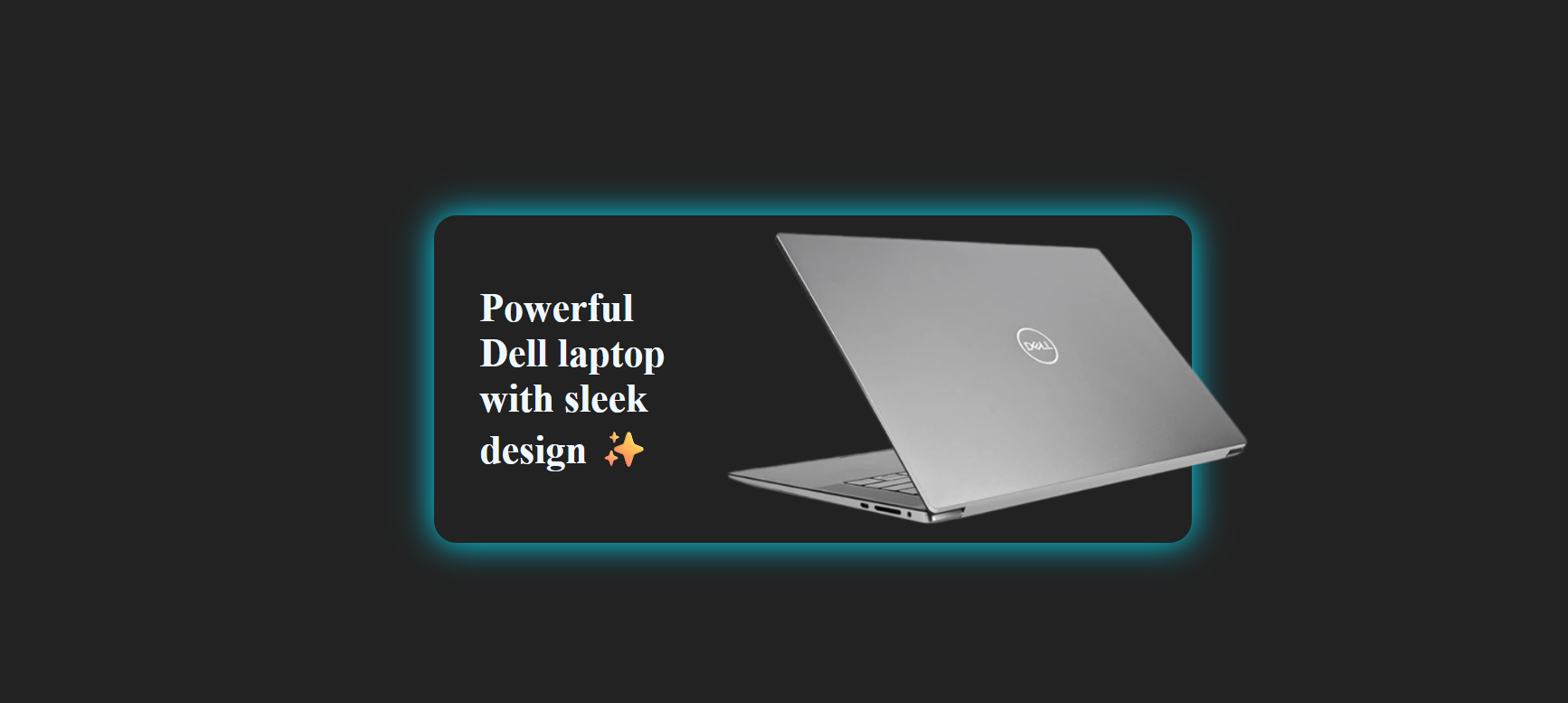
This tutorial walks you through creating a Circle to Rectangle shape animation using only HTML, CSS, and vanilla JavaScript. The result is an interactive widget that starts as a circular logo badge — displaying a brand mark like the Dell logo — and smoothly morphs into a rectangular product card on click, revealing the product name and image.
The entire animation is driven by a single CSS transition on border-radius,
width, and height. JavaScript only adds or removes a class — making this
one of the lightest interactive effects you can add to any page.
border-radius: 50% with equal
width and height (circle). On click, a JavaScript class toggle changes it to border-radius: 8px
with a wider width (rectangle). CSS transition animates every property change smoothly.
No libraries required.
Key Features of This Shape Animation
border-radius and dimension
changes via CSS — GPU-accelerated and silky smooth.click drives the full transition —
from compact circular logo to expanded product card.click listener — no extra handling needed for mobile.
index in any modern
browser and the animation runs instantly.How It Works — Step by Step
Three layers power the circle-to-rectangle animation: HTML structure, CSS transitions, and a JavaScript class toggle.
Structure the HTML
Create a single container div with two child groups: one for the circle state (holds the
logo) and one for the rectangle state (holds the product name and image). Both children sit inside the
same element. Visibility switches are handled entirely by CSS — you never need to show or hide elements
manually with JavaScript. Add a data- attribute or a meaningful class name to the wrapper
so your JavaScript can target it cleanly.
Write the CSS Transition
In the default (circle) state, set the container to equal width and height
with border-radius: 50%. Add transition: all 0.6s cubic-bezier(0.4, 0, 0.2, 1)
to smoothly animate every property. In the .expanded (rectangle) state, change
border-radius to a small value like 12px and expand width
to the desired card width. Use opacity and pointer-events to toggle
content visibility inside each state without layout jumps.
Toggle the Class with JavaScript
Select the container element and add a click event listener that calls
element.classList.toggle('expanded'). That single line is all the JavaScript this
effect needs. The class addition triggers the CSS transition which handles all the visual changes
automatically. To make it reversible, toggle removes the class on the second click,
morphing the shape back into a circle.
Polish the Content Reveal
Inside the rectangle state, stagger the appearance of child elements using
transition-delay so the product name and image fade in after the shape expansion
completes. This creates a natural two-stage reveal that feels intentional and elegant.
Apply overflow: hidden on the container to ensure no content bleeds outside the
shape boundaries during the transition.
border-radius,
opacity, and transform instead of width/height
when possible — they're GPU-composited and cause no layout reflow. If you must animate dimensions,
wrap the content in an inner element and animate it with transform: scaleX() instead
for the smoothest possible result.
Understanding border-radius as a Shape Tool
The CSS border-radius property does far more than round corners — at 50%
on an element with equal width and height it creates a perfect circle. Transitioning it to any
smaller value (like 8px or 16px) while simultaneously expanding the width
produces the circle-to-rectangle morph. Because border-radius is an animatable property,
CSS handles all the in-between frames automatically.
Best Practices for Shape Morph Animations
Keep the animation duration between 400ms and 700ms — fast enough to feel snappy, slow enough to
be legible. Use an ease-in-out or cubic-bezier curve rather than linear for a more natural physical
feel. Always provide a clear visual affordance (cursor pointer, subtle shadow, or hover scale) to
signal that the circle is interactive. For accessibility, respect prefers-reduced-motion
by wrapping your transition declarations in a media query that disables them when the user has
requested reduced motion.
Get the Source Code
The full source code is available for free on GitHub Gist. Explore the code below, copy it directly, or click Preview Result to see the live demo — then wait for the countdown to grab the full Gist link.
/* Loading source code... */// Loading source code...index, style.css,
and script.js, place them in the same folder, and open index
in your browser. The Three.js Toys library loads from a CDN automatically —
no server or install step required.
Frequently Asked Questions
How does the circle to rectangle animation work?
border-radius transitioning from 50% (perfect circle)
down to a small value like 12px (rounded rectangle), combined with width
and height changes. A JavaScript classList.toggle() call on click switches
between the two states, and the CSS transition property animates all changes smoothly.
Do I need JavaScript frameworks for this animation?
Can I customize the shape animation for other brands?
.circle-content element, update the
product name and image inside .rect-content, and change the CSS color variables to
match your brand palette. The structure scales to any brand with minimal changes.
Is the circle to rectangle animation mobile friendly?
click event, which also fires on
tap on mobile devices. Ensure the initial circle is at least 60px in diameter for a comfortable
tap target, and test on real devices since viewport sizes and tap precision vary.
How do I add a hover effect to hint the shape is clickable?
:hover rule to .shape-card with a subtle
transform: scale(1.05)
and an increased box-shadow glow. Set cursor: pointer on the element so
the pointer cursor also signals interactivity. This combination makes the clickable intent immediately
obvious to users.
Conclusion
The Circle to Rectangle Animation is a deceptively simple yet visually striking UI
technique. By transitioning border-radius and dimensions with CSS, you can transform a
compact circular logo badge into an expanding product card — all without touching a single animation
library.
Whether you're showcasing the Dell XPS, a sneaker drop, or your own product line, this morph effect keeps the brand front-and-center in the circle state and delivers richer information in the rectangle — a natural two-stage reveal that feels polished and intentional.
Found this useful? Explore more HTML, CSS & JavaScript projects in the sidebar →