What You'll Build
In this tutorial, you'll build a modern interactive image card UI from scratch — no libraries, no frameworks, just pure HTML, CSS, and vanilla JavaScript. The result is a staggered CSS Grid gallery of article cards, each with a hover zoom image effect, animated overlay gradient, and a glowing animated underline that reveals on hover.
The standout feature is a custom cursor with a text label ("Read") that follows the
pointer
across the entire page, styled with mix-blend-mode: difference for a color-inverting
blend
effect.
The cursor changes hue dynamically depending on which card column is hovered — achieved entirely
in CSS using the modern :has() relational selector, with no JavaScript logic beyond
tracking pointer coordinates.
This is an ideal advanced CSS animation tutorial for developers who want to push beyond basic hover states into interactive UI design that feels production-ready. It's also a great animated portfolio layout CSS project — the kind that makes visitors stop scrolling.
Key Features of This Interactive Card UI
pointermove and CSS custom properties.
translate: 0 50% — a
pure CSS
stagger pattern, no JS.overflow: hidden cards using
a CSS
custom property toggle.:root:has(article:nth-of-type(even):hover).
:focus-within for full keyboard
accessibility with a
colored outline.Full Source Code (Free)
The project is built in a single HTML file: the markup contains the card articles
and cursor elements, the <style> block handles all animations and layout,
and a small <script> at the bottom tracks pointer position.
Use the tabs to explore each part.
index.html file and open it in your browser — no server, no build step, no
dependencies.
The custom cursor activates immediately when you hover over any card.
How It Works — Step by Step
Here's the full breakdown of the eight core techniques that power this interactive image card hover animation.
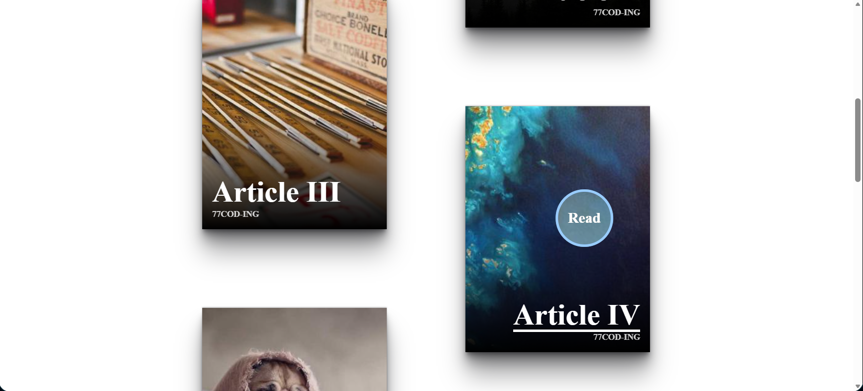
Card HTML Structure
Each card is an <article> containing an <img>
and an <a> with two <span> elements: the article
title and the author name. Two fixed <div class="cursor"> elements
are placed at the end of the body — one for the color circle, one for the blended text
label.
CSS Grid Staggered Layout
At 600px+, body becomes a two-column CSS grid with
grid-template-columns: auto auto. Even-indexed articles receive
translate: 0 50%, shifting them down by half their height. This creates
the Pinterest-style offset grid with zero JavaScript — a pure
CSS grid responsive layout pattern.
Custom Cursor Positioning via CSS Variables
The cursor div uses position: fixed with
translate: calc((var(--x) * 1px) - 50%) calc((var(--y) * 1px) - 50%).
JavaScript listens for pointermove on document.body
and calls document.documentElement.style.setProperty('--x', x) on every
frame. This is the entire JS for the custom cursor effect — 4 lines.
CSS mix-blend-mode: difference
Setting mix-blend-mode: difference on the cursor makes it
invert the colors of everything beneath it. A white cursor over a dark background
appears white; over a light image, it appears dark. This is what creates the
CSS blend mode effect that looks like an expensive design tool cursor —
no JavaScript color detection needed.
Context-Aware Hue with :has()
The cursor color is driven by a --hue CSS variable:
--color: hsl(var(--hue) 100% 80%). Two CSS rules —
:root:has(article:nth-of-type(odd):hover) { --hue: 320; } and
:root:has(article:nth-of-type(even):hover) { --hue: 210; } —
change the hue depending on which column is active. This is the
CSS :has() selector functioning as reactive state with no JS.
Hover Zoom Image with --hover Property
article:hover { --hover: 1; } sets a custom property.
The image reads it: scale: calc(1 + (var(--hover) / 5)) —
so at rest the scale is 1, on hover it becomes 1.2. Combined with
overflow: hidden on the article, the zoom is clipped cleanly.
This is the CSS hover zoom image effect pattern.
Animated Underline on the Title Span
The title <span> gets an ::after pseudo-element
styled as a 4px high bar. Its scale is var(--hover, 0) 1:
width 0 at rest, width 1 (full) on hover. For odd cards,
transform-origin: 0 50%
makes it animate left-to-right; for even cards, transform-origin: 100% 50%
makes it animate right-to-left — matching each card's text alignment.
Cursor Scale Transition with :has()
At rest, the cursor has scale: var(--active, 0) — invisible.
:root:has(article:hover) { --active: 1; } makes it appear only
when a card is hovered. Combined with transition: scale 0.2s,
the cursor elegantly pops in when entering a card and fades out when leaving —
all controlled by CSS :has() without a single JS event listener
beyond the pointer position tracker.
:has() selector is supported
in all modern browsers as of 2023, but is not available in Firefox versions below 121 or
any version of Internet Explorer. For projects targeting older Firefox versions, fall back
to a JavaScript mouseenter listener to add/remove a class on <html>.
CSS Techniques Deep Dive
This project is a masterclass in using CSS custom properties as reactive state. Here's a comparison of the key techniques used and why each was chosen over alternatives.
| Technique Used | What It Does | Why Not the Alternative? |
|---|---|---|
CSS Custom Properties--hover: 1 |
Acts as a boolean state flag toggled by :hover, consumed by multiple child
properties
simultaneously. |
JavaScript classList would require an event listener per card and re-render logic. The CSS approach cascades automatically. |
:root:has(article:hover) |
Sets a root-level variable in response to a deeply nested state change — without any DOM traversal in JS. | JS event delegation could do this, but :has() keeps animation logic entirely in CSS where it belongs. |
mix-blend-mode: difference |
Inverts the background color under the cursor automatically regardless of what's beneath it. | A dynamically computed color in JS would require reading pixel values from a canvas — vastly more complex. |
translate (CSS property, not transform) |
The standalone translate CSS property is GPU-composited and doesn't trigger
layout —
smoother than transform: translate() when combined with other transforms.
|
transform is still valid, but the standalone properties (translate, scale,
rotate)
compose better when multiple are active at once. |
scale: calc(1 + (var(--hover) / 5)) |
Computes the zoom level mathematically from a 0/1 flag. Easy to adjust the intensity without rewriting the hover rule. | Two separate rules (scale: 1 rest, scale: 1.2 hover) would
work but are less
expressive and harder to tweak. |
pointer-events: none on cursor |
Makes the cursor div invisible to the mouse — it doesn't block hovers or clicks on cards underneath. | Without this, the cursor div would intercept all pointer events, making it impossible to hover the cards. |
Why This Approach Is "Next Level CSS"
Most tutorials teach CSS hover effects as isolated rules: add a background on :hover, scale an
image on
:hover.
This project demonstrates the more powerful pattern: CSS custom properties as reactive state
variables
that flow from parent context to child visuals. One hover event on an article sets
--hover: 1, which is simultaneously consumed by the image scale, the underline width,
the link overlay visibility, and the cursor appearance — all updating in perfect sync, zero JS.
This is what separates intermediate CSS from advanced CSS UI design.
Combined with :has() for parent-context awareness and mix-blend-mode
for physics-based color blending, this is the kind of
creative CSS effects stack used in award-winning web experiences.
Projects like this one are what Awwwards-level agencies build — and you can reproduce
the full pattern from the source code above.
drop-shadow filters and 3D transforms.
For button animation, see the
Animated Button with Star Effects.
JavaScript & CSS Concepts Covered
This project covers these intermediate-to-advanced web development techniques:
- CSS Custom Properties as State — Using
--hoverand--activevariables as reactive flags consumed by multiple properties simultaneously. - CSS :has() Relational Selector — Styling parent/root elements based on the state of deeply nested children, enabling JS-free context awareness.
- JavaScript pointermove Event — Tracking real-time pointer coordinates and
injecting them
into CSS via
style.setProperty()on:root. - CSS mix-blend-mode — Applying blend modes to overlay elements for automatic color-adaptive effects without JS color detection.
- CSS Grid Staggered Layout — Creating a Pinterest-style offset grid using
nth-of-typeselectors and the standalonetranslateproperty. - CSS Hover Zoom Image Effect — Scaling images inside overflow-hidden containers with custom property math for easy intensity control.
- CSS ::after Pseudo-element Animations — Building animated underlines with
scaleandtransform-originthat match card text alignment. - CSS :focus-within Accessibility — Mirroring hover effects for keyboard
navigation using
:focus-withinon card containers. - CSS aspect-ratio — Maintaining consistent card proportions across all screen sizes with a single property.
- CSS HSL Color Functions — Dynamic color theming using
hsl(var(--hue) 100% 80%)for single-variable color control.
Frequently Asked Questions
How do I create a custom cursor effect with JavaScript and CSS?
position: fixed div styled as a circle. In JavaScript, listen to
pointermove on document.body and update two CSS variables:
document.documentElement.style.setProperty('--x', e.x) and
document.documentElement.style.setProperty('--y', e.y).
In CSS, position the cursor with
translate: calc((var(--x) * 1px) - 50%) calc((var(--y) * 1px) - 50%).
That's all the JavaScript needed — the full source code is in the tabs above.
How does CSS mix-blend-mode difference work on a custom cursor?
mix-blend-mode: difference subtracts the cursor's color from the background
color at each pixel. A white (255,255,255) cursor on a dark background
subtracts to produce near-white; on a bright area it subtracts to near-black.
This auto-adapts the cursor contrast to any background — no JS color detection or
media queries needed.
How do I make images zoom on hover using only CSS?
overflow: hidden on the card container. On the img,
add scale: calc(1 + (var(--hover) / 5)) and
transition: scale 0.2s. Set the --hover variable via
article:hover { --hover: 1; }. The image zooms to 1.2× on hover and
the overflow clip keeps it contained within the card bounds.
What is the CSS :has() selector and how is it used for the cursor color?
:has() relational pseudo-class lets you style a parent based on its
descendants' state. Here,
:root:has(article:nth-of-type(even):hover) { --hue: 210; }
changes a root-level CSS variable whenever an even card is hovered, which cascades
into the cursor's hsl(var(--hue) 100% 80%) color — no JavaScript required.
How do I create a staggered CSS grid layout for cards?
grid-template-columns: auto auto on the body at your breakpoint,
then apply article:nth-of-type(even) { translate: 0 50%; }.
This offsets every second column by 50% of the card height, creating the staggered
effect. No JavaScript, no absolute positioning — pure CSS Grid.
How do I animate an underline from left to right on hover?
::after pseudo-element to the title span:
set height: 4px, position: absolute, inset: auto 0 0,
and scale: var(--hover, 0) 1 with transition: scale 0.2s.
The key is transform-origin: 0 50% for left-to-right animation.
For right-aligned cards use transform-origin: 100% 50% to reverse the
direction.
Why does the cursor disappear when not hovering a card?
scale: var(--active, 0) — scaling to 0 by default.
:root:has(article:hover) { --active: 1; } only sets this to 1 when
a card is being hovered. With transition: scale 0.2s, the cursor
smoothly fades in on card entry and fades out on exit. This is intentional — the
custom cursor is a card-specific affordance indicating a clickable element, so hiding
it on the background reduces visual noise.
Is this interactive card project good for a developer portfolio?
:has() selector, mix-blend-mode, CSS Grid, standalone transform
properties, and keyboard accessibility with :focus-within — plus clean
pointer event handling in JavaScript. This is exactly the kind of
creative frontend UI effects work that impresses hiring managers and
clients at agencies. Copy the source, swap the images for your own work, and you have
a polished portfolio section.
Conclusion
This interactive image card hover animation shows exactly how much you can do
with modern CSS when you treat custom properties as reactive state. The entire interaction system —
cursor appearance, hue shifts, zoom, underline animation — is driven by just two CSS variables
(--hover and --active) and the four-line JavaScript pointer tracker.
The CSS :has() selector eliminates whole categories of JavaScript event handling.
mix-blend-mode: difference solves the cursor-contrast problem in one line.
The staggered CSS Grid layout requires zero DOM manipulation. This is what
next level CSS animations look like — not complexity for its own sake,
but the right tool used precisely.
Swap the images, change the cursor text, update the hue values — and you have a production-ready animated portfolio layout with a unique, memorable interaction that visitors won't forget. Then explore more projects below to keep building your skills.
Found this useful? Explore more HTML CSS JavaScript projects in the sidebar.