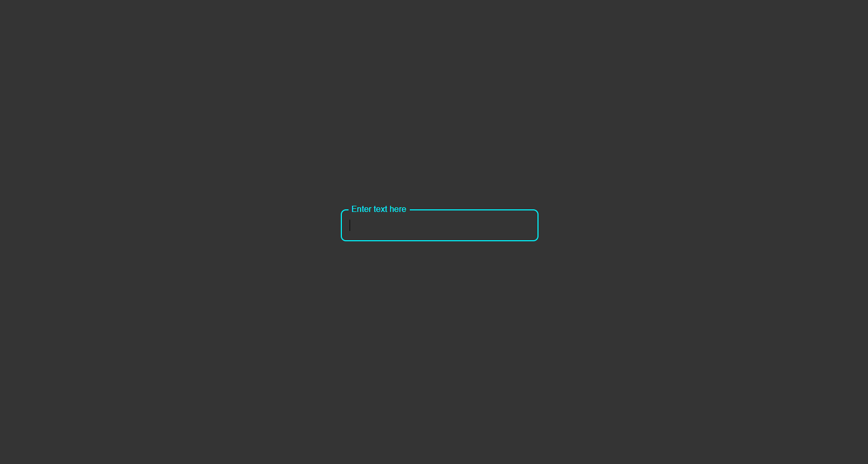
What Is the Floating Placeholder Effect?
The floating placeholder effect is a form design pattern where the label starts inside the input field — visually acting as a placeholder — but smoothly floats above the field when the user clicks or starts typing. This ensures the label is always visible, eliminating the confusion caused by placeholders that disappear on input.
The effect is achieved entirely with CSS using the :focus and
:not(:placeholder-shown) pseudo-classes combined with a transform transition — no
JavaScript needed.
Why Every Website Should Use It
How It Works — Step by Step
HTML Structure
Create a wrapper <div class="input-wrap"> containing an <input>
and a <label>. Crucially, the label must come after the input in the
HTML order so CSS sibling selectors can target it based on the input's state. Add
placeholder=" " (a single space) to the input — this is required for
:placeholder-shown to work correctly.
CSS Positioning & Default State
Position the label absolutely inside the wrapper, aligned with the input text baseline. In its default
state, the label sits inside the field. Style the input without a visible placeholder (set
color: transparent on the placeholder).
Float on Focus & Fill
Use input:focus + label and input:not(:placeholder-shown) + label to target
the label when the field is active or filled. Apply transform: translateY() to move it
upward and reduce its font-size. Add transition on both for a smooth
animation. The :not(:placeholder-shown) selector ensures the label stays elevated even
after the user removes focus.
:placeholder-shown pseudo-class
only fires when a placeholder is present and the field is empty. Adding a single space as a placeholder value
activates this selector without showing any visible placeholder text.transform distance and
font-size values for mobile.
Best Practices & Common Mistakes
- Use a real
<label>with aforattribute for accessibility - Add
placeholder=" "(space) to enable:placeholder-shown - Place the label after the input in HTML for CSS sibling targeting
- Test on mobile — ensure the label doesn't overlap when floating
- Add
transitionfor a smooth, professional feel
- Use
display: nonelabels — invisible to screen readers - Skip smooth transitions — abrupt label jumps look amateurish
- Use very small floating label font-size — must stay legible at 12–13px
- Add unnecessary JavaScript when CSS handles this completely
- Overcomplicate with JavaScript when CSS suffices
Frequently Asked Questions
How does the floating effect work without JavaScript?
:focus pseudo-class targets the label when the input is active.
The :not(:placeholder-shown) pseudo-class keeps the label elevated when the field has
content. A transition on transform and font-size creates the smooth
animation.Why do I need placeholder=" " (a space)?
:placeholder-shown pseudo-class only activates when a placeholder
attribute is present and the field is empty. A single space as a placeholder value enables this selector
without showing visible placeholder text.Is this pattern accessible?
<label> is properly associated with the input via
the for attribute, screen readers announce it correctly. The floating animation is purely
cosmetic and doesn't affect semantics.Can I use this with a <textarea>?
<textarea> elements.
Adjust the label's top offset to match the textarea height and set resize: vertical so the
label doesn't overlap on resize.Which browsers support this?
:focus, :placeholder-shown, and CSS transitions. No polyfills needed.
Conclusion
The floating placeholder input is one of the most impactful form improvements you can make
in minutes. By combining :focus, :not(:placeholder-shown), and a CSS
transform transition, you get a polished, accessible form element that stays clear throughout the
user interaction — with zero JavaScript.
Use it in login forms, contact forms, sign-up pages, or any field-heavy interface to immediately elevate the perceived quality of your UI.
Found this useful? Explore the related projects in the sidebar for more modern UI components.