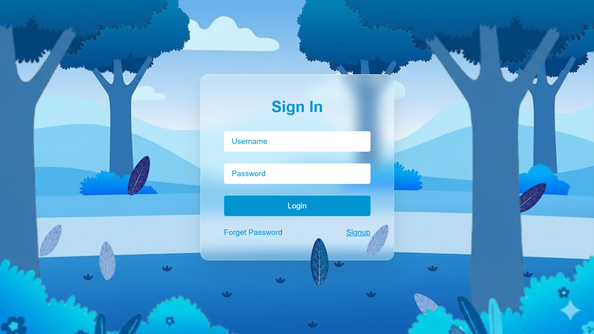
Glassmorphism Login Form in HTML & CSS
In this tutorial, you'll build a modern glassmorphism login form
and responsive glassmorphism login page using HTML and CSS,
enhanced with an animated Particles.js background.
If you're interested in more modern UI effects, explore our
animated HTML and CSS button effects
and
creative CSS animation projects.
This project is perfect for practicing CSS backdrop-filter, Flexbox centering, @keyframes animations, and third-party library integration — all in one cohesive real-world UI component.
Key Features of This Glassmorphism Login Form
backdrop-filter: blur() for a real
frosted-glass look.@keyframes animate leaves or particles falling across the
viewport.Glassmorphism Login Form HTML & CSS Source Code
Get the complete HTML and CSS source code for this glassmorphism login form. You can preview the result, copy each code file, and customize the design for your own projects.
How to Create a Glassmorphism Login Form in HTML & CSS (Step-by-Step)
Learn how to create a modern glassmorphism login form using HTML and CSS, with a responsive layout and an animated Particles.js background. This step-by-step guide explains the main techniques behind the design, from structuring the login page to creating the frosted-glass effect and configuring the particle animation.
HTML Structure
A full-viewport wrapper <section> holds two children: a
<div id="particles-js"> that Particles.js renders into,
and the login card <div class="login-box"> with form inputs.
Both are position: absolute inside the wrapper.
CSS Glassmorphism Effect
The login card uses background: rgba(255,255,255,0.1) for translucency,
backdrop-filter: blur(12px) for the frosted-glass blur, and
border: 1px solid rgba(255,255,255,0.2) for the glass edge.
A box-shadow adds depth.
Flexbox Centering
The full-page container uses display: flex; align-items: center; justify-content: center;
to keep the login card centered on every screen size without any absolute positioning on
the card itself — a clean and maintainable centering technique.
Input Fields & Button Styling
Inputs use background: rgba(255,255,255,0.08) and a subtle
border-bottom for a minimal glass-style look. The submit button
includes a :hover background and transition for
clear visual feedback on interaction.
CSS Keyframe Falling Animation
Leaf or particle elements use @keyframes to animate
translateY, rotate, and opacity from
top to bottom. Multiple instances use different animation-delay
and animation-duration values for a natural, staggered fall.
Particles.js Initialization
Particles.js is loaded from CDN and initialized with particlesJS('particles-js', {...}).
The config object sets particle count, color, size, speed, and link distance.
Set color: "#00d9ff" to match the site's cyan palette for visual consistency.
backdrop-filter: blur() requires the
-webkit- prefix for older Safari versions. Always add both:
-webkit-backdrop-filter: blur(12px); backdrop-filter: blur(12px);
and provide a fallback opaque background for unsupported browsers.
Project Background Images — Free Download
The login page uses six layered background images to create the depth effect. Download each one from Google Photos and place them in the same folder as your HTML file.
index.html
and reference them by filename in your CSS background-image properties.
Frequently Asked Questions
What is a glassmorphism login form?
backdrop-filter: blur() and a semi-transparent
background to create a frosted-glass appearance. Placed over a vivid animated background,
the form appears to float in front of the scene — a popular UI trend in modern web design.
How do I create a glassmorphism effect with CSS?
background: rgba(255,255,255,0.1) for translucency;
backdrop-filter: blur(12px) for the blur;
border: 1px solid rgba(255,255,255,0.2) for the glass edge;
and border-radius for rounded corners. The element must sit over a colorful
or animated background for the effect to be visible.
What is Particles.js and how do I add it?
<script src="https://cdn.jsdelivr.net/particles.js/2.0.0/particles.min.js"></script>,
then call particlesJS('particles-js', { ...config }) with your desired settings.
Does backdrop-filter work in all browsers?
-webkit-backdrop-filter prefix alongside the standard property,
and provide a fallback background: rgba(0,0,0,0.5) for older browsers
that don't support it.
Is this login form responsive on mobile?
max-width to scale cleanly from
320px mobile to large desktop monitors.
How do I change the particle color to match my brand?
particlesJS() config, find the particles.color.value
property and change it to any hex color — for example "#00d9ff" for cyan
or "#a855f7" for purple. The link color between particles can be set
separately under line_linked.color.
Conclusion
This glassmorphism login form is a great example of how modern CSS and a lightweight library can combine to create a production-quality UI component. By using backdrop-filter, CSS keyframe animations, layered backgrounds, and Particles.js, you get a visually impressive login page that loads fast and works on all devices.
Download the source code, grab the six free background images above, and start customizing the design to fit your project. Change the glow color, particle density, or animation timing to make it your own.
Found this useful? Explore more modern UI effects in the sidebar projects.