What You'll Build
This tutorial walks you through creating a premium glowing animated text button that's perfect for menu components, call-to-action sections, or any futuristic UI. Here's what makes it special:
Step-by-Step Build Guide
Create the Button HTML Structure
Start with a <button> element. Inside it, include two
<span> elements — one for the regular outlined text and another
for the animated glowing text that appears on hover. The button wrapper uses
overflow: hidden to clip the fill animation.
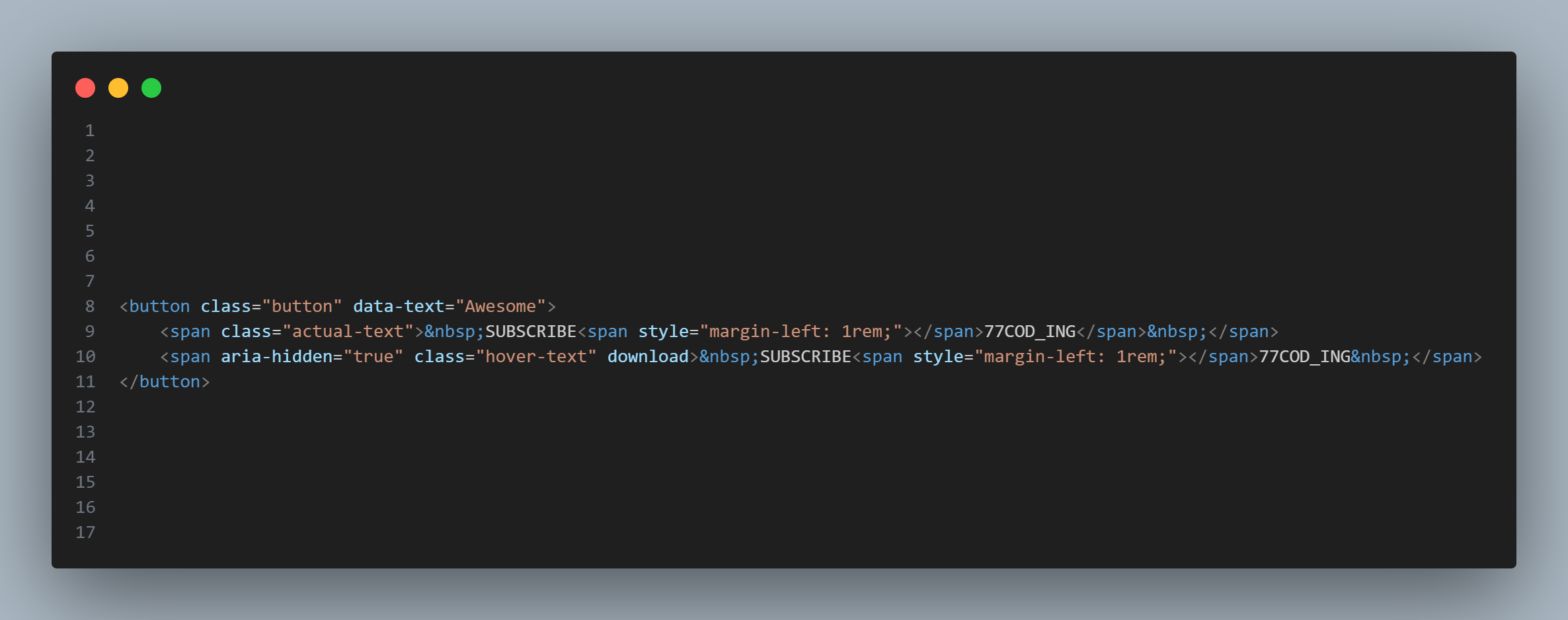
The dual-span structure enables the stroke-to-fill transition
Apply Text Stroke & Transparent Fill
Use -webkit-text-stroke to create the outlined text effect. Set
color: transparent so only the stroke outline is visible initially.
This gives the button a hollow, wireframe look before interaction.
-webkit-text-stroke property
is supported by all modern browsers. The -webkit- prefix is required
even in Firefox and Edge for this specific property.
Set Up the Glowing Fill Span
Style the second <span> with a solid color (e.g., cyan or white)
and position it absolutely over the stroke text. Set its initial
width: 0% so it's completely hidden. The overflow: hidden
on the parent button ensures the fill is clipped until triggered.
Add the Hover Fill Transition
On button:hover, animate the inner span's width from
0% to 100% using a CSS transition. This
creates a smooth left-to-right fill effect. A duration of 3–5 seconds gives an
elegant, cinematic feel.
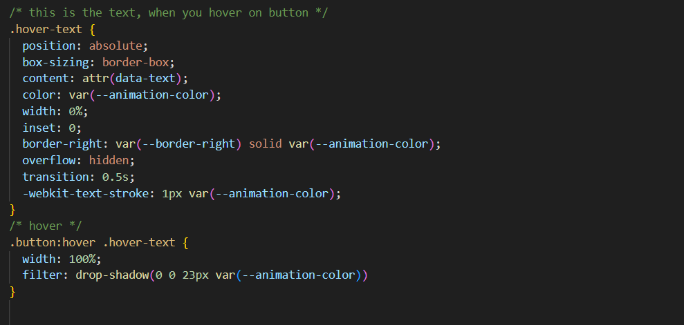
The width transition creates the left-to-right text fill reveal
Apply Drop-Shadow for Neon Glow
Use filter: drop-shadow() on the button to create the neon glow effect.
Unlike text-shadow, drop-shadow follows the actual rendered
shape of the text stroke, producing a more authentic glow. Stack multiple
drop-shadows for increased intensity.
text-shadow for
this effect — it only applies to the text fill, not the stroke outline.
filter: drop-shadow() respects the full rendered shape including strokes.
Fine-Tune Timing & Colors
Adjust the transition-duration (3–5s recommended), cubic-bezier
timing function, and glow color to match your site's theme. You can also add a subtle
@keyframes pulse animation for a breathing glow effect on the idle state.
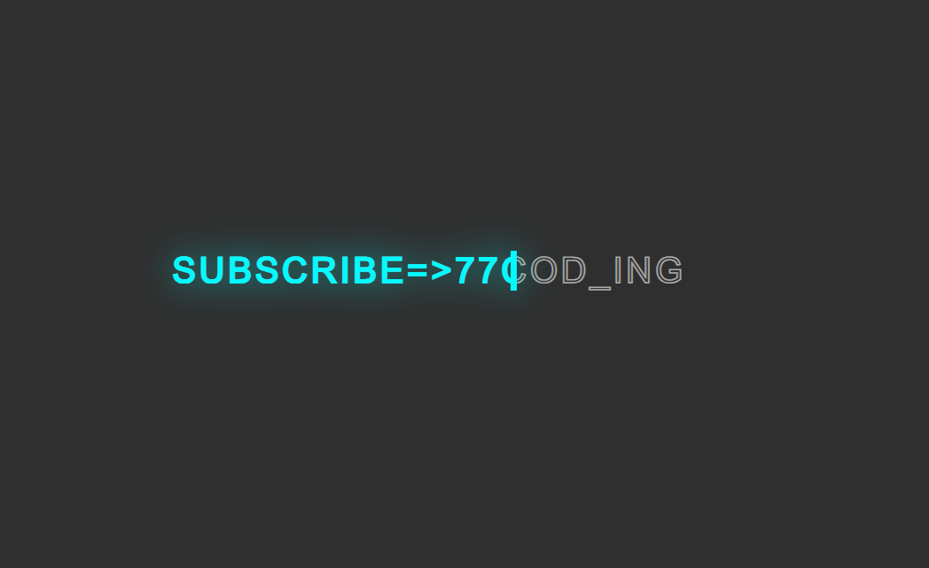
The completed button with smooth hover fill animation and neon glow
CSS Properties Reference
Here's a quick reference of the key CSS properties used in this project and what each one does:
| Property | Purpose | Key Value |
|---|---|---|
-webkit-text-stroke |
Creates outlined/hollow text by drawing a border around each character | 1px #00d9ff |
filter: drop-shadow() |
Adds a glow that follows the actual rendered shape including strokes | 0 0 10px cyan |
transition |
Animates the width change for the fill effect on hover | width 3s ease |
overflow: hidden |
Clips the fill span so it reveals progressively left-to-right | hidden |
position: absolute |
Overlaps the fill span exactly on top of the stroke text | absolute |
color: transparent |
Hides the text fill so only the stroke outline is visible initially | transparent |
Best Practices
Ensure the glow doesn't reduce text contrast. Test on dark and light backgrounds.
Match the glow color with your site's accent color for visual harmony.
Keep transitions between 3–5 seconds. Too fast looks jittery, too slow feels unresponsive.
Maintain focus visibility for keyboard navigation. Add focus-visible styles matching the glow.
Common Mistakes to Avoid
-
Using
text-shadowinstead ofdrop-shadow— the shadow won't follow the stroke outline - Using overly bright glow colors (e.g., pure white at full opacity) that strain the eyes
- Applying too many simultaneous animations, causing performance issues on low-end devices
-
Forgetting
overflow: hiddenon the button, which breaks the fill clip effect - Neglecting responsive sizing — the text may overflow or become unreadable on small screens
- Ignoring text alignment and padding consistency across different button instances
Full Source Code (Free)
The entire project lives in a single HTML file — no external CSS or JS files required.
The HTML sets up the card structure and links images from picsum.photos
for demonstration. The CSS drives every animation, transition, and responsive breakpoint.
A four-line script at the bottom removes the shimmer placeholder once each image has
loaded. Use the tabs below to explore the HTML and CSS sections separately.
🔓 Full Source Code unlocks in
Hosted on GitHub Gist — free, no sign-up required
index.html file.
No build tools, no npm, no libraries — open it in any modern browser and the accordion
gallery works immediately. Swap the picsum.photos URLs with your own images
to customize it instantly.
Frequently Asked Questions
How does the CSS text stroke effect work?
-webkit-text-stroke property draws an outline around text characters.
When combined with color: transparent, only the stroke outline is visible,
creating a hollow text effect. On hover, a second <span> with a solid
color fills in from left to right, creating the animation. The stroke width and color
are fully customizable.
What is the difference between text-shadow and drop-shadow for button glow?
text-shadow only applies to the text fill content and doesn't follow
transparent areas or stroke outlines. filter: drop-shadow() creates a shadow
based on the actual rendered shape of the element — including the -webkit-text-stroke
outline. This makes drop-shadow the correct choice for glowing outlined text
where you want the glow to follow the stroke path precisely.
Can I change the glow color and animation speed?
drop-shadow() color values and the
-webkit-text-stroke color. For animation speed, adjust the
transition-duration property on the button (e.g.,
transition: all 3s ease for a 3-second fill). You can also change the
cubic-bezier timing function for different easing curves like bounce or elastic feel.
Does this glowing button work on all browsers?
-webkit-text-stroke property works in all modern browsers including Chrome,
Firefox, Safari, and Edge. The filter: drop-shadow() is also widely supported
with full browser coverage. For older browsers that don't support these properties, the button
will still function as a clickable element — it degrades gracefully, just without the visual
glow and stroke effects.
Can I use this effect on links or div elements instead of buttons?
<a>, <div>, or
<span> elements. Just ensure you add cursor: pointer for
visual feedback and appropriate ARIA attributes (like role="button" and
tabindex="0") for accessibility on non-button elements.
How do I make the glow animation more subtle or more intense?
drop-shadow() (e.g.,
drop-shadow(0 0 3px cyan)) and lower the color opacity. For more intensity,
stack multiple drop-shadow filters with increasing blur:
filter: drop-shadow(0 0 5px cyan) drop-shadow(0 0 15px cyan) drop-shadow(0 0 30px cyan).
You can also add a pulsing @keyframes animation that cycles the shadow intensity
for a breathing glow effect.
Conclusion
Building a glowing animated text button with HTML and CSS is an easy yet powerful way to make your website stand out. This effect delivers interactivity, modern style, and performance efficiency — all without a single line of JavaScript.
- Pure CSS solution — no JavaScript dependencies
- Neon glow effect using
filter: drop-shadow() - Cinematic text fill animation with width transition
- Fully customizable colors, speed, and timing
- Works across all modern browsers with graceful degradation
- Perfect for Subscribe, Join, Download, and Explore actions