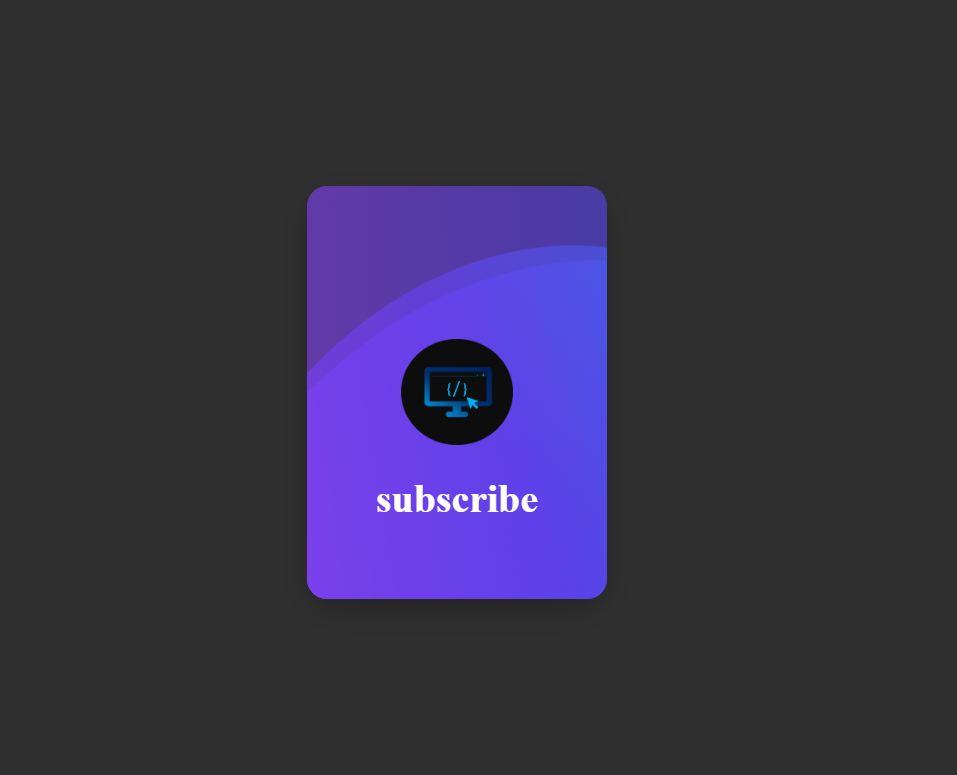
Want to make your website stand out? In this tutorial, you’ll learn how to design an elegant animated card using pure HTML and CSS. The project features rotating color waves, a glowing background, and a centered "Subscribe" text — perfect for modern landing pages or profile cards.
Quick Summary: Create an HTML structure with a centered card, use CSS to style the waves,
and apply animation with the @keyframes property to create a rotating color effect.
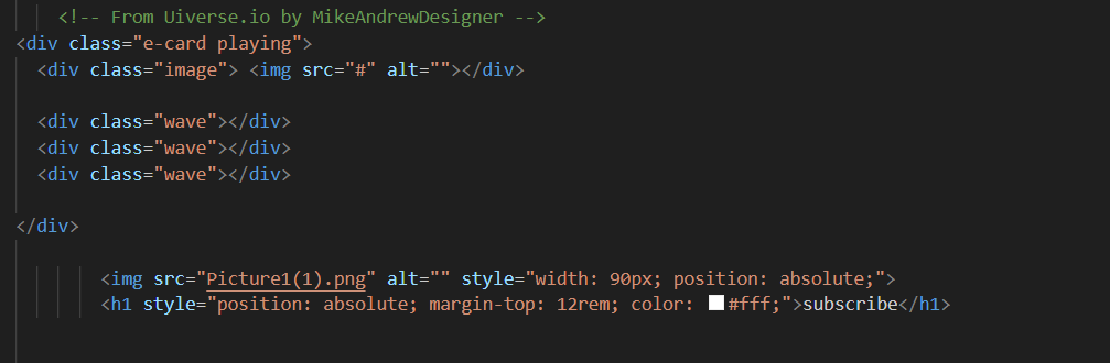
Start with a simple HTML file. This will include the main container (.e-card) and three .wave elements to form the animation layers.
Use Flexbox to center the card on the screen. Add a dark background color (#2f2f2f)
to make the waves stand out.
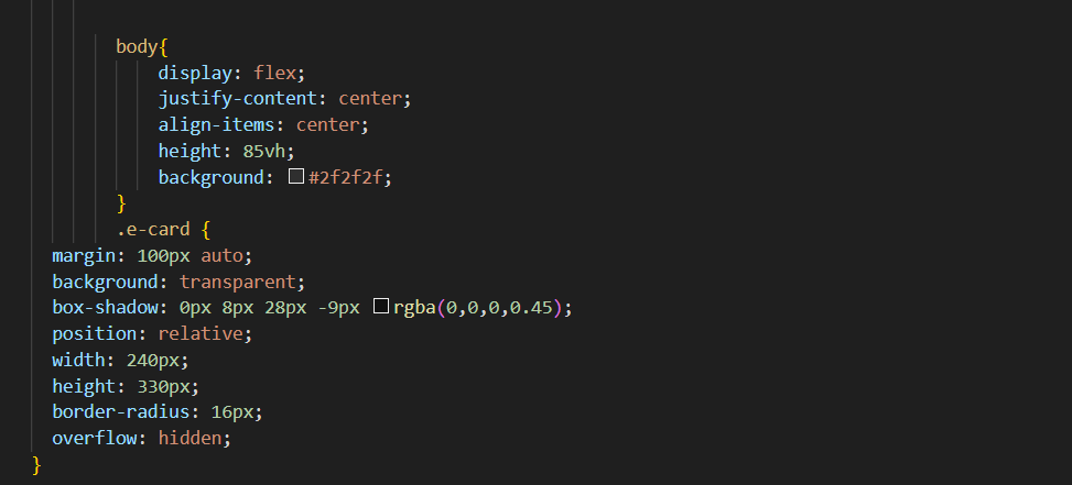
Add a .e-card class with rounded corners, a transparent background,
and a subtle shadow for depth. The overflow: hidden property ensures that the waves stay inside the card borders.
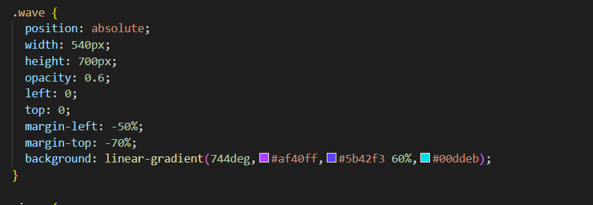
Each .wave div uses a linear gradient to create a colorful layer.
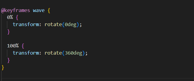
With the @keyframes wave rule, the layers rotate continuously, creating a soothing motion effect.
You can place your logo or icon inside the card using the <img> tag.
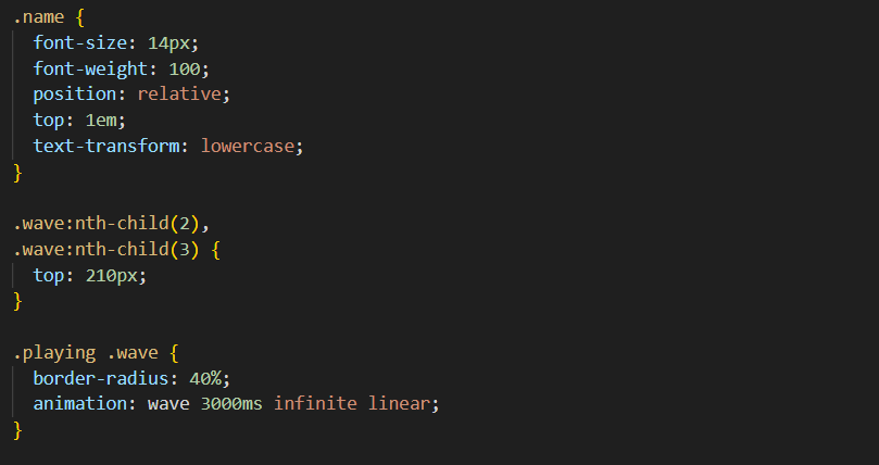
Below it, add a Subscribe title or any message you like.
The example below positions both using position: absolute;.
Adjust animation speed, colors, and transparency to match your website theme. You can also experiment with more gradient layers or icons for a unique look.
That’s it! You’ve built a smooth, modern animated card using only HTML and CSS. This design is lightweight, responsive, and perfect for call-to-action sections like “Subscribe” or “Join Now”. Customize it with your own images and text to make it truly yours.
SEO Keywords: CSS animated card, HTML wave animation, subscribe button design, pure CSS effects, creative front-end projects